
If you were to pick a brand apart, what would you find? Maybe a logo, a brand name, and a handful of values. Our businesses are defined by their branding. For those in industries like financial technology (or fintech), which is reaching impressive new heights, it’s more important than ever to have a unique identity.
Back in 2019, you’d find around 12,000 fintech startups worldwide, grabbing at your target audience. If you think that sounds like tough business, then bad news, because this number has jumped up to 26,000 in 2023.
To establish yourself as a frontrunner, there needs to be some differentiation from everyone else. At Literal Humans, we consider ourselves to be good news people. So, here’s the positive. You can achieve this through your brand strategy. Phew, right?
- Starling Bank
- PayPal
- Klarna
Each of these businesses have mastered a certain element of their branding to create something creative and meaningful. To be the best, you must learn from the best. So, use these three excellent examples as inspiration to take your business to the next level.
Why does branding matter to fintech companies?
Before we get to the how, let’s look at the why. Branding in any sense, be it a refresh, a full rebrand, or simply starting from scratch, is a mammoth task. It won’t be long before you realize how much time, effort, and money is involved.
Sometimes it feels easier to stick your logo on everything and leave it at that. But strong brand identity is such a crucial element to success that it can’t just be ignored. Here are the most noteworthy reasons why you should make the commitment.
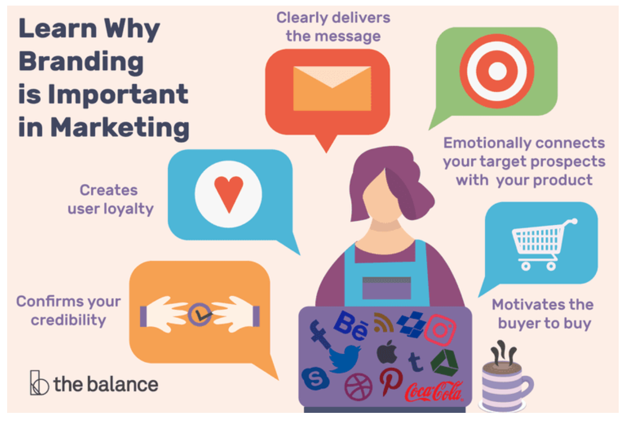
- It builds trust. A staggering 81% of potential customers need to trust a brand before they consider buying. When you handle a person’s rent money and life savings, this only becomes more important. Prioritizing consistency, creating recognizable assets, and providing constant value will present your brand as reliable.
- You can position yourself as an expert. When finances are concerned, picking the right provider won’t be a quick decision by any means. So, to shorten the buyer’s journey, you need to leverage your company as the dependable and authoritative choice. Branding is how customers determine your quality. An impressive, well thought-out brand will be associated with expertise. This leads to more frequent and quicker sales.
- It’s easier to stand out in a saturated market. As we previously mentioned, the fintech industry is booming. When you are presented with plenty of choices, who do you prefer to do business with? Most likely, the business you know or hear the most about. Memorable branding prompts brand awareness and retention.
Our top 3 fintech branding examples
Why did we choose these examples? Even though they operate in the same industry, they are all memorable enough to stand apart from each other. Successful fintech brands are innovative. Below, you’ll see how they take something conventional and make it their own.
1. Starling Bank and social media
Your branding needs to fit within the context of your industry. Companies that need to be authoritative feel like they have more constraints when it comes to content marketing. The result? A lot of samey and boring corporate social media accounts.
A bombardment of memes and gifs isn’t necessarily getting the right ideas across. But at the same time, being afraid to take risks doesn’t lead to strong branding. The businesses that don’t offer anything new won’t spark a conversation. We know better, and so does the British bank Starling Bank. You need to be modern without compromising your credibility.

Starling Bank is a neo bank, so they only operate online, and they challenge the traditional expectations of how a finance service should put content out there. They have found the right balance between fun and professional, which we noticed on their Instagram page.
- Information, such as scamming methods, is described with pop culture references. These appeal to a millennial audience, who are the demographic with the highest preference for mobile banking and apps. This also taps into nostalgia marketing.
- The dark blue and purple text on the posts perfectly matches their branding. Even on social media, it is important to maintain a solid visual identity. Sometimes this can get lost when you post more fun content, which makes your brand feel less cohesive and put together.
- Memes are used to catch the eye. Finance isn’t the most sharable topic, so this is how Starling Bank gets around that issue. Still, crucial context and information can be found in the captions.
- Complicated topics, such as how to create a virtual card, are illustrated through visual content. This shows that the service is knowledgeable enough to turn difficult information into something digestible, which consumers will appreciate.
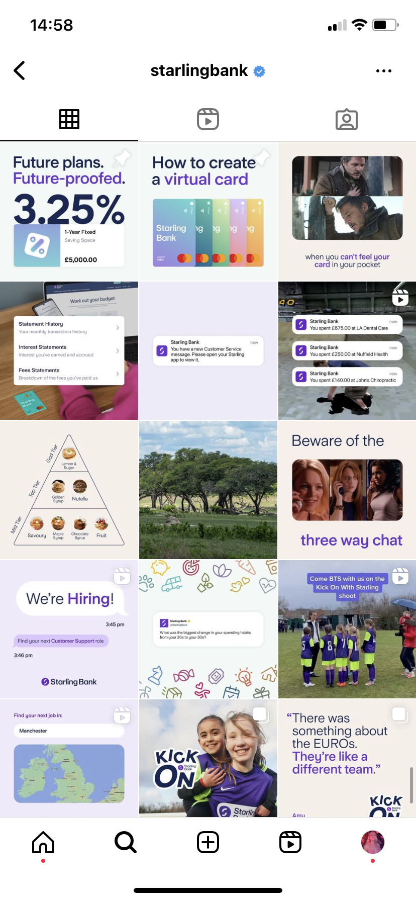
Here’s a closer look at a post that works well. The image references the popular Netflix show “You”. Starling Bark timed this to coincide with the release of the latest season. Though the content is entertaining and will engage a wide audience, they educate in the caption and the tone of voice is professional. That’s the best of both worlds.

2. PayPal and logo design
When you hear someone mention a brand, usually the first thing you will picture in your head is the logo. Think McDonald’s with their iconic arches, or Nike’s tick that everyone recognizes from a mile away. 75% of customers recognize a brand by its logo.
Your logo works hard. It tells potential buyers what you’re about, what you care about, and what they can expect from you. You might not believe a few words and an image can do all this, but we promise you it can.
For that reason, many fintech businesses will opt for a practical and minimalist design. But this can cause logos to look the same, and it gets boring for consumers. So, how can you follow the conventions but create something worth remembering? Let’s look at PayPal and how they manage to overcome these industry obstacles.
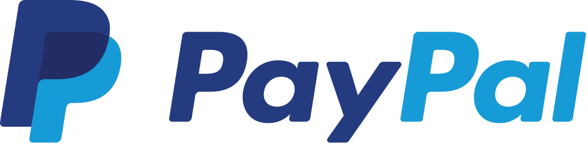
- User experience is improved by the simplicity of the logo, as most customers will access their financial services on banking apps. Mobiles require a design that still looks good quality, even on a smaller screen. This demonstrates that PayPal cares about the ease of their service.
- The overlap of the “P” in the design illustrates some of their key values, which are inclusion and collaboration. Customers respond well to logos that mean something, as it shows cohesion and clear purpose.
- The typography is neatly spaced, the font is bold, and the edges of the letters are rounded. Everything about it screams accessible. This is exactly what PayPal build their reputation on.
- The fintech industry has its own branding trends, which involve the use of blue, purple, and green. This subverts the traditional banks that tend to lean towards red. PayPal chose shades of blue for their color palette, which represents loyalty and respect, but steers away from green, which symbolizes money. By not using it, they appear more customer-centric in their values.
3. Klarna and brand guidelines
Branding can often be mistaken as the final product. But it’s also the work that goes into getting there. It doesn’t matter if you’re a new brand or a well-established business, you should have a clear set of guidelines.
These ensure that every email, social media post, and advertisement is a cohesive brand experience. They are instructions that partners, freelancers, and team members will follow whenever they create something for the company. Therefore, they should be easy for anyone to understand and replicate. Yours should include elements like:
- Typography, font, and logo guidelines
- Your brand story and voice
- Which images can and can’t be used
- Color palette
- Appropriate and inappropriate phrases
Let’s look at an example, shall we? Few fintech companies stray from what they know works. But Klarna does it differently. Not only have they gone rouge with their color palette, but they’ve gone with pink! It’s a welcome change from the often dull banking designs.
However, they’ve given themselves a challenge. If you’re going to do things your own way, you need to do it well. They do this by putting rules in place. These still allow for creative freedom, but Klarna can maintain a regulated appearance across all marketing campaigns and platforms. Let’s dive in and see how they’ve mastered their branding documentation.
-
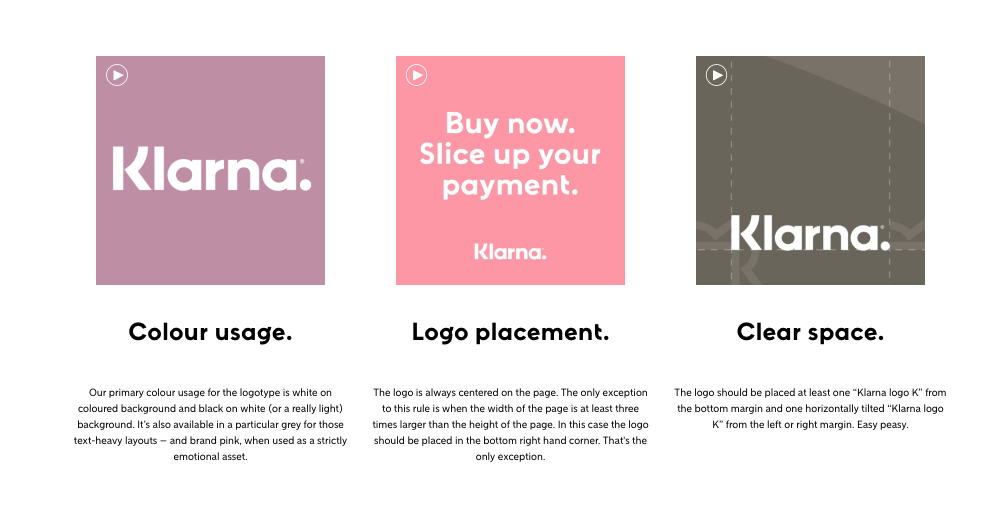
Klara uses images and plenty of text in their documents. It sounds obvious, but you should always illustrate your brand guidelines as much as possible. There should be no room for interpretation.
-
Even the guidelines themselves match the brand’s typography and font. This might sound like a small detail, but it’s an important one. For instance, the company states that the logo is always centered on the page. The text and images are always center in the guide, too. Every document should be cohesive, even ones that aren’t customer-facing, to stress how necessary following these rules are.
-
It’s really detailed. Some brands don’t spend enough time on their guidelines, and therefore don’t explain why things are the way they are. When creators are told the reasons behind design choices, they can emulate them much better.
-
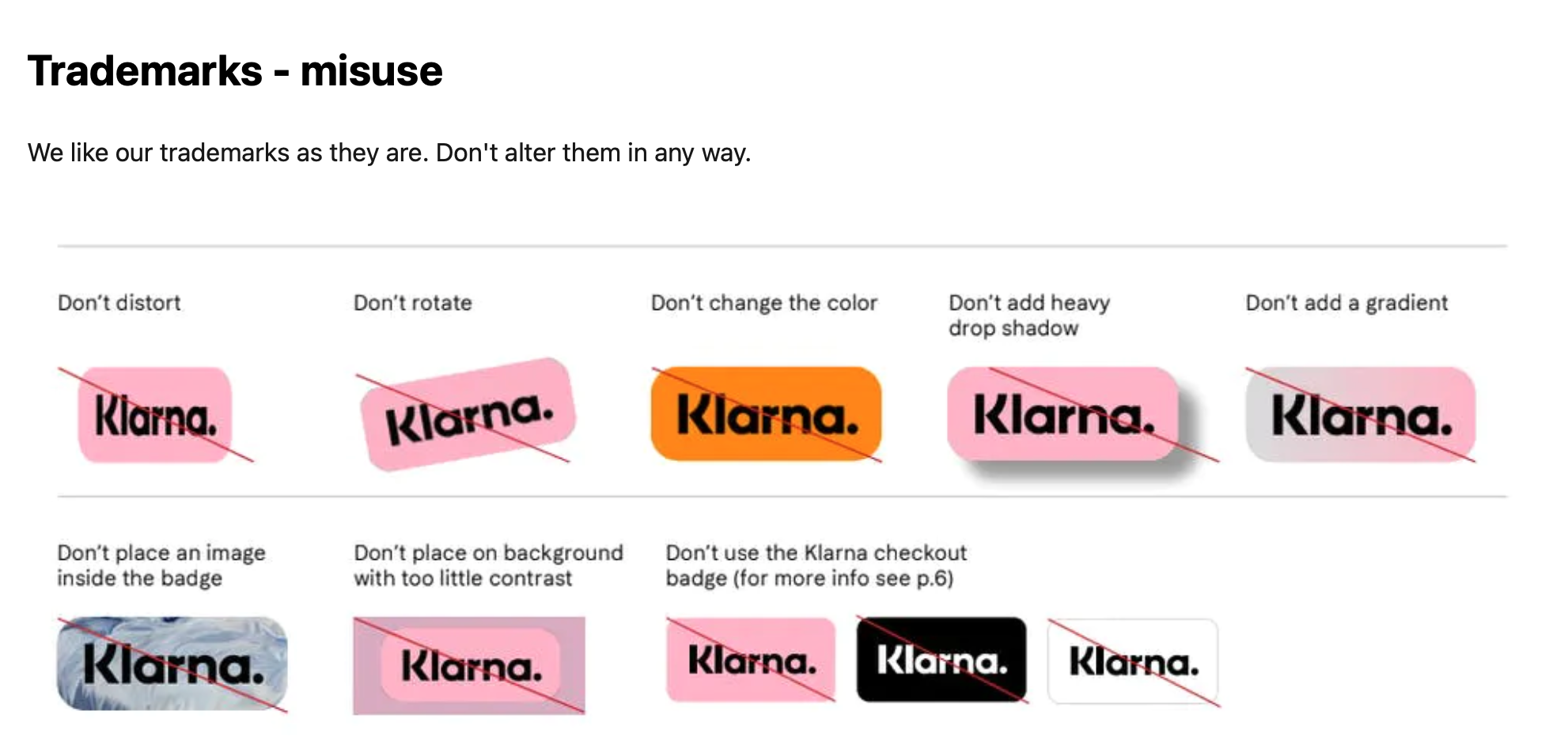
They make sure no one messes with their trademarks. This is a great idea because changing the background, color, or rotation can be enough to make your brand look unprofessional, which will majorly put customers off. This is especially relevant when it comes to fintech marketing, which relies on professionalism.
Branding is everything
New customers put a lot of faith in financial institutions. When it comes to money, good service means security, so naturally, they want the best. So, for businesses like fintech that offer very similar services, it’s the branding that makes all the difference.
Try not to worry too much about what everyone else is doing. As long as you have a strong brand strategy, a well-constructed brand, and the motivation to adapt whatever isn’t working, your customers will respond.
We hope these brand champions have shown you how it’s done. You can stick with blues and greens or push boundaries with pink, so long as it represents your company. So do your business justice and learn by example. You’ll be one of the greats before you know it.


