Customers have always had expectations, such as reasonable pricing and high-quality service, but our modern buyers take this a little further. Many will seek out a brand experience that’s authentic and personalized, but a whopping 90% expect it to be consistent.
However, less than 10% of businesses maintain a high level of consistency across all products and marketing channels. This means there is a huge opportunity to fill the gap, gain a competitive advantage, and win over your audience.
We won’t leave you in suspense any longer. To reap these rewards, you just need to create a branding kit that keeps everyone on the same page. This article will give you everything needed to get started, including examples from the best brands out there.
What is a branding kit?
A branding kit is an essential resource for any business. It gives new players a blueprint to put their best foot forward in the market and supports growing leaders who have a strong presence to maintain.
But before you can grab yourself a piece of the pie, you need to know what it is. So, let’s talk about it. Your branding kit is a collection of the visual assets that make your brand unique. It will consist of design choices, images, and tutorials that work together to help every team member present a united, on-brand front to your customers.
Your branding kit doesn’t have to look the same as everyone else’s, as you’ll see when we move on to examples. That being said, the guidelines will typically focus these brand elements:
- Logo
- Font
- Typeface
- Color palette
- Icons
Why is a branding kit important?
You’ve probably heard someone in the business world say, “Rules are made to be broken”. In some cases, this does ring true, as many of the best brands were built upon creativity, innovation, and adaptability.
But brand identity is where you shouldn’t throw away the rulebook. It’s crucial to develop consistency in your business to convince customers to interact with it.
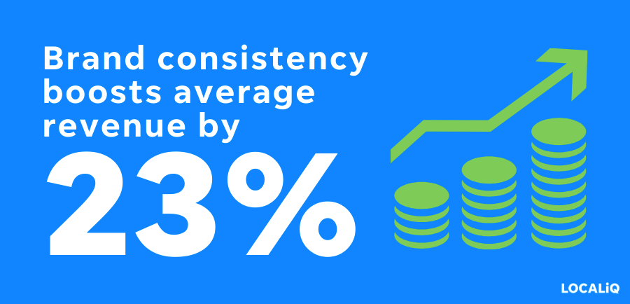
Without clarity and cohesiveness, too many different opinions will be brought to the table, resulting in a Frakenstein’s monster of marketing materials and brand assets. What’s worse, potential customers will be turned off by the weak and unprofessional appearance this creates.
Here are some other important reasons why a branding kit is a business essential:
- Cost-effective: Imagine a freelancer produces content for your brand, but it feels all wrong. You’ve then got to spend money trying to fix it. If it’s too far off the mark, then their work might be totally scrapped and you’ll lose out even more. Providing creators with brand guidelines ensures they stay on track.
- Brand recognition: Customers are more likely to buy from a brand they’re familiar with. One way to develop this brand awareness is through visual identity. For example, color improves recognition by up to 80%. But this will only be effective if the same palette is used to create this association.
- Saves time: When all of your assets are in one place, it becomes a lot easier to develop promotional or seasonal materials that might be time-sensitive. This helps you keep on top of trends and be a step ahead of your competitor’s marketing strategies.
- Greater perceived value: Consistency reduces the variability of the end result, makes it easier to meet the expectations of customers, and boosts efficiency. All of these factors contribute to a reputation of high quality and value.
The best branding kit examples
And now, onto the main event, the branding kits from some of the most widely successful businesses in the world.
Luckily for us all, they’ve published their brand identity kits, or parts of it, to the public. This unique opportunity gives smaller businesses the chance to learn from the best. So, don’t take it for granted and check out the examples below for inspiration.
1. Netflix
Netflix boasted approximately 200 million subscribers globally in 2023. Even if you don’t have a Netflix account, you probably have the password to someone else’s. It would be hard to find a household without access to the streaming service in one way or another.
For many of us, the brand has replaced live TV altogether. We prefer an ad-free experience where we can binge episode after episode. But this isn’t the only reason for the platform’s unbelievable success. Eye-catching branding also played a huge part.
Netflix has maintained its brand image since it was launched. Even as a DVD-by-mail service in 1997, it still stood out with a bold red and black color scheme.
Keeping this consistency only becomes more difficult as the company grows and its team evolves. To remain the champion of brand awareness, Netflix developed a foolproof branding kit. Let’s take a look at it.
- Brand signature: The branding kit explains what the “N” in Netflix means to the company so creators can use it appropriately.
- Brand color palette: CMYK, RGB, and HEX codes show creators exactly what they need to replicate instead of just calling it red and black.
- Clear space: Specific measurements ensure the logo and other assets look good on different backgrounds.
- What to avoid: To make designing as clear as possible, Netflix explains what they don’t want to see, such as altered shadows, rotations, and colorful logos.
- Extra considerations: Netflix asks readers not to place the logos on doormats where it could get dirty, disposable items that get thrown away, edible products, and scratch-off services where the imagery will get damaged.
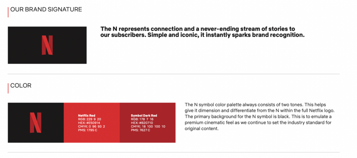
Find the fully documented brand style guide here.
2. Apple
Since we’re talking about the best of the best, we would be remiss not to mention Apple. The business has accumulated a cult following of loyal customers, and as of 2023, there are more than 1.46 billion active iPhone users worldwide.
Apple is one of the most recognizable businesses in the world. But, unlike Netflix, attention-grabbing brand colors didn’t contribute this time. In fact, Apple’s sleek black and gray design choices are quite the opposite.
Simplicity is a core value for the technology giant, and this is demonstrated with clean visual content, concise messaging, and a lack of physical features on the products themselves.
Apple’s ability to stay an innovative industry leader with such a simple visual identity is a testament to its branding kit. The guide helps creators find the perfect balance between pushing boundaries and maintaining integrity.
We’ve provided a rundown of the guide below to show you how it’s done.
- Legal considerations: It is clearly stated here that there is a specific way Apple’s assets should be used; permission is needed beforehand, and the guidelines must be stuck to.
- Signature colors: Examples demonstrate that the channel signatures should only be in black and white and never on a visually cluttered background.
- Clear space: Diagrams clarify the minimum space allowed on logos. It’s also clear that no graphic elements are allowed to enter this area.
- Typography: The brand fonts are named as a modified version of the Myriad font called Myriad Set, but it is asked that these aren’t replicated by another company.
- Product presentation: Apple states that its assets should never be alone on someone else’s product, and the other business’s identity needs to be clear. Also, details are given about what it won’t brand (such as sports equipment and gambling merchandise).
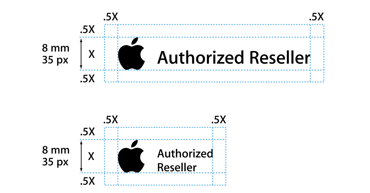
If you want to see it for yourself, the kit can be found here.
3. Spotify
No matter who your favorite band is or how you listen to them, our passion for music unites us all. For this reason, it’s no surprise that the industry is overcrowded with businesses trying to become the streaming service of choice.
When the competition is fierce, good brands do something different. That’s exactly how Spotify rose to power. Since launching in 2008, it grabbed the attention of its target audience with features like a free subscription model and access to personalized playlists.
But the brand’s visual identity stood out just as much as the product itself. The use of dynamic illustrations, vibrant colors, and interactive displays told potential customers that Spotify was fresh and cool. They knew they would get something unique if they signed up.
The branding kit shows just how the platform crafted this image and stayed on-trend. Here are the design strategies they documented.
- Logo design: Spotify asks for logo usage to be a combination of the wordmark with the icon unless there isn’t room for both. Advice is also given about which colors to use and what to avoid, including rotations and gradients.
- Using content: The background of artwork should be in a Spotify-provided color so that, even though it’s not company-owned, it still reflects the overall brand design.
- Sizing and space: A minimum size is given so the assets are always legible and there is a maintained brand consistency wherever it’s been displayed.
- Brand colors: Just as Netflix did, the CMYK, RGB, and HEX codes are used to make sure the palette is accurate. The branded Spotify Green is also introduced, which is exclusive to the company.
- Fonts: Default sans-serif font is advised for third-party creators, but it is shown that the brand has its own unique font called Spotify Circular, but this needs permission.
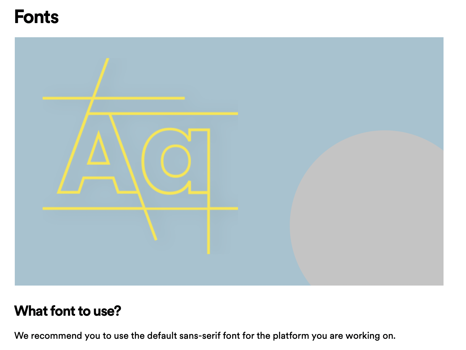
The full design guidelines can be accessed here if you need more inspiration.
4. Starbucks
The people at Starbucks are experts when it comes to generating excitement. After all, customers start talking about the Pumpkin Spice Latte before the first orange leaf has even hit the ground. But it isn’t just familiar favorites that capture our attention because the business introduces new drinks every season.
So, how does the company avoid diluting its identity if it continuously adds new items to its menu?
The answer, of course, is by maintaining a consistent brand through the visual elements it portrays. Even if a drink isn’t like anything else that’s being sold, customers will be reassured by the green and white cup design.
Let’s uncover how Starbucks fosters this trust by looking at the key parts of its brand guide.
- Brand logos: The kit shows the allowed color combinations for the logo and the wordmark and even provides a timeline of its evolution for more context.
- Colors: The scheme is split into primary colors (which are always green) and secondary colors, which are to be more expressive.
- Typography: Three fonts are used, each shown interactively alongside their weight and size. You’re even able to type your own words in each one to see how they look.
- Illustration: Like the colors, Starbucks splits the illustrations into categories, which are functional and expressive. It also shows where to use them, such as on their rewards app, cups, or signage.
- Photography: This section clarifies that the brand uses editorial and product photos, the formats it can be used in, and the importance of the images being honest.
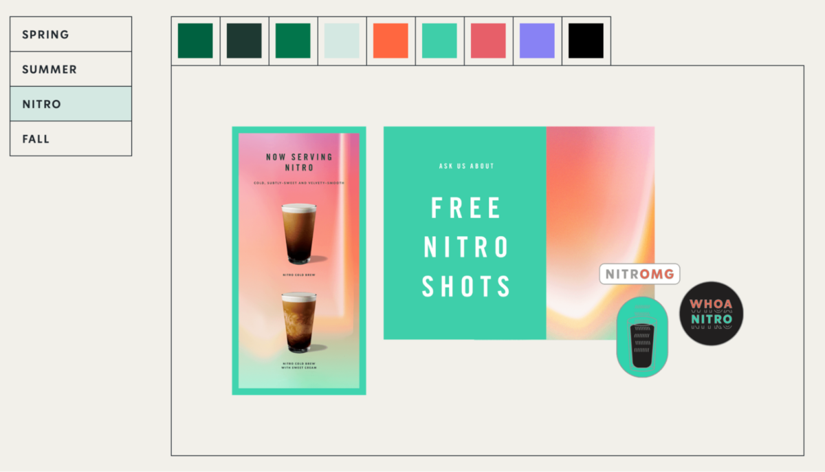
For a more in-depth look into how Starbucks makes its brand come to life, find the rest of the document right here.
How can you create your branding kit?
If these branding kit examples haven’t got you fired up and ready to make your own, we don’t know what will.
If you are ready to get started, then you’ll be wondering where to begin. There’s definitely more to think about when you don’t have the huge branding departments or infinite budgets like the companies above. But here’s the good news, you don’t need any of that because the internet is filled with helpful resources.


