In the competitive business world, a brand’s success hinges on being memorable and connecting with consumers on a deep emotional level.
Enter branding assets, the secret sauce that elevates small startups into iconic brands.
From Nike’s iconic swoosh logo to McDonald’s ‘I’m Lovin’ It’ tagline, these assets leave a lasting impression on audiences across the world.
In this blog, we will explore four incredible examples of successful brand assets and uncover the reasons behind their long-lasting appeal.
4 examples of successful brand assets
While countless articles have covered the assets of iconic brands such as: McDonald’s, Nike, Coca-Cola, Amazon, and Apple, we want to provide you with high-quality examples from lesser-known case studies. In the following section, we will examine different types of brand assets and uncover what makes them a memorable touchpoint for consumers.
1. Royal Caribbean- Typography
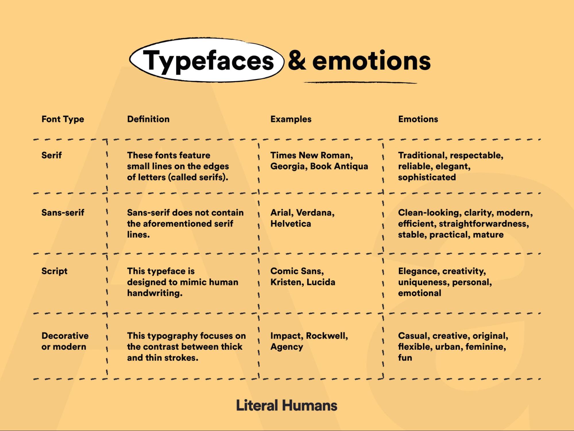
It may seem rather absurd, but the chosen typeface of a brand can have an astronomical impact on customer perceptions. The idea of font psychology is incredibly prevalent in marketing and recognizes how different types of typography can evoke different emotions.
Check out the table below to see what emotions certain kinds of typefaces convey.
Royal Caribbean is a renowned provider of innovative, youthful, and family-centric cruises that maintain elements of luxury.
The company provides a comprehensive brand guideline that dictates how its branding should look across all platforms, from social media to marketing materials. Within this document, there is an in-depth style guide that tackles typography and provides a strict template for all teams to follow.
Check out the detailed typography guidelines in the below images.
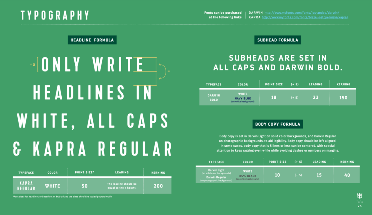
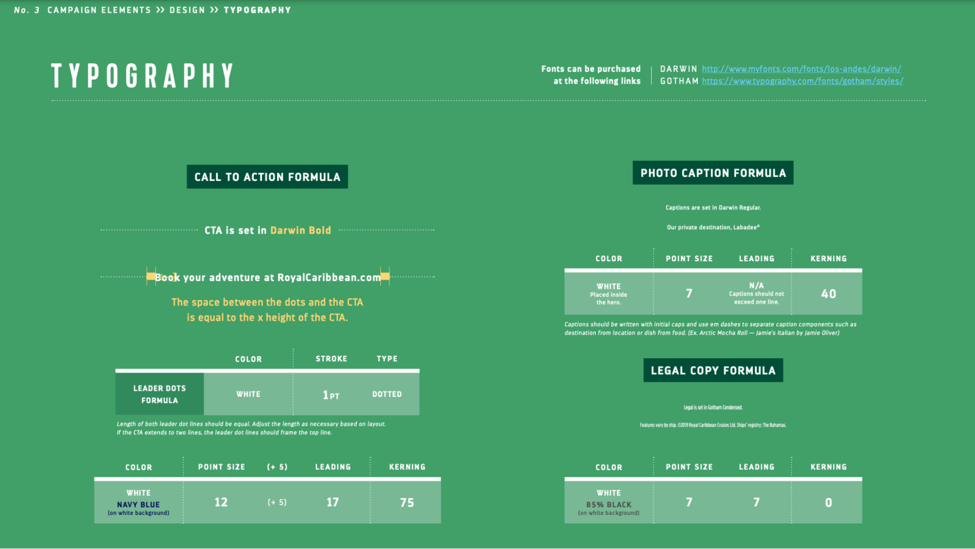
This branding guide states that all headings must be written in Kapra, while the body copy needs to use the Darwin typeface. Let’s take some time to look at what emotions these font styles convey and how they relate to the brand.
The Kapra font conveys the following emotions:
- Elegance: The Kapra font exudes an air of sophistication, making it perfect for high-end brands and luxury products.
- Creativity: With its artistic design, Kapra sparks inspiration and encourages out-of-the-box thinking, making it an ideal choice for creative industries.
- Modernity: The sleek and contemporary look of Kapra gives it a modern feel, making it a great fit for brands that want to convey a sense of innovation.
- Confidence: The bold and strong letter forms of Kapra instill a sense of confidence and authority, making it a powerful choice for brands that want to make a bold statement.
- Fun: This display typeface elicits emotions of fun, making it the perfect choice for a brand that wants to highlight the excitement surrounding its product or service.
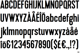
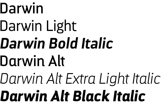
The Darwin font is also utilized consistently throughout Royal Caribbean’s content and conveys similar ideas to Kapra. This includes thoughts of elegance, fun, modernity, confidence, professionalism, and creativity which perfectly aligns with Royal Caribbean’s core values.
2. Color palette– NFL teams
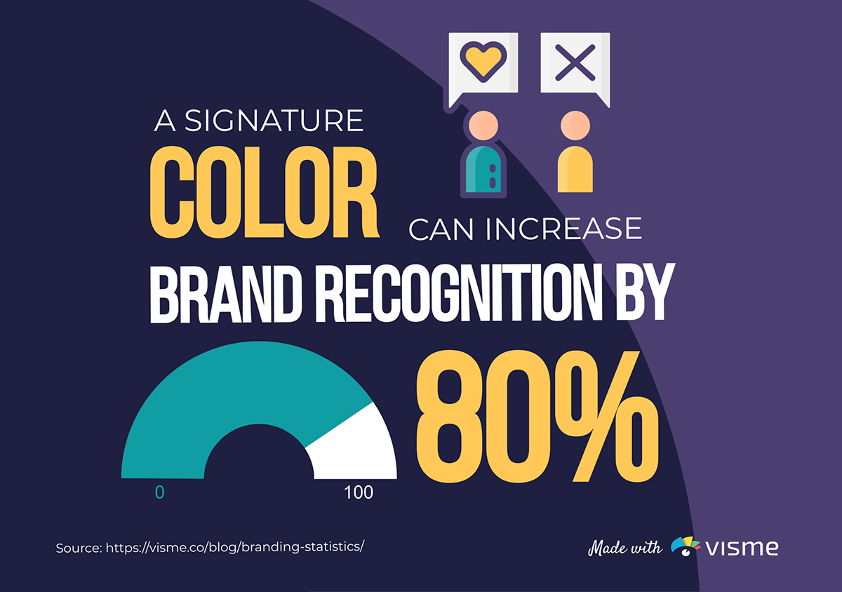
The importance of color in marketing can not be overstated, as customers associate certain color schemes with different brands. In fact, it is estimated that brands that have a signature color can expect to see an 80% increase in brand recognition.
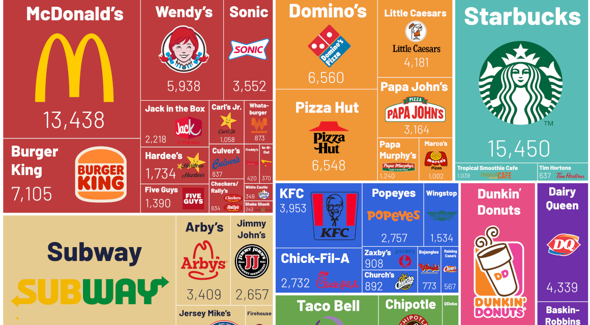
Take the fast food industry as an example; countless chains have made certain color schemes synonymous with their brands. Think about what colors come to mind when thinking about the following fast-food outlets.
- Domino’s
- McDonald’s
- Subway
- Taco Bell
- Starbucks
McDonald’s? Red and yellow. Subway? Yellow and green. Domino’s? Red and blue. For each of these chains, it is likely that you have associated them with the colors found consistently throughout their branding, from their logo to marketing.
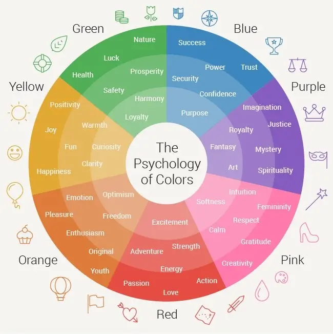
Much like fonts, colors can evoke a whole range of emotions. Both color theory and psychology attempt to understand how different combinations of colors can affect a target audience.
Check out the infographic below to understand what the use of different colors in your branding can signify to consumers.
There is no industry in the world that relies on color schemes more than competitive sports. Having a distinctive and instantaneously recognizable color scheme yields many benefits, including:
- Creates a sense of unity between players and fans.
- Encourages sponsors and advertisers to associate with the team.
- Allows fans to showcase their pride and loyalty to a team.
- Increases brand recognition amongst a wider audience.
- Brand colors can be used in merchandising.
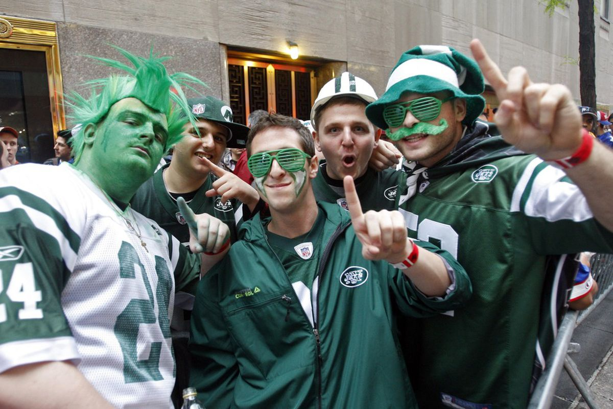
The NFL is a prime example of color schemes being used effectively, with every team having a color palette that can be automatically associated with their brand.
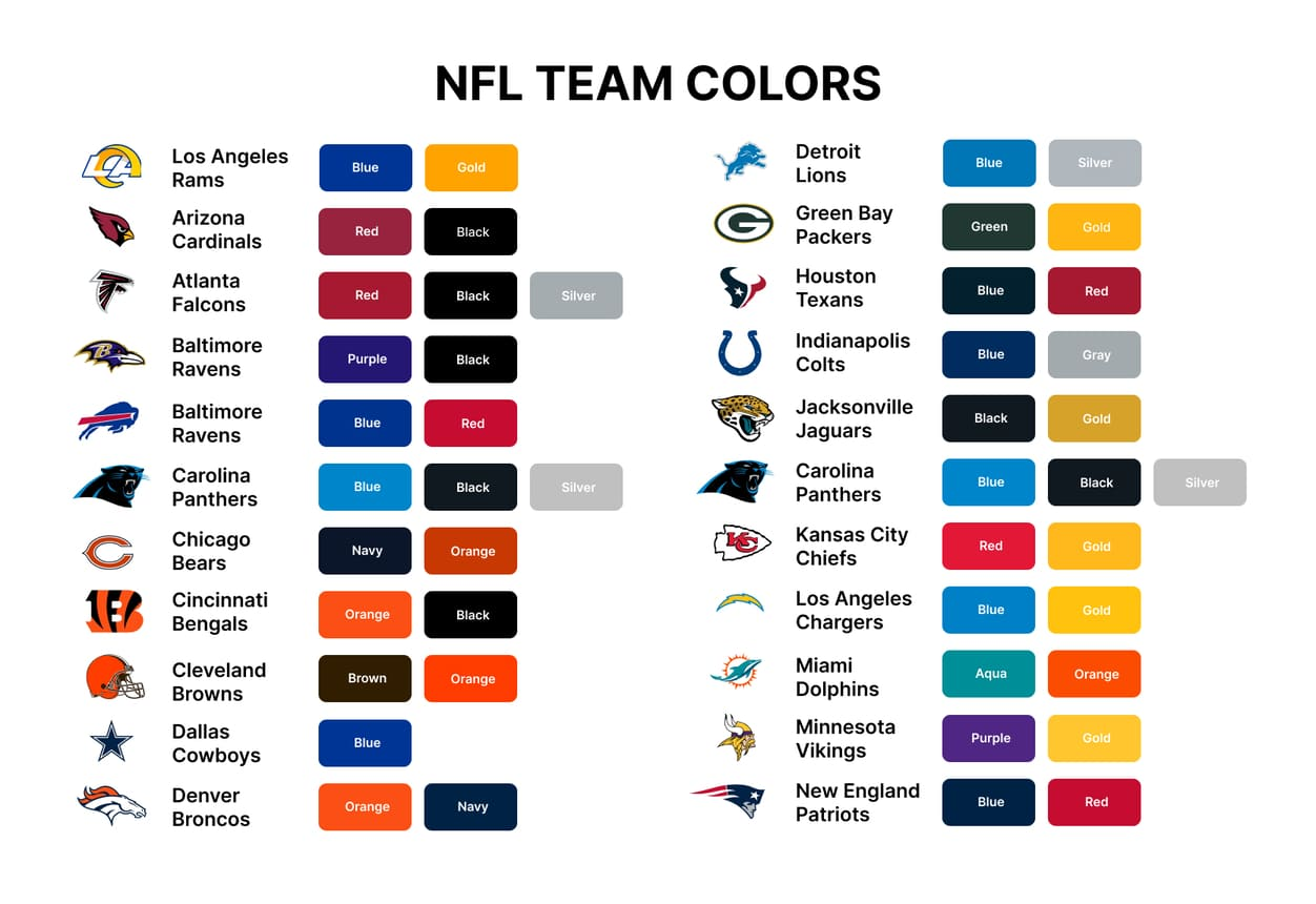
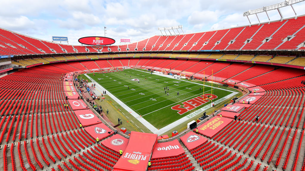
For instance, the Kansas City Chiefs use a distinctive red and yellow color scheme. This choice of colors connotes action, energy, passion, strength, excitement, happiness, warmth, fun, and positivity, which are all ideals the team wants to promote to their fans.

Importantly, the team consistently utilizes this iconic color palette throughout their branding, including:
- Logo
- Website
- Social media
- Uniform
- Merchandise
- Stadium
- Marketing materials
This encourages brand recognition to grow considerably among a wider demographic while also solidifying the association of these colors with the brand.
3. Tagline– Nerf
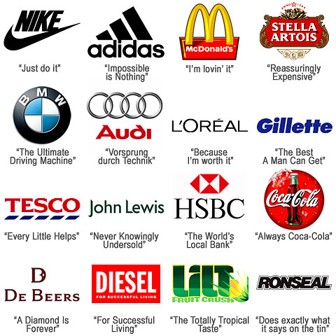
Believe it or not, it is estimated that 47% of consumers believe that a slogan is either very or somewhat important when making a purchasing decision. It would seem like a catchy tagline can influence buyer behavior, generate brand awareness, and increase conversions.
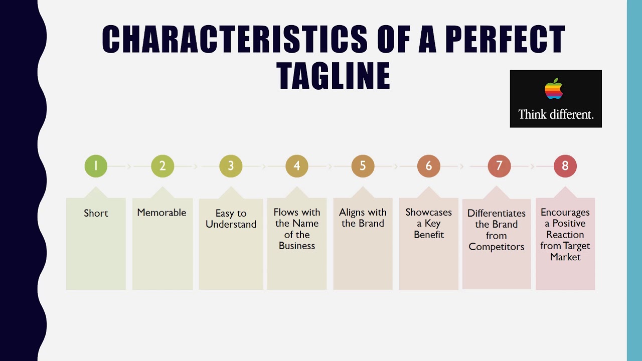
But what exactly makes a tagline successful enough to be remembered by your target audience? Here is our list of top tips to create a catchy slogan for your next marketing campaign.
- Simplicity: A great tagline should be simple and easy to understand. It should communicate the core message clearly without being overly complicated or confusing.
- Memorability: The best taglines are easy to remember, ensuring that consumers can recall them when needed. This can be achieved through rhythmic patterns, alliteration, or clever wordplay.
- Uniqueness: A perfect tagline sets the brand or product apart from its competitors. It should be distinctive and avoid clichés or generic phrases.
- Relevance: The tagline should align with the brand’s identity, values, and positioning. It must reflect the essence of what the brand stands for and what it offers.
- Emotional Appeal: A powerful tagline often taps into emotions, creating a connection with the audience and inspiring action.
- Timelessness: While trends change, a great tagline withstands the test of time. Avoiding references to specific events or fads helps the tagline remain relevant for years to come.
- Conveys Benefits or Promise: A perfect tagline communicates the benefits or promise of the product or service it represents.
- Short and Sweet: Ideally, a tagline should be concise, typically consisting of a few words or a short sentence to increase memorability.
- Versatility: A well-crafted tagline should work across different mediums and marketing campaigns. It should complement logos, slogans, and advertisements.
- Attention-Grabbing: The tagline should capture the audience’s attention and pique their interest to know more about the brand or product.
The toy industry is full to the brim of incredible taglines that are designed to make young children pester their parents for the next must-have craze. Some iconic examples in this sector include:
- Barbie- ‘You can be anything’
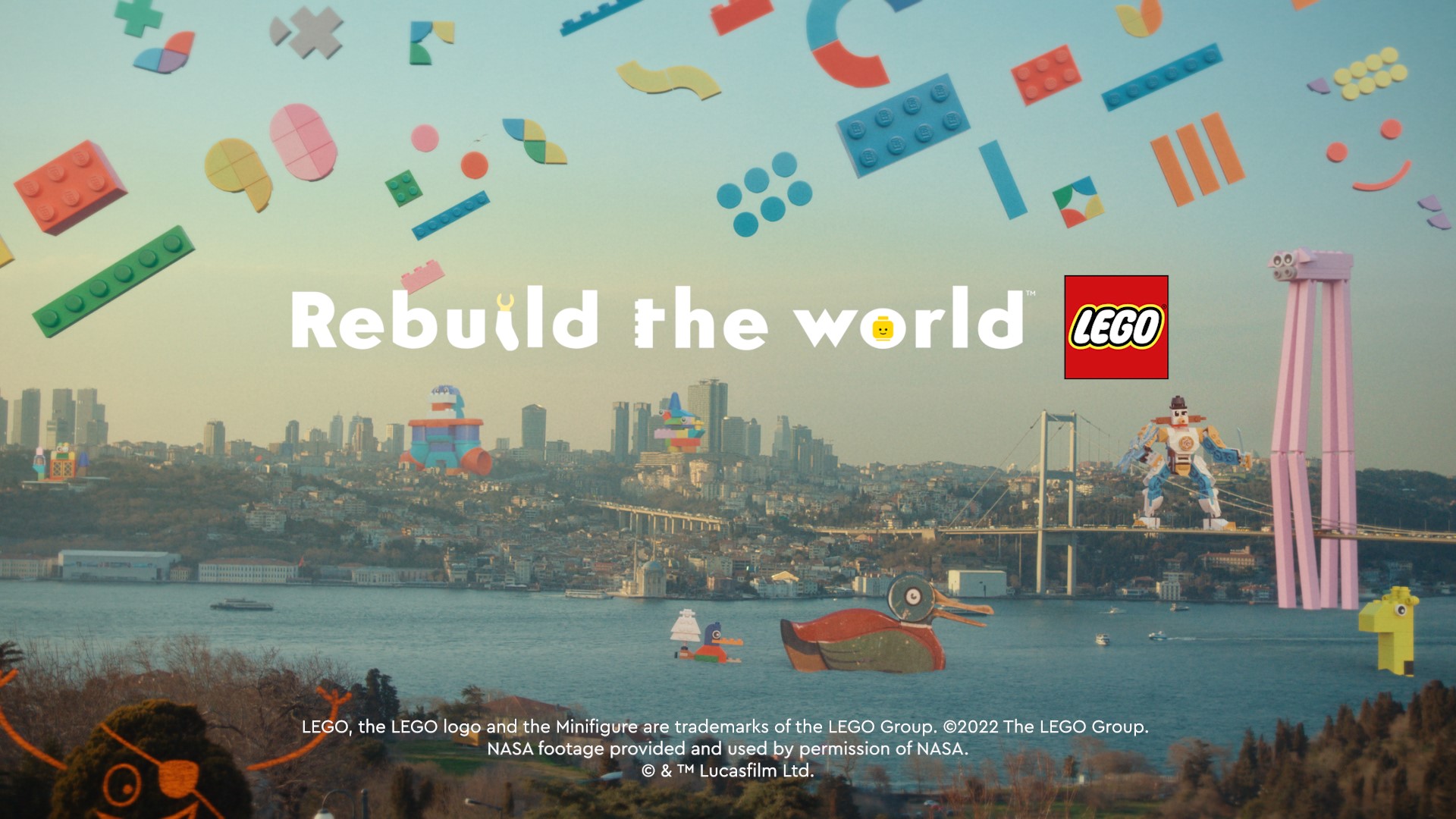
- Lego- ‘Rebuild the world’
- Funko- ‘Everyone is a fan of something’
- Hot Wheels- ‘Go with the winner’
- Pokemon- ‘Gotta catch them all’
- Bratz- ‘The only girls with a passion for fashion’
- Play-doh- ‘Open a can of imagination’
- Transformers- ‘More than meets the eye’
However, we want to examine the slogan of the ultimate manufacturer of foam-based weaponry: Nerf. While the brand has had numerous taglines, the one that has stood the test of time is undeniably ‘Nerf or nothing.’
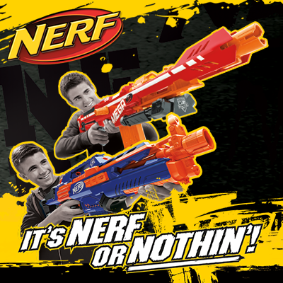
This catchy tagline was first introduced in the 1990s and has been synonymous with the brand ever since. This is a truly exquisite slogan that serves multiple functions:
- The slogan is short and easy to remember, making it highly effective for marketing purposes. It conveys the essence of the brand personality in just three words.
- The phrase has a rhythmic and catchy quality to it, making it more memorable and likely to stick in the minds of consumers.
- The tagline reinforces the idea that Nerf is the go-to brand for action-packed, safe, and fun play, emphasizing that there are no other acceptable alternatives.
- The slogan acts as a call to action, encouraging customer loyalty by telling consumers that choosing anything else but Nerf would be subpar.
- ‘Nerf or Nothing’ clearly communicates the core brand values of Nerf, which are excitement, adventure, and having fun.
- It creates a clear distinction between Nerf products and other toy brands, making it easier for customers to remember and identify the brand.
- The slogan appeals to the adventurous and playful nature of children, and even adults, who enjoy engaging in imaginative play. It taps into the emotions associated with excitement and fun, making the brand more appealing
- The ‘Nerf or Nothing’ slogan has been used by Hasbro for a significant period, contributing to its recognition and longevity in the market. Long-term use of a memorable slogan helps build brand consistency, recognition, and trust among consumers.
4. Company name– Toys’R’Us
A strong brand name is inarguably the most crucial brand element in any marketing strategy. It acts as the first and primary touchpoint for most customers and will automatically become synonymous with your product or service.
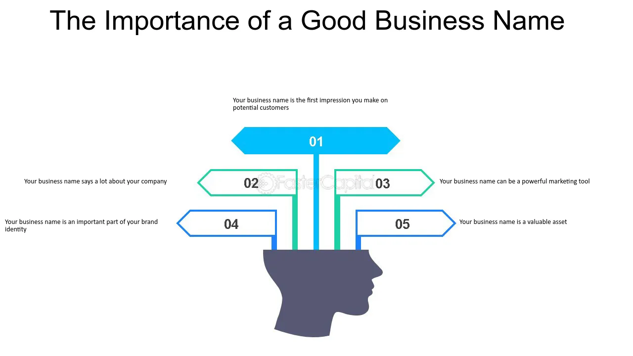
If you are considering rebranding, a new company name should always be your last resort. This drastic change could possibly eradicate any built reputation or trust between your consumer base and brand. In fact, only 18% of consumers would view a name change as a positive change.
However, it is important to note that many popular brands have successfully changed their company name. Below is a table that showcases some of the most prominent companies that have decided to rebrand their name.

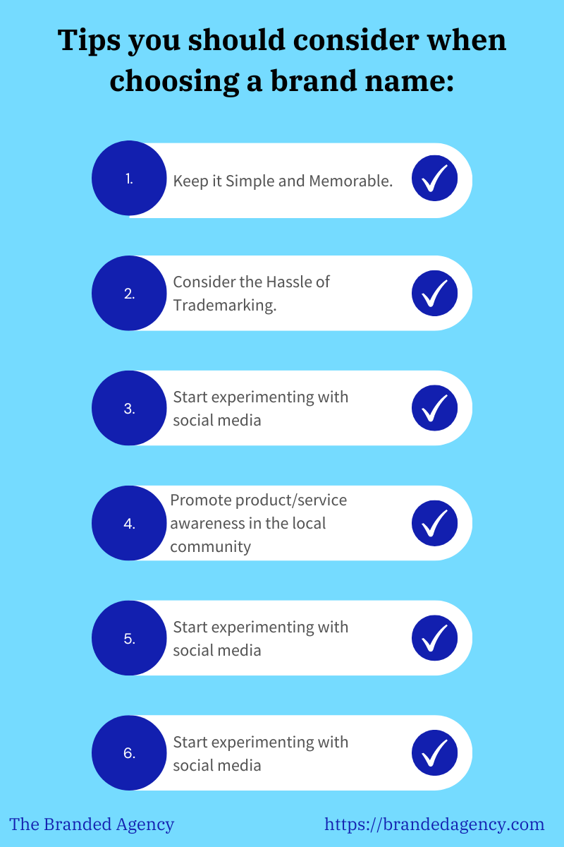
What exactly makes an iconic brand name? Here are our must-know tips for creating a perfect company name:
- Keep the name easy to pronounce and type. Avoid using complex words or spellings that might confuse potential customers.
- Ensure that the name reflects your business’s core values, products, or services. It should give people an idea of what your company is about.
- Consider using catchy phrases, alliteration, or rhymes to make it more memorable.
- Stand out from the competition by choosing a name that is distinct and not easily confused with other brands.
- Avoid selecting a name that is too narrow-focused, as it may hinder your company’s growth or expansion in the future.
- Ensure the name has positive or neutral connotations in your target market and language.
- Before finalizing the name, test it with a focus group or potential customers to gather feedback and see how they react to it.
- Check for trademark availability to avoid any legal issues down the line. It is also important to make sure that the name you want is available as a website domain.
- While it might be tempting to use trendy words or phrases, they can quickly become outdated. Instead, opt for a timeless name that won’t go out of style.
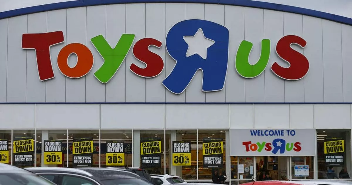
This brand is a true masterclass in naming conventions, as it harnesses the following techniques:
- Memorable: The brand name is simple, catchy, and easy to remember making it more likely that customers will recall it when looking for a toy store or considering a purchase.
- Unique: The use of “R” instead of “are” adds a playful and child-friendly touch, making it appealing to both kids and parents.
- Association: The name immediately conveys the purpose and focus of the company to potential customers, which is to sell toys.
- Emotion: The brand evokes emotions of joy, nostalgia, and excitement associated with childhood and play.
The tip of the branding iceberg
In this blog, we have examined four crucial branding assets that are sure to boost recognition, recall, and conversions. However, it is important to note that this is the mere tip of the iceberg, and there are countless other elements to consider within a brand strategy, including:
- Jingle
- User experience
- Marketing materials, including: business cards, advertisements, and brochures
- Digital marketing
- Tone of voice
- Logo
- Graphic design and format
- Mascots
Our advice is to take some time to optimize each individual element within your company to ensure that you remain relevant and memorable to your target audience.

