Are you considering rebranding your business? Or maybe you’re just interested in the impact a new brand can have on a company. Either way, looking at past case studies, both good and bad, is fascinating.
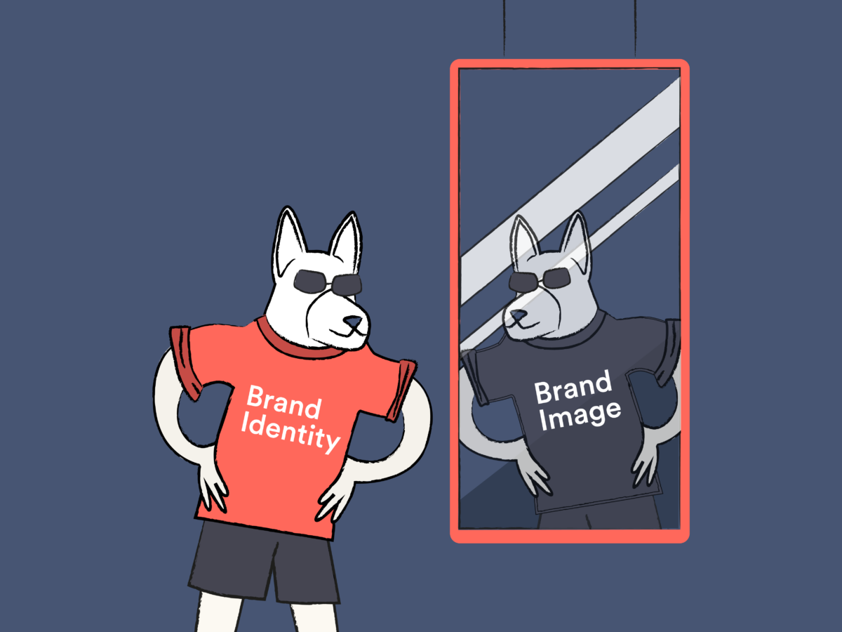
In our divisive world fuelled by social media and cancel culture, getting your message across correctly is essential. In the age of visual content, brand identity plays a huge role in conveying your mission to the right audience.
But what if it goes wrong? Or what if people lose interest? This is when companies begin to consider a rebranding strategy. This can involve a new logo, a redesign, a name change, and even new typography. Anything that can help reboot their visual identity. We’re going to be exploring 5 case studies and deciding whether they were a rebranding success or a damaging flop.
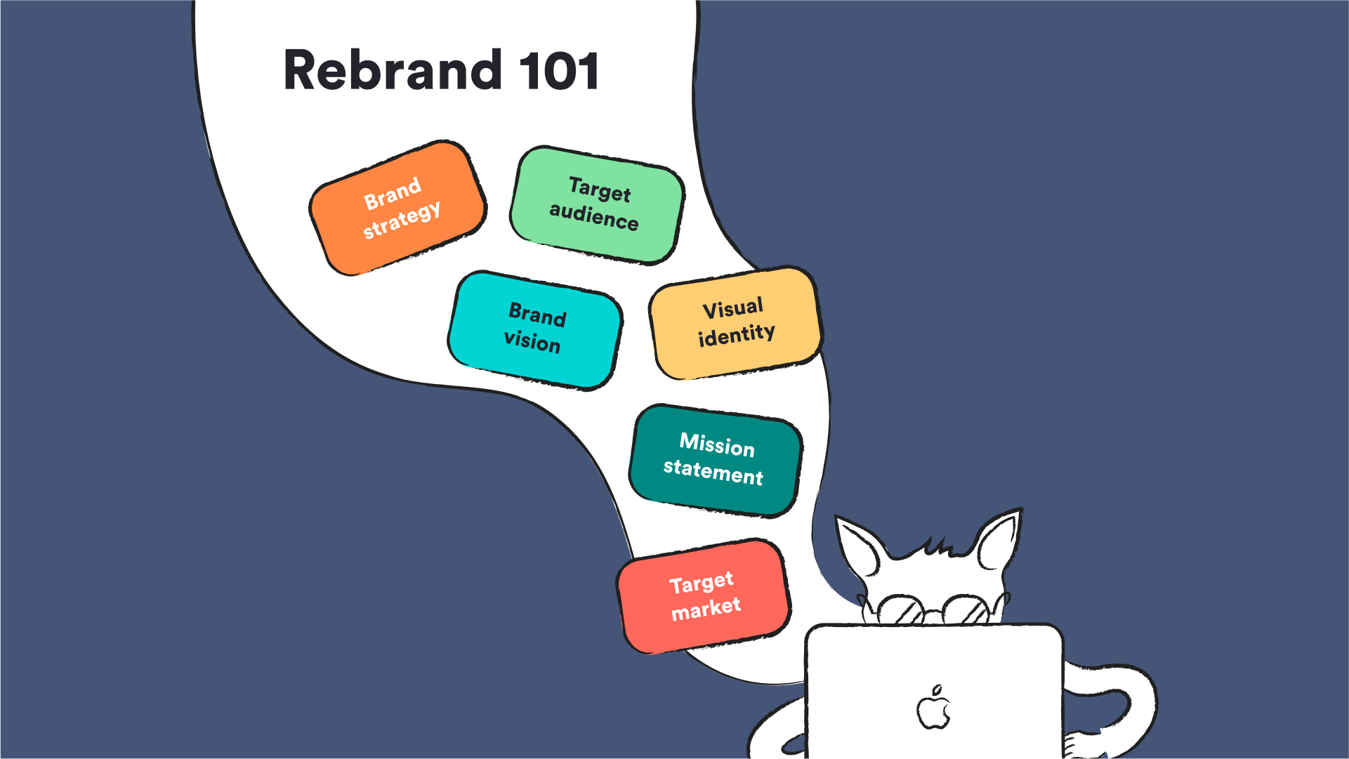
5 Rebranding case studies
We’ve chosen the following case studies for various reasons. Some rebranded with the goal of staying up-to-date; others tried to cover up past mistakes. And a few made a concerted effort to claw back into the industry.
Let’s have a look at where things went right or where they went terribly wrong.
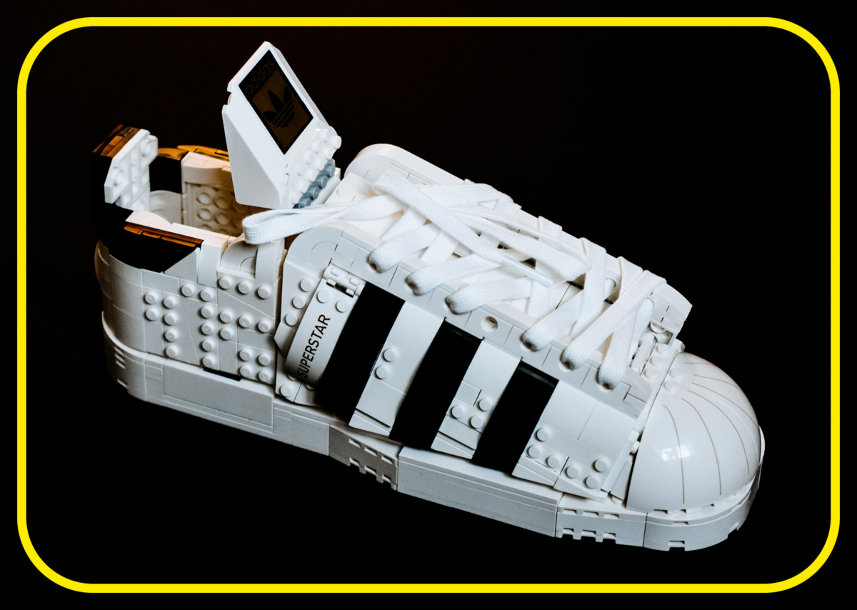
1. Lego
In 2003, Lego was $800 million in debt and facing bankruptcy. Hard to believe, right? They seem like such an iconic toy – a quintessential part of the majority of our childhoods.
Despite having maintained a strong brand identity since 1932, things started to slip in the late 1990s and early 2000s. The turn of the 21st century saw a rise in electronics, and it seemed as though people would potentially turn away from regular, physical toys in favor of their shinier, more interactive counterparts.
For a time, Lego managed to mitigate this issue by licensing intellectual property – a genius marketing move that started in 1999 in collaboration with Star Wars in preparation for The Phantom Menace. However, their expansion into physical theme parks across the world, overproduction of bricks, and general mismanagement of marketing strategies served to dilute their lovable branding to a nearly irredeemable degree.
So, what changed?
Lego was in the unfortunate position where they had to walk a fine line between staying true to their older, authentic selves and modernizing for a new age. Deals with blockbuster films that led to the release of new brick sets and games (Lego Star Wars in 2005) certainly helped keep things afloat for a while, but more had to be done at the core of the company.
The CEO at that time, Jørgen Vig Knudstorp, began dramatic changes. This included:
- Cutting jobs
- Reducing expenditures
- Moving production to developing countries
- Selling Legoland theme parks
- Paying closer attention to older Lego fans, as well as conducting research into the likes and dislikes of a new generation of children
- Bringing focus back to what made Lego unique and iconic in the first place
And it worked. Within only a few years, Lego was starting to see a major increase in profits, brand deals, and overall consumer satisfaction. Now, with a plethora of games, films (including four theatrical releases), and a current market share of 7.6%, they are the largest toy brand in the world.
Our verdict? Yes, a very successful rebranding, indeed.
2. BP oil
This is an incredibly controversial rebranding case study due to the devastating events surrounding it.
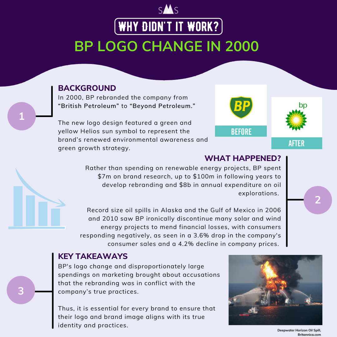
In 2001, following widespread public criticism of their safety standards, BP spent over $200 million on a rebrand, which not only included a new logo, but also a new name. British Petroleum became Beyond Petroleum.
The premise was clear. BP seemed to be heading in a direction away from fossil fuels and towards greener, more sustainable energy. But it was a promise they were never able to fully keep.
In 2006, 200,000 gallons of oil spilt from a BP pipeline in Alaska.
In 2009, they sold their wind farms in India.
Then, in April 2010, the oil rig Deepwater Horizon, drilling in the Gulf of Mexico, suffered a devastating blowout. This explosion claimed the lives of 11 crew members and caused the largest marine oil spill in history.
The rig, although owned by Transocean, was operated by BP. Due to the extreme negligence and lack of safety compliance, BP were made to pay a total of $65 billion towards the Clean Water Act (CWA), in fines and penalties, and in compensation towards the families of those who lost their lives.
Facing severe financial pressure, BP even sold their solar panels in 2011.
Now they are undergoing another rebranding, hoping to develop a new identity that sets them apart from their past. By 2030, they aim to have invested up to $60 billion in renewable energy, and have already increased their production of renewable energy sources such as offshore wind farms and biofuels.
Ultimately, only time will tell if they can actually turn things around and make good on their word. For now, our verdict is that this was a majorly unsuccessful branding case study.
3. Oatly
Oatly’s story is significantly more positive. Their revamp shows that even small brands can make it big with the right ingenuity.
Oatly is a Swedish company owned by Rickard and Bjorn Oeste, who made the first ever oat milk in the early 1990s. Due to the size of the company and limited availability of budget, it took some creative thinking to start gathering more attention.
In the early 2010s, under the guidance of their new CEO, Toni Petersson, Oatly changed their packaging design to something bold, instantly recognizable, and far more in keeping with their brand values. They adopted a more informal, chatty tone and incorporated this wittiness into their products. Every side of the milk cartons had something engaging or interesting to read about and used accessible jargon to make sure everyone was included. Even their name on the packaging, ‘Oatly!’, seemed exuberant and full of energy.
This coincided with efforts to push for greater sustainability, which led to a huge increase in brand awareness, giving them global recognition.
So, is it a successful rebranding? We’d definitely say so.
4. PayPal
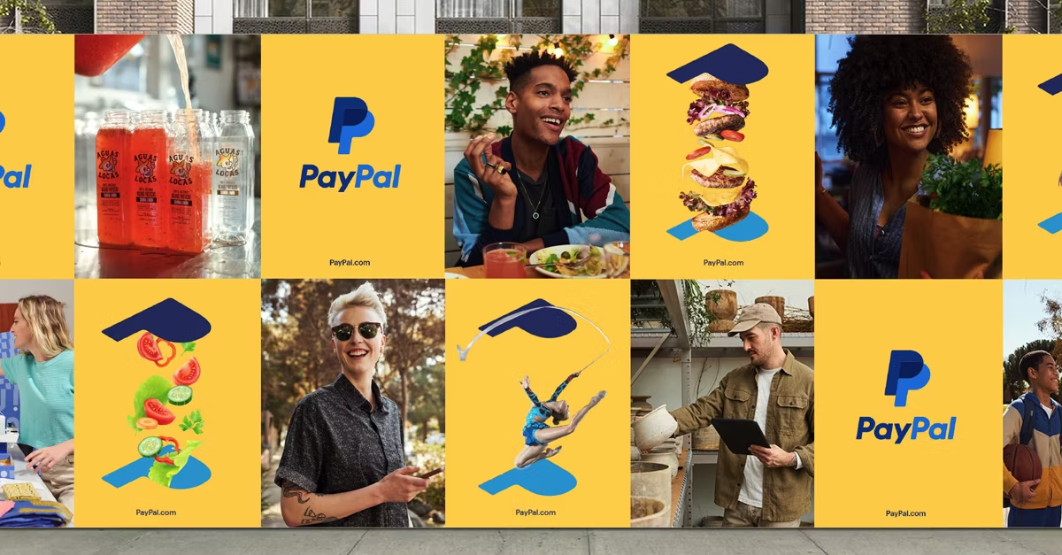
PayPal is an example of an already successful brand looking to redesign themselves for a modern audience. They partnered with the design studio Gretel to achieve these results.
The rebranding process started with an update to the old logo. The simple two-tone ‘P’ was simplified even further, becoming just a silhouette. The shades of blue were separated more, shadowing one another more clearly. A splash of vibrant gold was added to many of the backgrounds as a nice contrast and to build a sense of ‘delight’, as Gretel puts it.
Then the marketing campaigns and updated advertisements added a greater sense of diversity – something which PayPal has begun to strive for a lot more with their “people first” approach. This article notes that PayPal’s logo now even adheres to the standards set by the ADA (Americans with Disabilities Act) accessible design, which could potentially open their branding up for even more customers.
However, despite their best efforts, PayPal’s stock price has continued to steadily drop. Despite doing exceptionally well during the Covid-19 pandemic, this growth just hasn’t continued since.
Now they’re pushing for greater integration of renewable energy, striving to go completely green in terms of powering their data centers by the end of 2023.
Were they successful in their rebrand? We’d give it a solid ‘meh’. The designs are nice, visually appealing, and more inclusive, but it didn’t promote any real revenue growth or actionable change.
Better luck next time?
5. Mailchimp
Mailchimp started out within the niche of email marketing. However, after multiple customer surveys, they realized they could break out of this pigeonhole and offer more to their clients. To do this, they needed a rebrand.
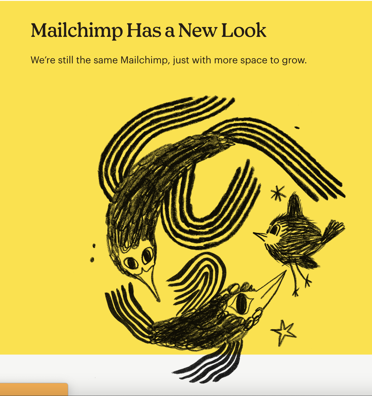
Another one of Mailchimp’s issues was the irregularity between their logo and their mascot. They knew they needed to refresh the brand identity, so they decided to kill two birds with one stone in a complete revamp.
However, they didn’t part with their fun and quirky brand personality. Instead, they leaned into it more. This is because the business developed a great relationship with its customers over the years, so to remain loyal and accessible to them, they kept the heart of the brand. Including the mascot, Freddie. This was also clear in their new typeface of Cooper Light and their color palette of bright yellow. Everything about the rebrand screamed fun, excitable, and accessible.
The new logo, whilst remaining true to the mascot, felt more authoritative and professional. The simplicity of the design and the jet black against the yellow, along with the bold typeface, meant it was also attractive to new customers.
Ultimately, this revamp allowed Mailchimp to offer more products, solutions, and services. It saw them break through the constraints of email communication and access the wider industry of general marketing.
We give two thumbs up. A successful branding campaign all around!
Time for a makeover
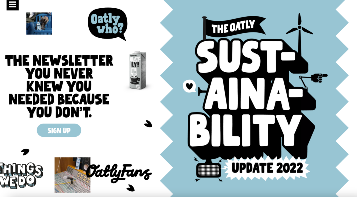
The success of your rebrand has a lot to do with the digital marketing campaign that goes alongside it. Even Oatly made use of this to a certain degree, with their wacky, left-right scrolling on their website rather than the conventional up-down we’re all used to. It definitely serves to set them apart!
If you want your product to stick in your consumers’ minds, you need to find clever ways to be unique, especially if you’re a small startup company. It’s okay to change your brand strategy over time – in fact, it’s very much encouraged! You can’t expect one thing to work forever, as nice as that would be. Even Lego had to change it up eventually.
But don’t worry, there’s always going to be someone there to help. Whether you take on the challenge yourself with a dedicated team or decide to enlist the help of a branding agency to put you back on the right track, a rebrand will help freshen up stagnant areas and brush off the dust.