Brand briefs aren’t company underpants. Sorry to disappoint. These are the kinda briefs you want the world to see. They shout about your vision, brand values, and how you’ll make it all happen along the way. Plus, they’re super important to give employees direction and a sense of purpose.
Thing is, lots of small businesses or one-person marketing teams don’t bother with them. Because creating one takes up time they just don’t have. But they’re essential for maintaining brand consistency if you plan to scale or partner up one day.
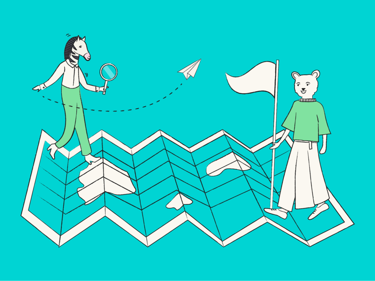
So, don’t bother copying boring brief templates. Use these 10 brand brief examples for inspiration. Then bust out some creative goodness that’ll engage and excite your target audience.
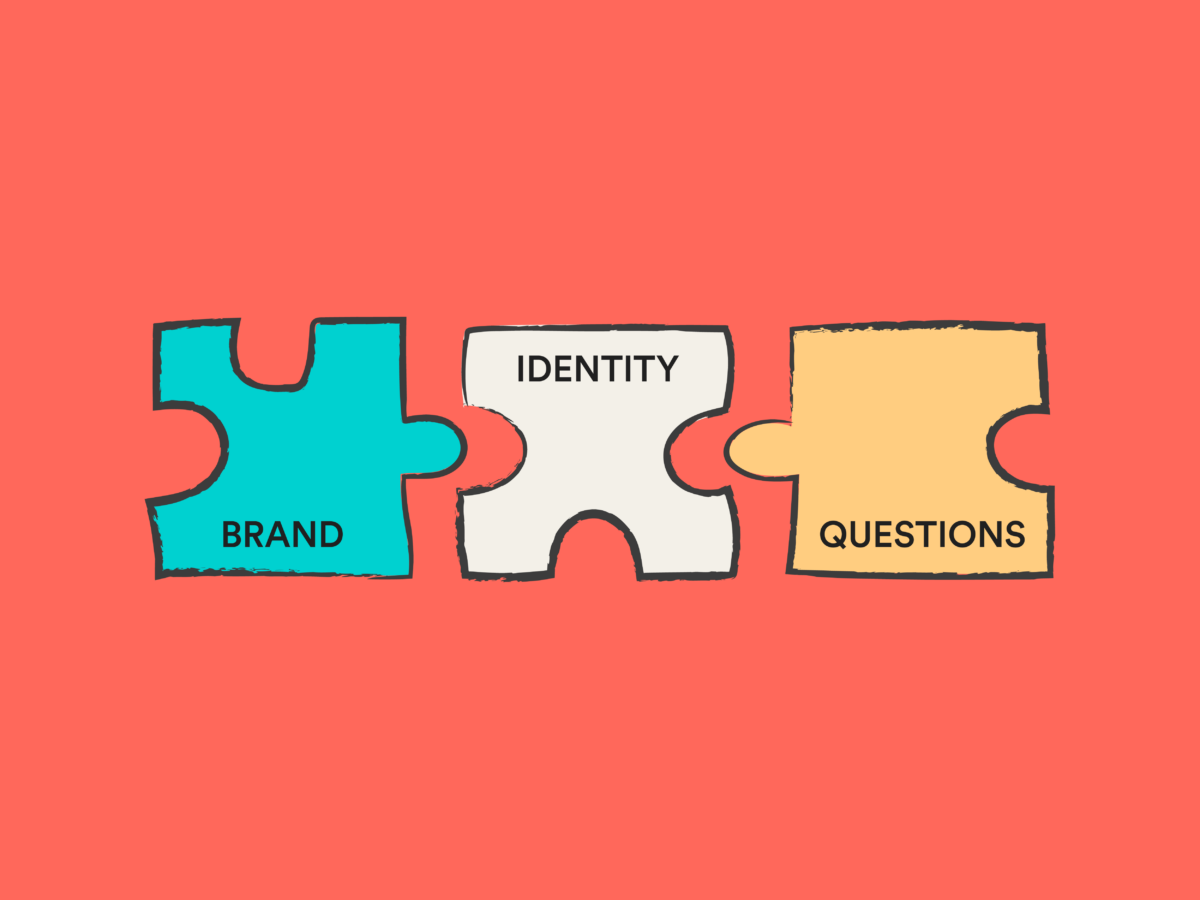
Brand brief vs. creative brief
Your brand brief is your whole strategy. It outlines your:
- Brand story
- Mission statement
- Core values
- Business goals
- And much more
It can also be referred to as your brand guidelines or brand book. You can even use yours as a design brief for your whole business. Either way, it’s long.
A creative brief is much shorter—think one or two pages. These cover your brand strategy for specific projects. If you have an in-house design team, they may create these themselves. But if you outsource to a design agency, you’ll need to make one for them.
Here’s a creative brief template, so you have an idea of what one looks like:
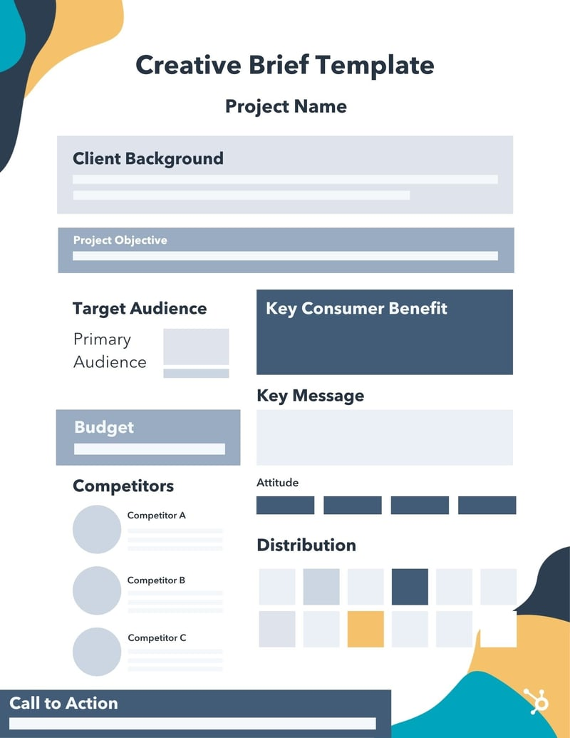
They’re essential for project management. And they help make sure any creative team is sticking to your brand design and general vibe. It’ll also cover the deliverables you’re expecting. For example:
- The creative project’s target market
- Brand voice for copy
- Key competitors to keep in mind
- Brand messaging to hit
- Marketing strategy objective (e.g. increase social media engagement on Twitter)
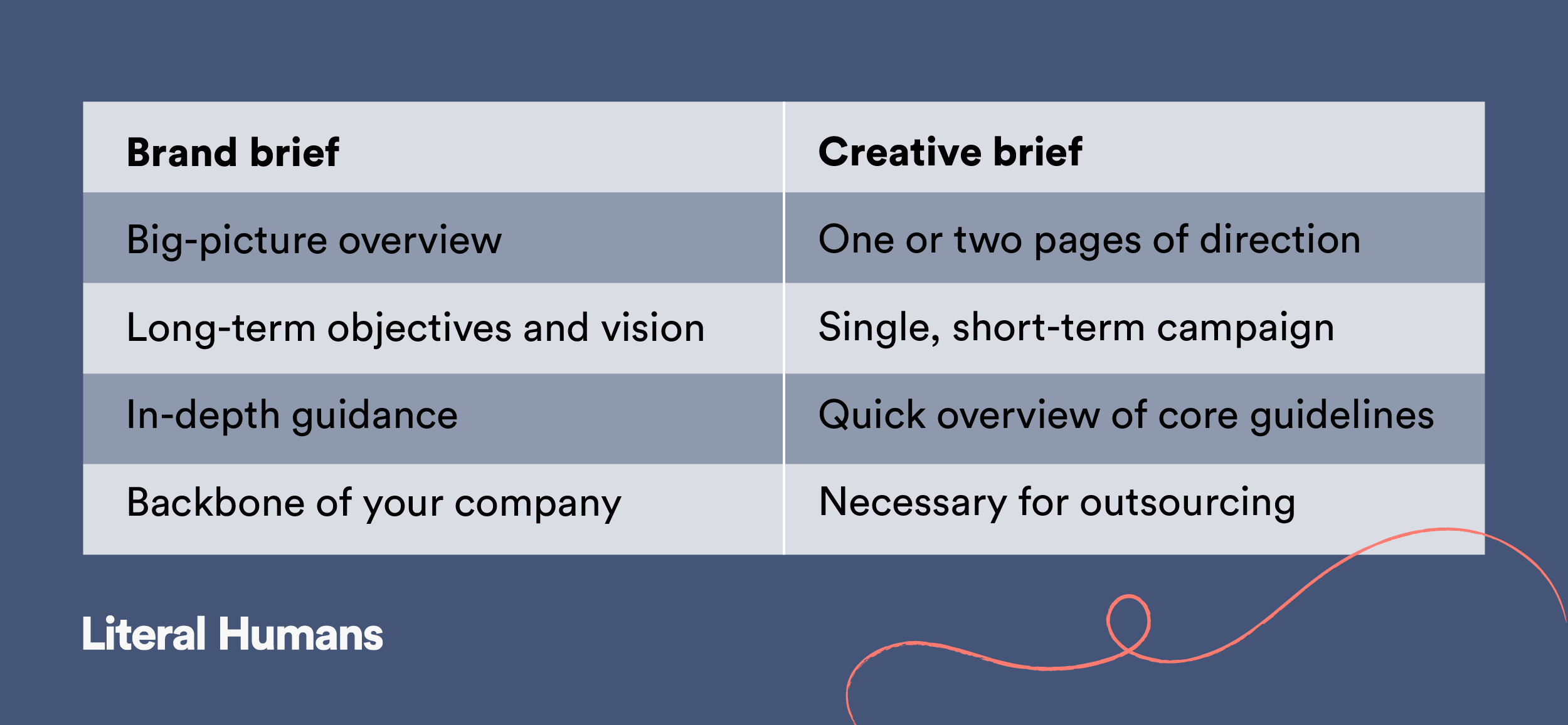
You’ll hit most of these points in your brand brief too—but in a lot more detail. Here are the main differences between them:
Now, let’s look at 10 successful brand examples to help inspire yourself. And give you a competitive advantage.
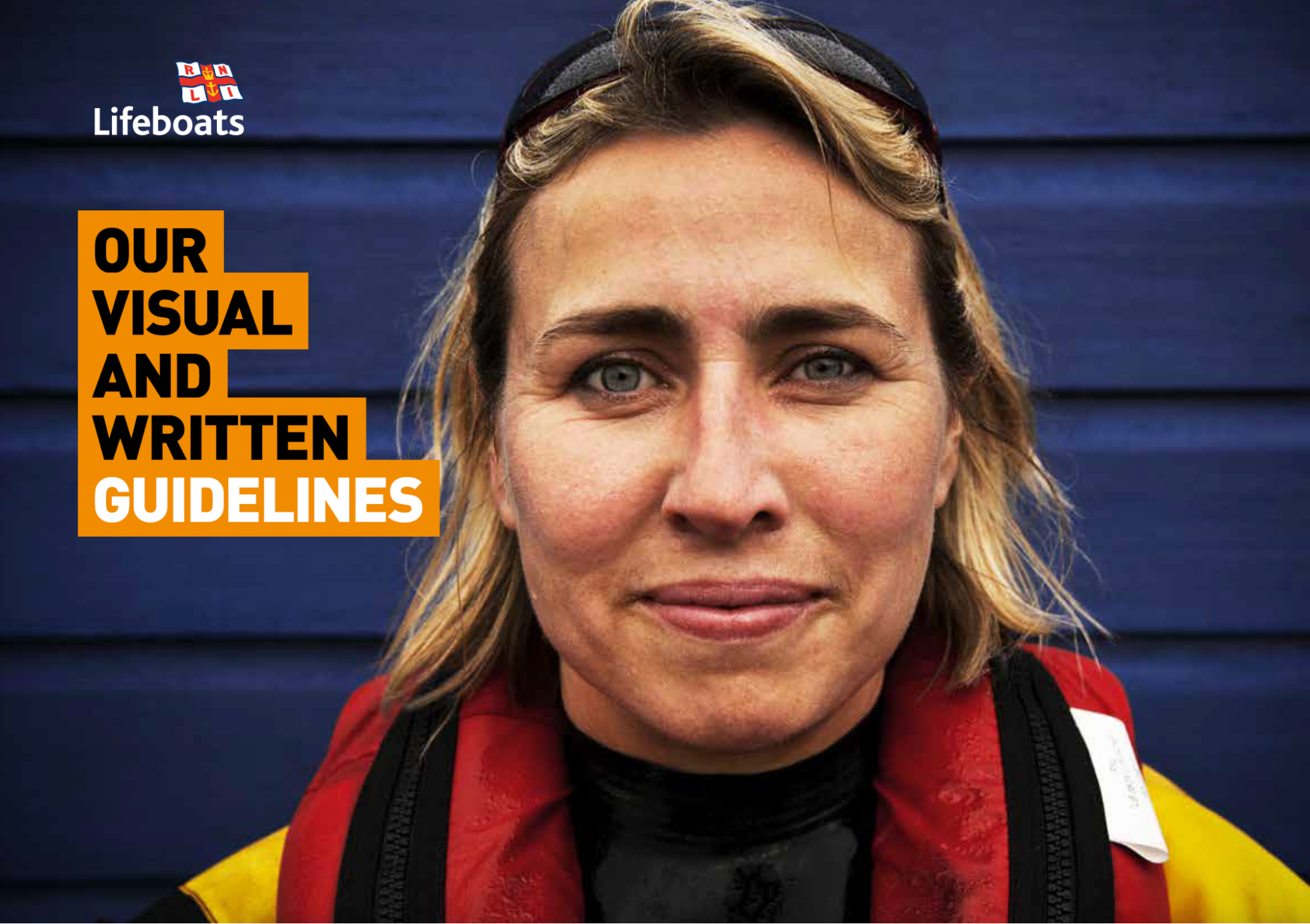
RNLI: Raising target audience awareness through tone
The RNLI (Royal National Lifeboat Institution) is a UK charity that saves lives at sea. They use really distinctive photography but keep their other design elements simple to focus on their voice.
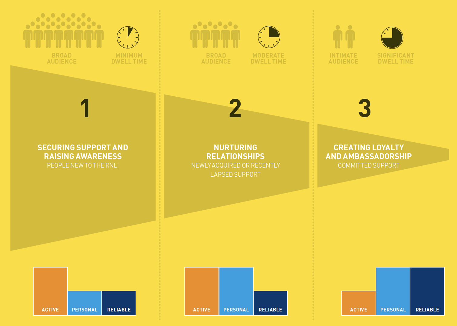
They break their brand personality down into three words:
- Active
- Personal
- Reliable
These can be toned up or down, depending on the marketing campaign or design project. But must always be present. According to the RNLI:
“We can reflect this tone in the photographs we use too: the active nature of rescue images, the personal connection created when using bold portraits, or the reliability of lifeguards and lifeboat crew.”
They go into great detail about how to write in an active, personal, and reliable way. This includes things like:
- Keeping sentences short and agile
- Avoiding formal, slang, or trend language
- Talking about people where possible
- Using diverse language
- Sticking to RNLI house style (correct capitalization, punctuation, and use of numbers)
As a charity, there are also mandatory inclusions for any design brief template—like adding the registered charity number to all written documents. Plus, a permission and privacy statement wherever there’s data capture.
There’s also focus on the more obvious elements you’d expect—like typography. Because an active tone can be carried by your choice of font for your headings or taglines too.
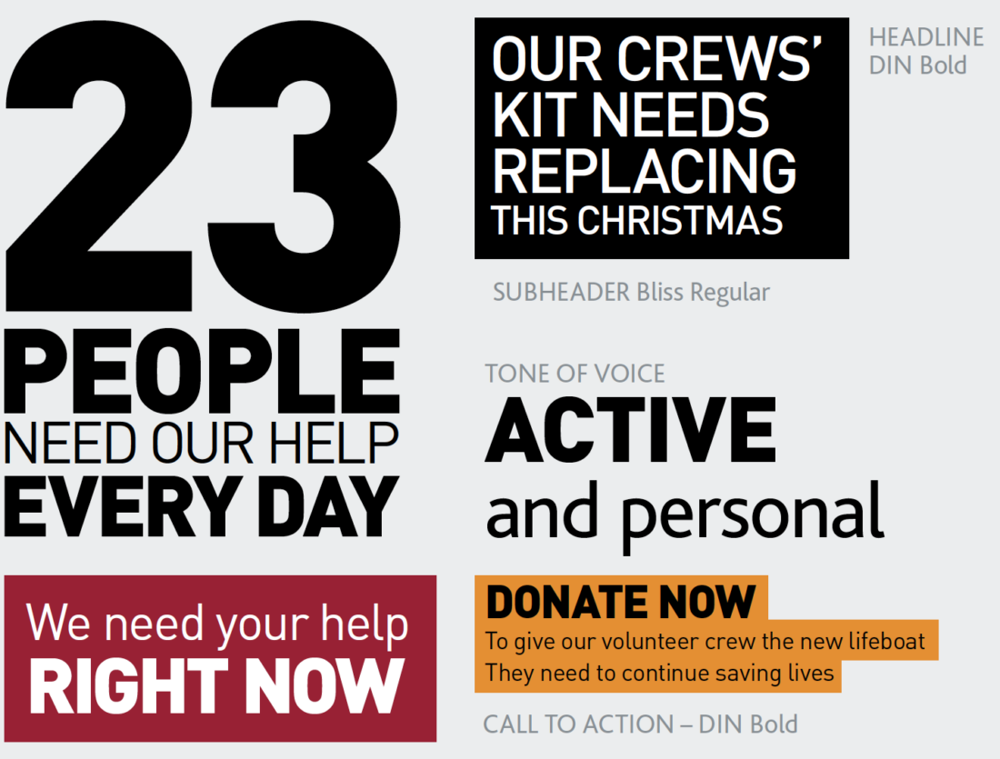
The RNLI has one of the most recognizable brands in the UK. And they need it to be. As a nonprofit, they have to get their value proposition across with strong marketing and keep top of mind for the public. Otherwise, there’s no funding to continue their mission.
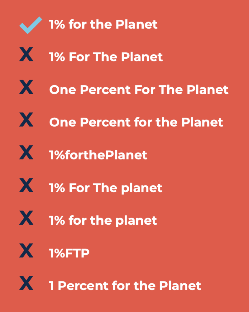
1% for the Planet: Make it easy to be consistent
1% for the Planet has a clear brand promise: “To inspire commitment and action so that our planet and future generations thrive.” That’s a big goal. But their brief starts simply—how to get their name right.
One of their first graphics covers the correct:
- Capitalization
- Numbering
- Spacing
- Symbols
- Use of acronyms (big no-no)
Then onto the logo. This graphic design should be pretty simple to reproduce. No one’s going to mess that up, right? Don’t be so sure.
1% for the Planet’s brand brief doesn’t leave anything to chance. It covers everything from:
- The two elements making up their primary logo design
- Stakeholder variations
- One-color and additional versions
- Size and space specifications
- Common mistakes
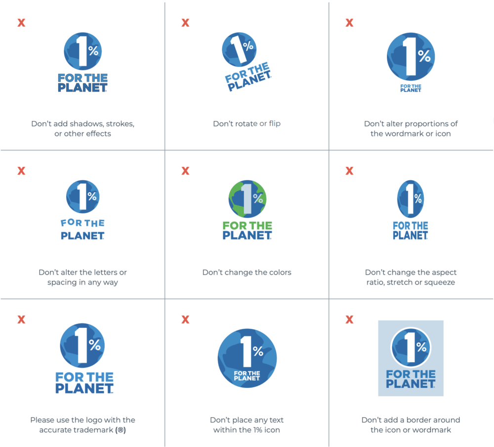
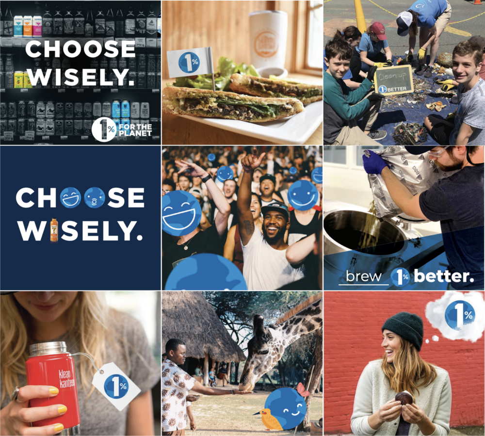
Then it’s onto typography, imagery, and campaigns. Tell people how to use them. Why you’ve chosen that specific way.
Don’t take anything for granted when it comes to your creative assets. You need to protect them to make sure your branding process is seamless.
So, spell out how to use your name, imagery, and integrations properly and become a consistent company that looks professional and trustworthy. No matter how small you are.
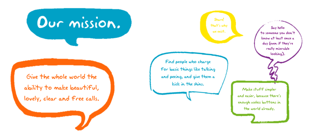
Skype: A brand identity that makes tech accessible
You’ve probably heard of Skype. But do you know how to use it?
Their brand book is titled: “The world according to Skype.” And straight away, the heading makes it feel like it’s going to be accessible for all demographics.
The whole brief is full of light-hearted cartoons and conversations—even the font is pretty childlike. And their opening mission statement is the perfect way to introduce their down-to-earth (sometimes cheeky) tone of voice.
It’s a 63-page document that covers all things Skype, like:
- Words they like/don’t like
- Design and color guidelines
- Using photography and illustration
- Giving their users a voice
- “The end bit”
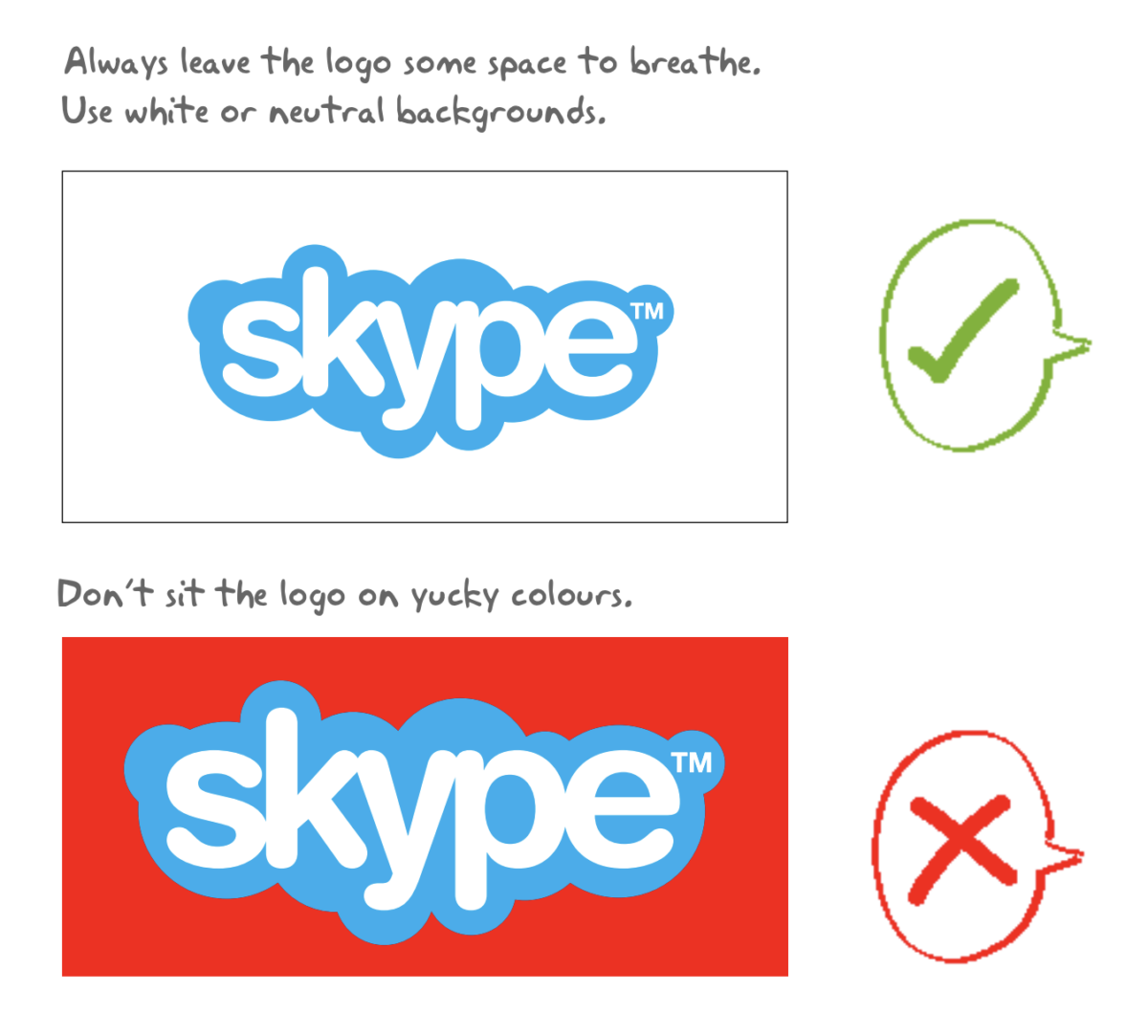
All parts of the brief use their friendly tone. For example, their logo specifications include the phrase, “Don’t sit the logo on yucky colors.”
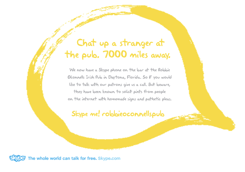
Skype is all about people. They make this clear throughout. So, one of their main marketing strategies is to use real stories from their users—retelling them in their signature speech bubbles.
Skype’s brief template shows you can make something as (potentially) nerve-wracking as video conferencing accessible to all. Their choice of branding and voice makes you feel instantly at ease.
If you’re in a complex industry, try to think how you can do the same. Breaking things down and being casual doesn’t make you look any less smart or professional. In fact, being able to make anyone understand your mission makes it clear how much of an expert you are.
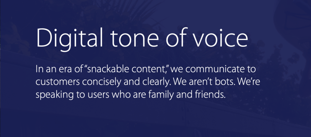
Hulu: Big, bold brand brief template
If you thought Skype’s brand book was long, here comes Hulu’s Big Green Guide. You’re instantly smacked in the face by their bold text and signature green. And that sets the tone for the next 138 pages.
This is probably my favorite of the bunch because the font and color scheme feels so modern. It’s so simple, but it never gets boring. They’ve considered everything here:
- Design principles and toolkit: Down to the nitty gritty
- Product design: Creating clear navigation, letting the “copy sing”, using color purposefully
- Motion toolkit: Making sure everything that moves moves “on brand”
- Tone of voice: They’ve got a few different types
- Campaigns: How the branding should look in the wild
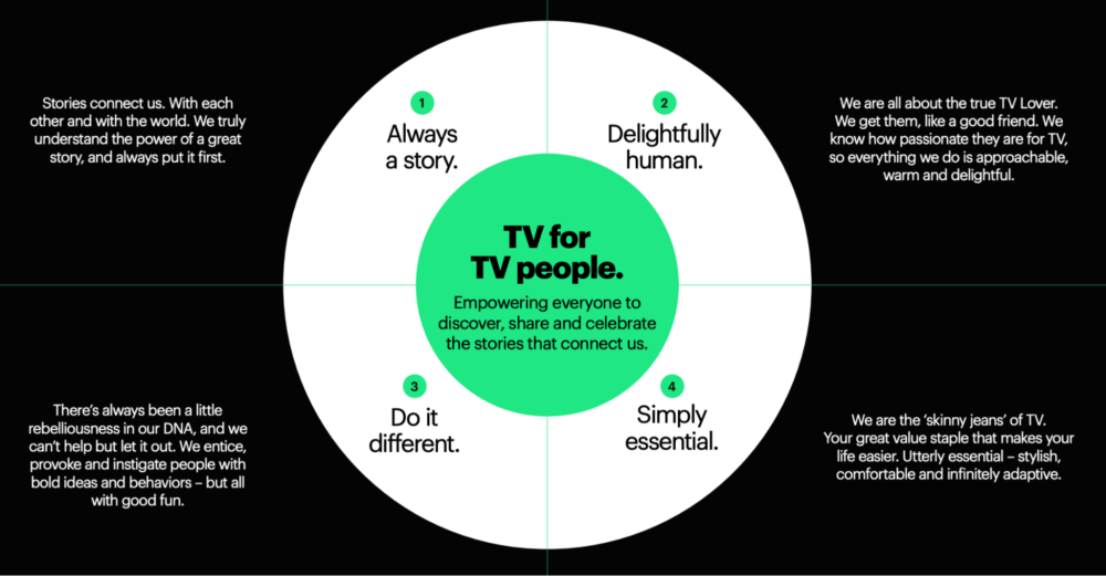
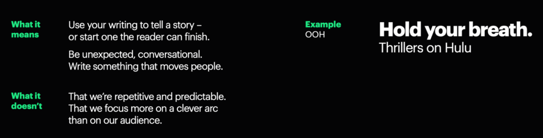
There are four types of brand voice styles Hulu use:
- Always a story: Conversational, emotional, unexpected
- Delightfully human: Intelligent, empathetic, inclusive
- Do it different: Confident, optimistic, witty
- Simply essential: Bold, energized, clear
Each style has an in-depth description of what it means and what it doesn’t. Plus, examples throughout that illustrate each point. So there won’t be any confusion.
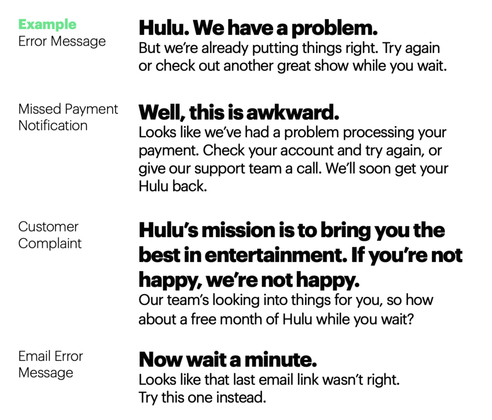
Even their error messages follow the same conversational copy style and typography.
Hulu knows who they are. And they’re proud of the service they provide. Their design process is so in-depth, but it doesn’t feel like a drag because their tone bounces you through.
Big doesn’t have to be boring. If you have a lot to cover, you’ll have to work harder at making it engaging. But Hulu show it’s more than possible.
Visa: Show how tech can be human-centric
Visa want to put their users in control. So, their brand brief focuses on how vendors and partners can provide a customer-centric user experience (UX).
Visa’s UX principles are broken down into four main categories:
- Fast: Don’t overcomplicate
- Authentic: Be more human, less machine-like
- Iconic: Don’t let them forget you
- Smart: Always stay two steps ahead
Unlike some of the other briefs on this list, their tone of voice section is condensed to a few short sentences (the informal copy style is clearly catching on).
Visa are a digital company, but they focus on a surprising sensory element too:
- Seeing in motion (animation)
- Sound
- Touch (haptics)
So, what is haptics? Well, whenever you pay via smartphone or watch, you’ll feel a vibration. This is timed to match the animation and sound to form a seamless sensory experience.
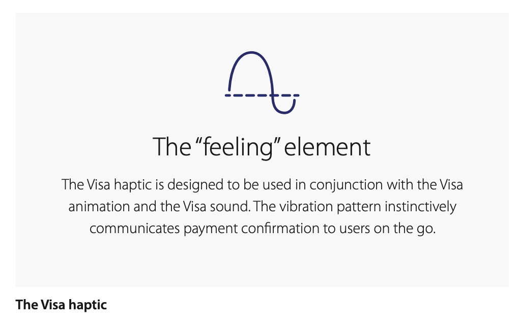
It’s meant to give consumers confidence in the process. When you feel, see, and hear that combination you know the payment has been successful. It’s also less than a second long. So it feels fast and secure.
This extra element Visa have included in their brand brief elevates them. Which sensory elements could you add to your product or service? And how could you display that in your brief?
Try to think outside the box and create an experience that few others are. That’s how you add an extra dimension to your process and surprise people.
Honda: Make it complex, not complicated
Honda’s ‘Book of Dreams’ is nothing like any of the other brand briefs on this list. It was actually a creative brief that became a brand book. The deliverables for the creative team were these:
- Make people notice the existing brand
- Create advertising which makes people think of Honda when they think about buying a new car
- Turn the brand into a business asset and make Honda a company that people care about
- Launch three new cars
- Use the tagline ‘The Power of Dreams’
The team realized they needed to be distinctive—to come up with creative ideas that would break through the noise. Something multidimensional that could make it appeal to different people in different ways. So, The Book of Dreams was born.
There are no logo sizing details or color palettes in sight here. There’s no structure or single style. It’s a big, beautiful mess of ideas, quotes, doodles, and more. It’s almost hard to put into words because you’re meant to have your own personal reaction.
I don’t want to tell you how to feel here. Or what any of the graphics are meant to represent. That’s up to you to decide. Dreams are personal. And that’s the whole point of the book.
The Book of Dreams isn’t full of branding project (or even rebranding) specifics. In fact, there are barely any mentions of Honda throughout. But that’s what makes it so great.
It brings humanity into advertising because it’s complex. It’s chaotic. Just like people. Just like us.
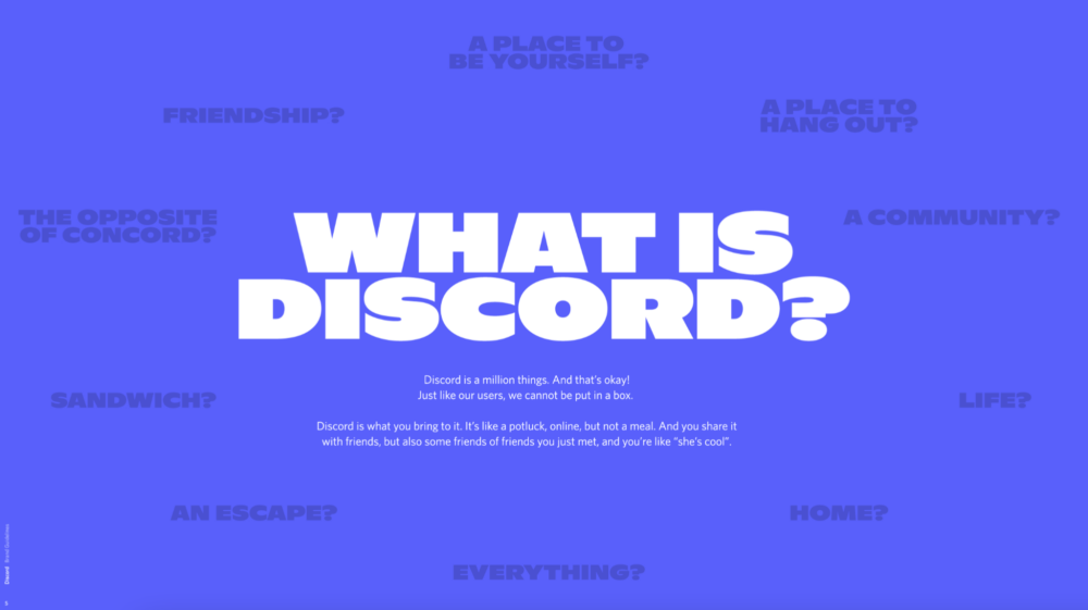
Discord: Use your brand brief to differentiate
“Discord is a million things.” That’s their brand brief summarized in a single line. Their main marketing tagline? “Imagine a place”. Because Discord can be anything you want it to be.
It’s meant to be inclusive—a welcoming environment with a place and a conversation for everyone to belong.
Discord sticks to a concise, conversational tone. But sometimes they throw in something that doesn’t seem to fit their usual style.
“At any given point, discussions range from whether a hotdog is a sandwich, which Pokémon would be the most likely to work at the DMV, whether or not mentos are a real thing, if eating plain toast is a sign of being genius, to regular old homework chat, streaming gameplay and long convos over movies and wholesome talks just about everything.”
Discord’s voice is a little whimsical at times. It doesn’t quite fit into any box. But that’s what they want. So, even when they break their usual style, it still fits.
Their four main brand values fit this image too:
- Playful
- Original
- Relatable
- Reliable
And they split their messaging into three tiers:
- “That Discord feeling”
- Community belonging
- Product value
The brief details everything you’d expect—colors, logo use, and typography. But because of the bold lettering and vibrant colors, it keeps the reader interested.
It’s not messy, either. Every page is structured the same, so it’s really aesthetically pleasing. Text description on the left. Graphics and examples on the right.
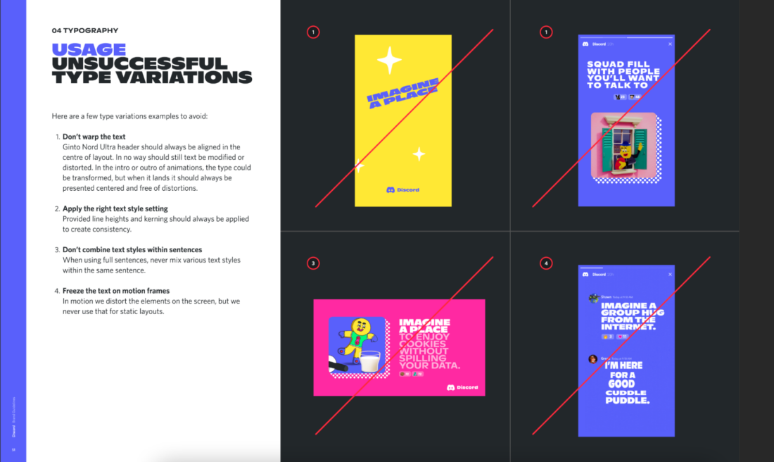
They even show you how their branding works in a physical setting—not just digital marketing campaigns. So, you get a real feel for how the brand looks in every location.
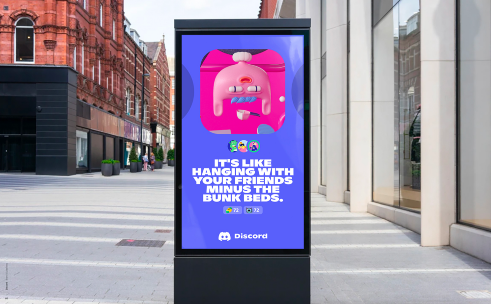
Discord has managed to differentiate themselves from other chat apps like Slack and Teams by creating a unique brand personality. Pairing that with their quirky designs and bold colors, it manages to feel modern and nostalgic at the same time.
Barbican: Giving a venue its own brand identity
The Barbican Center is an iconic performing-arts venue in London that rebranded back in 2013. The creative brief was to show the venue wasn’t just a “shell for individual art forms”. But something that deserved its own identity.
The new brand needed to:
- Unite all arts under it with one single visual communication (rather than the previously fractured versions)
- Be flexible enough to appear online on any platform (instead of the print-only one that couldn’t scale)
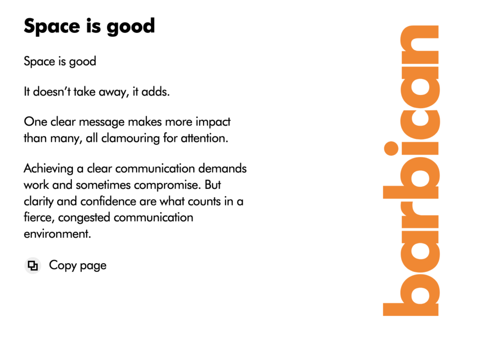
And boy, did they deliver. The result is bold, strong branding that you just can’t ignore. It’s simple and clean with no clutter distracting you.
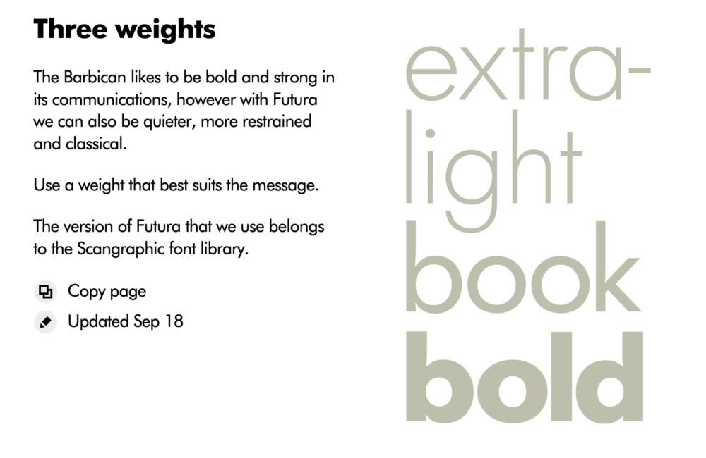
They stick to one font that is the brand’s core, Futura. You see it everywhere. But different weights allow the strength of each message to be altered. It stays on-brand but means every bit of text isn’t too loud and in your face when it doesn’t need to be.
They use these bright overlapping shapes as their “carrier” to create a “fresh new visual language”. This helps anyone to instantly recognize the brand—which is now just as well known as the venue.

The whole brief follows this logic too. One font, simple colors, and lots of negative space to focus your attention on the detail.
The Barbican Center’s brand brief is pretty much the opposite of Honda’s. Rather than letting the reader make their own mind up, they tell you who they are. But that’s what you need to stand out in a city as busy as London.
Cisco: Going into detail builds trust
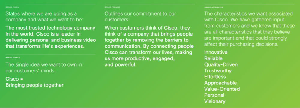
Cisco want to be the most trusted technology company in the world. Their mission statement is “Bringing people together”. And their 75-page brand brief is meant to give you confidence they’ll do it.
Their brand experience promises to be:
- Exceptional: Unrivaled quality that exceeds expectations
- Vital: Meeting customers’ needs
- Effortless: Making customers’ lives easier
- Visionary: Transforming the world for the better
Those are some big goals. So, how do they do it? Well, they’re upfront about their vision, brand promise, and stance. Plus, the exact characteristics they want to be associated with. Because they know from audience feedback that they affect purchasing decisions.
As there are so many potential touchpoints for Cisco customers, they’ve grouped them into three sections. Each with their own detailed standards:
- Communications
- Product and service experience
- Interactions with people
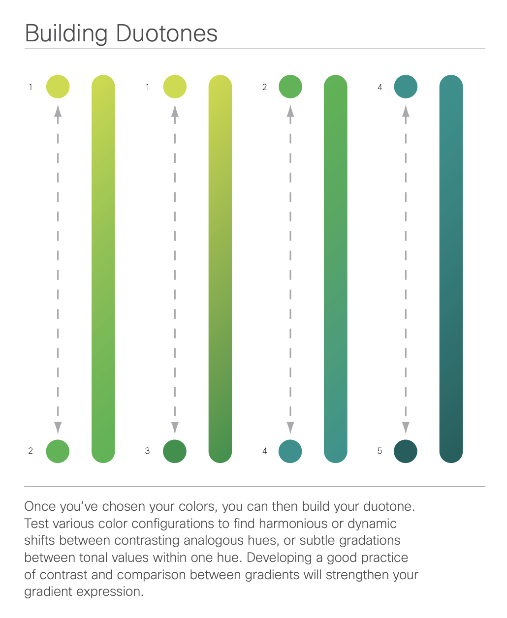
Consistency is clearly the focus here. And Cisco goes into great detail about even the smallest elements—like building duotone gradients to create calming or energetic feelings.
Cisco may not have the most memorable branding of the lot. But they want to be a company that’s trusted. So, rather than trying to wow you with visual branding, they’ve been meticulous instead.
Their brand brief is a welcoming insight into how they’ve built their brand and how they’ll evolve. Nothing is hidden. And this kind of transparency can give people confidence in you.
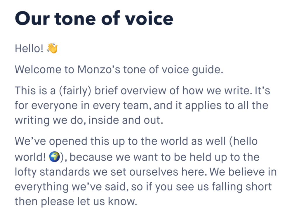
Monzo: Use your brand voice to make things simple
Banking can be complicated. So, Monzo are dedicated to making it simple. They’re a fairly new brand—only founded in 2015. And their whole brief focuses on the part they think is most important: their tone of voice.
The opening paragraph immediately sets the tone (thank you) for the rest of the brief. How often do you see a banking site using an emoji? Did you want to wave back? Maybe just me.
It’s such a simple way of showing how relaxed they are. It’s still professional, but it sounds like a conversation with a friend.
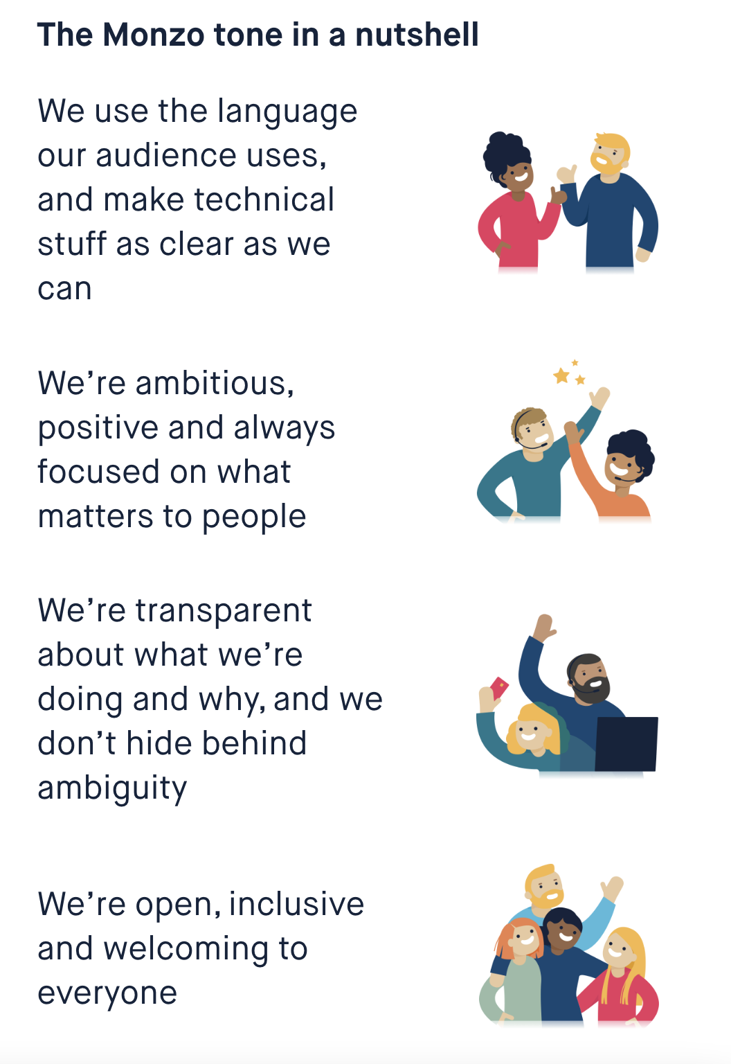
They then break their tone down into four main sections:
- Mirroring their audience’s language and making technical stuff clear
- Ambitious, positive, and people-focused
- Transparent about what they’re doing and why
- Open, inclusive, and welcoming
If you’re not sure what all that looks like in practice, don’t worry. Monzo have got you covered with tons of real-life examples. Like this one for using more verbs and fewer nouns:
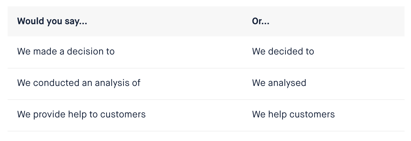
They don’t assume you know anything. For the section above, they explain what a noun and verb are:
“When we’re writing, we tend to swap out verbs for nouns. That’s because nouns are seen as fancier and more professional. Verbs are action or doing words, like ‘decide’ or ‘analyse’. And nouns are naming words, like ‘decision’ or ‘analysis’.”
They say every word matters. And each piece of text you read follows through on this statement.
Monzo are so confident, they encourage those who think they’re falling short to get in touch. Only 28% of the public think the banking sector is trustworthy. But this open communication style shows they’re different (and you believe them.)
Conversational copywriting is becoming the norm, and it’s not surprising. It’s welcomed. Formal, academic writing = disconnection. And that’s the opposite of what you want from your target audience.
Make your brand brief as unique as you
Each of these brand brief examples is unique. Because they all cover different parts of their business that they value the most. But there’s something that links them—they each have a huge focus on people and humanity.
The digital tech companies have to work much harder for this. Because the main service is usually faceless. So, they have to create a brand identity that people trust and want to engage with—without humans at the forefront. Brands like Discord, Hulu, and Skype have all achieved this.
Your brand brief should spell out your core values. Either by telling people what they are or getting them across with design. So, figure out yours and how you can represent them best. That’s how to make a lasting connection with your target audience.