Website design is among the most important factors in overall customer satisfaction, brand loyalty, lead generation, and search engine ranking. In fact, 75% of consumers state that website design is a major consideration when assessing a company’s credibility.
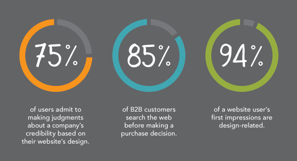
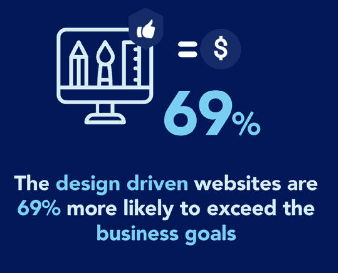
Furthermore, it is estimated that 69% of websites that are design driven are much more likely to exceed their business goals. So, if your current website struggles to achieve your desired outcomes, it may be time to overhaul your entire web design.
We realize the idea of creating a completely new site may sound like a daunting and monumental task. But fear not; we would like to offer an alternative solution. We are here to guide you through the process of transforming your existing website with a website revamp. With our eight must-read tips, you can rest assured that your site will become a fully optimized success story guaranteed to solve your web design woes.
Website revamp vs website redesign
These common terms are often used interchangeably, but there are some key differences that are important to highlight.
Website redesign: The main distinction between the two undertakings is in the scope of the projects. The website redesign process involves a complete overhaul of your website from top to bottom, including design, navigation, structure, layout, and content.
Website revamp: This approach is considerably less drastic; it simply involves tweaking a few elements to improve the user experience rather than creating an entirely new design. Think of it in terms of upcycling; we are taking a solid foundation, albeit in need of some love, and reimagining it as something far grander.
Now, both of the strategies are fantastic methods of reinvigorating an old site, but a revamp has a few key benefits that may make you reconsider beginning that website redesign project:
- A revamp is considerably more cost-effective than a complete redesign as you are only changing a few key features. On average, completing a redesign by yourself can cost between $100-$3000. However, if you opt to use an agency, a redesign can set you back an astonishing $15,000-$30,000.
- On average, a revamp has an incredibly quick turnaround in comparison to a redesign which can take anywhere between 45 to 90 days.
- A revamp provides a refurbished website with the same user flow and basic structure, maintaining user familiarity.
Our top tips for a smooth website revamp
Settle down and relax as we take a look at our 8 must-use tips to revitalize and revamp your existing website.
1. Listen to the metrics
When first embarking on a website revamp project, listening to your current site’s metrics is incredibly important. This allows you to assess your website’s performance and find potential problem areas that require improvement.
While many tools are available, Google Analytics is our top choice for measuring your metrics. Check out the infographic below to see what you can track and analyze with the program.

However, in our humble opinion, two of the most important metrics to monitor in web design are:
- Bounce rate
- Conversion rate
Bounce rate
This metric measures the number of users who only visit a single page before abandoning your website.
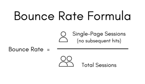
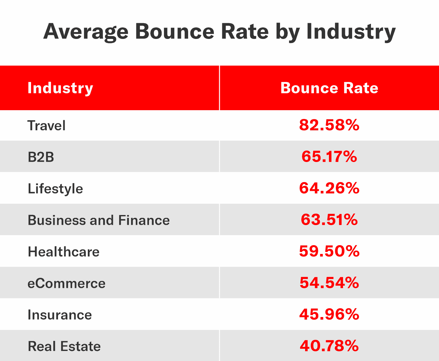
Now, the first question you may want to ask is, what does a good bounce rate look like? It is important to note that this figure can vary dramatically depending on your industry, content type, and audience.
So, the best way to gauge the quality of your website is to compare it to your competitors. The below infographic details the average bounce rate for different industries and is a fantastic way to contextualize your website’s performance.
Conversion rate
This metric measures the number of successful conversions achieved by your website. But what exactly is a conversion? It is when a user completes a desired action which can include:
- Subscribing to a newsletter
- Purchasing a product
- Submitting a form
- Creating an account
- Sharing content

If you have either a high bounce rate or a low conversion rate, it means that your business website is not capturing the attention of your target audience. This can indicate issues with your existing website, including poor user experience, functionality, and overall site design.
2. Acknowledge user feedback
Bill Gates, co-founder of Microsoft, said:
“Your most unhappy customers are your greatest source of learning.”
And this is true when undertaking a website revamp too. When looking for inspiration about how to improve your website, your first port of call should always be your target audience. Your user base is the ultimate source of feedback and will often be more than willing to advise you on how to strengthen your user experience.
However, rather shockingly, 42% of businesses do not collect customer feedback. It is no wonder, then, why only 12% of consumers believe companies really put their customers first.
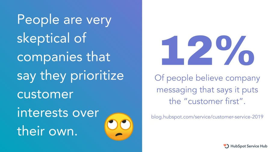
So, it is about time you buck this negative trend and ask your users what they really want from your website. Here are our top four methods to obtain customer feedback:
- Embed a button or widget that links to a survey on your web pages
- Send an automated email when a desired action is completed with an attached feedback form
- Create a live chat function for customers to automatically communicate their feedback
- Track feedback through social media channels, testimonials, and user reviews
3. Create a buyer persona
Before attempting to reinvigorate your website; it is important to understand who you are targeting with the revamp. By understanding your audience, you are able to make the best decisions that cater for their needs. We believe creating a buyer persona is the best way to do this.
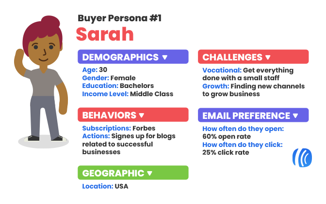
A buyer persona is essentially a culmination of data that represents your average consumer. Your persona should include:
- Age
- Gender
- Location
- Income
- Interests
- Pain points
- Goals
To create this, you will need to collect data about your user base. To do this, you will need to conduct some in-depth audience research. Our top strategies to uncover this valuable information are:
- Send out short customer surveys that ask about personal information, opinions, complaints, needs, and wants
- Analyze your competitor’s target audience to understand your industry’s main demographic
- If you want your business to evolve and grow then consider what your dream future customer would look like
- Use analytical tools such as Google Analytics to identify key data points about your target audience
4. Embrace responsive design
There has been a sudden shift in how online content is being accessed, which means that websites must now embrace responsive design. But what does this term actually mean? Well, in essence, it is the ability of a site to be adaptable, meaning that content is perfectly optimized to be viewed on any screen or device.
Matt Felten, a leading Los Angeles product designer, states that:
“If I’m a small-business owner and all of the competition has a really nice, responsive website, and I don’t, in less than a second, people make a negative judgment about my product.”

One of the most important aspects of web design is the idea of mobile-first. This is the idea that websites should now be created with the mobile user experience at the forefront of design philosophy.
Don’t believe us? Here are three incredible facts that’ll convince you:
- Mobile devices amount to 60.04% of all website traffic
- 92.1% of users access the web via mobile devices
- If your website is not mobile-friendly, users are more than five times more likely to leave
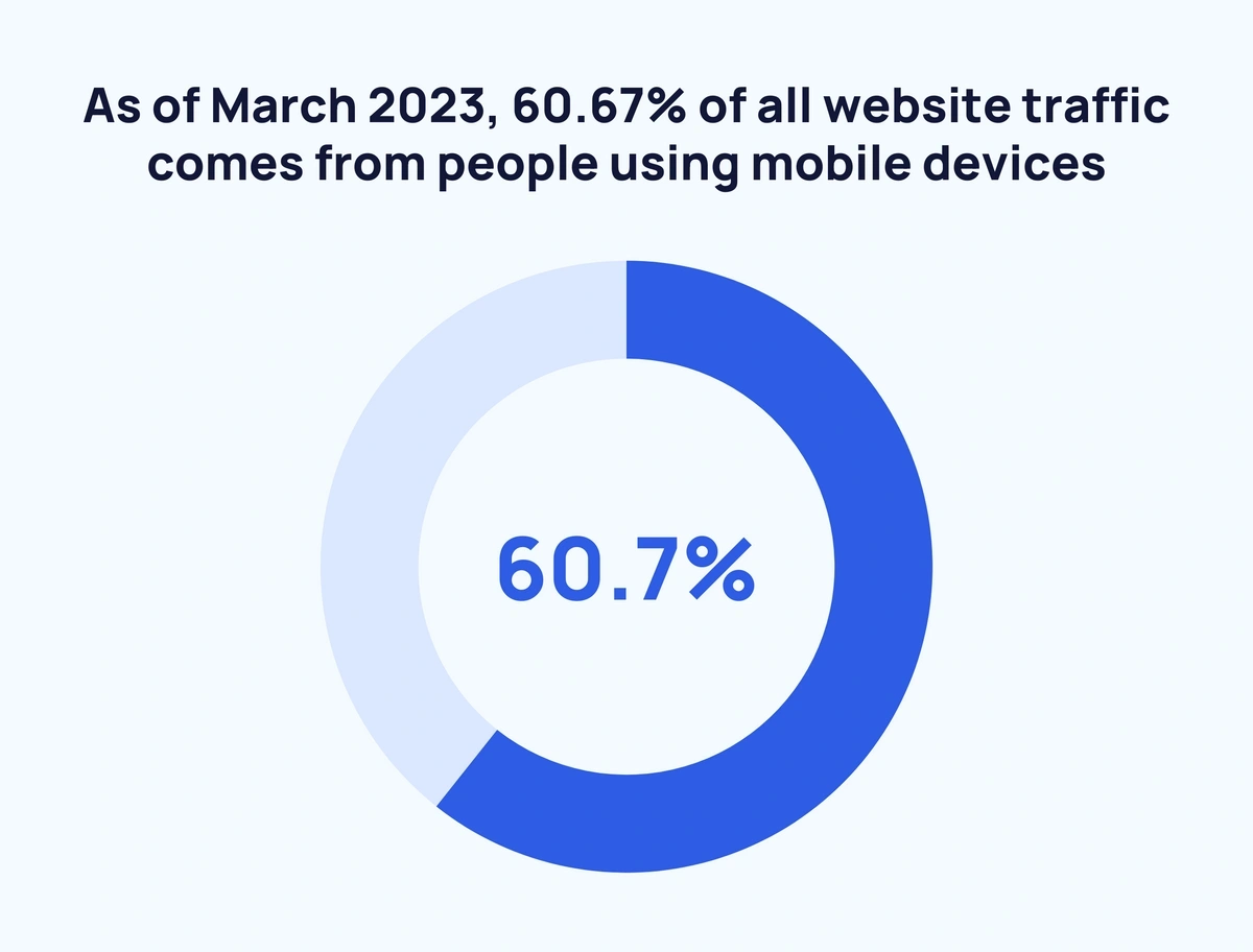
To test if your website is up to scratch and delivers a seamless mobile user experience, there are two methods.
- Try to access your website on multiple different devices to measure the quality of the experience by examining loading times, the efficacy of the website on a smaller screen, and ease of navigation.
- Use a dedicated testing tool to take a deep dive into the effectiveness of your mobile-friendly website.

We believe that the best tool to use is Google’s free Mobile-Friendly Test which will rate your page and advise you on any tweaks that can be made to improve mobile friendliness.
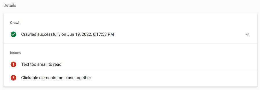
The handy table below provides you with the main errors Google’s tool will highlight and the fixes they recommend.
5. Give your website a facelift
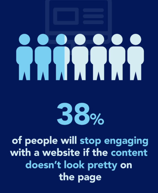
Believe it or not, at least 38% of users will stop interacting with a website if they do not find it visually appealing.
We realize the idea of creating a completely new site may sound like a daunting and monumental task. But fear not; we would like to offer an alternative solution. We are here to guide you through the process of transforming your existing website with a website revamp. With our eight must-read tips, you can rest assured that your site will become a fully optimized success story guaranteed to solve your web design woes.
Website revamp vs website redesign
These common terms are often used interchangeably, but there are some key differences that are important to highlight.
Website redesign: The main distinction between the two undertakings is in the scope of the projects. The website redesign process involves a complete overhaul of your website from top to bottom, including design, navigation, structure, layout, and content.
Website revamp: This approach is considerably less drastic; it simply involves tweaking a few elements to improve the user experience rather than creating an entirely new design. Think of it in terms of upcycling; we are taking a solid foundation, albeit in need of some love, and reimagining it as something far grander.
Now, both of the strategies are fantastic methods of reinvigorating an old site, but a revamp has a few key benefits that may make you reconsider beginning that website redesign project:
- A revamp is considerably more cost-effective than a complete redesign as you are only changing a few key features. On average, completing a redesign by yourself can cost between $100-$3000. However, if you opt to use an agency, a redesign can set you back an astonishing $15,000-$30,000.
- On average, a revamp has an incredibly quick turnaround in comparison to a redesign which can take anywhere between 45 to 90 days.
- A revamp provides a refurbished website with the same user flow and basic structure, maintaining user familiarity.
Our top tips for a smooth website revamp
Settle down and relax as we take a look at our 8 must-use tips to revitalize and revamp your existing website.
1. Listen to the metrics
When first embarking on a website revamp project, listening to your current site’s metrics is incredibly important. This allows you to assess your website’s performance and find potential problem areas that require improvement.
While many tools are available, Google Analytics is our top choice for measuring your metrics. Check out the infographic below to see what you can track and analyze with the program.

So, take a step back and look at your website’s overall aesthetic. Does your site look incredibly drab, dull, and uninviting? Then it may be time to reinvigorate it with a fresh coat of paint. Luckily for budding website renovators, this process is rather simplistic as most content management systems, such as WordPress or Squarespace, have easy-to-use interfaces that make editing and formatting a breeze.
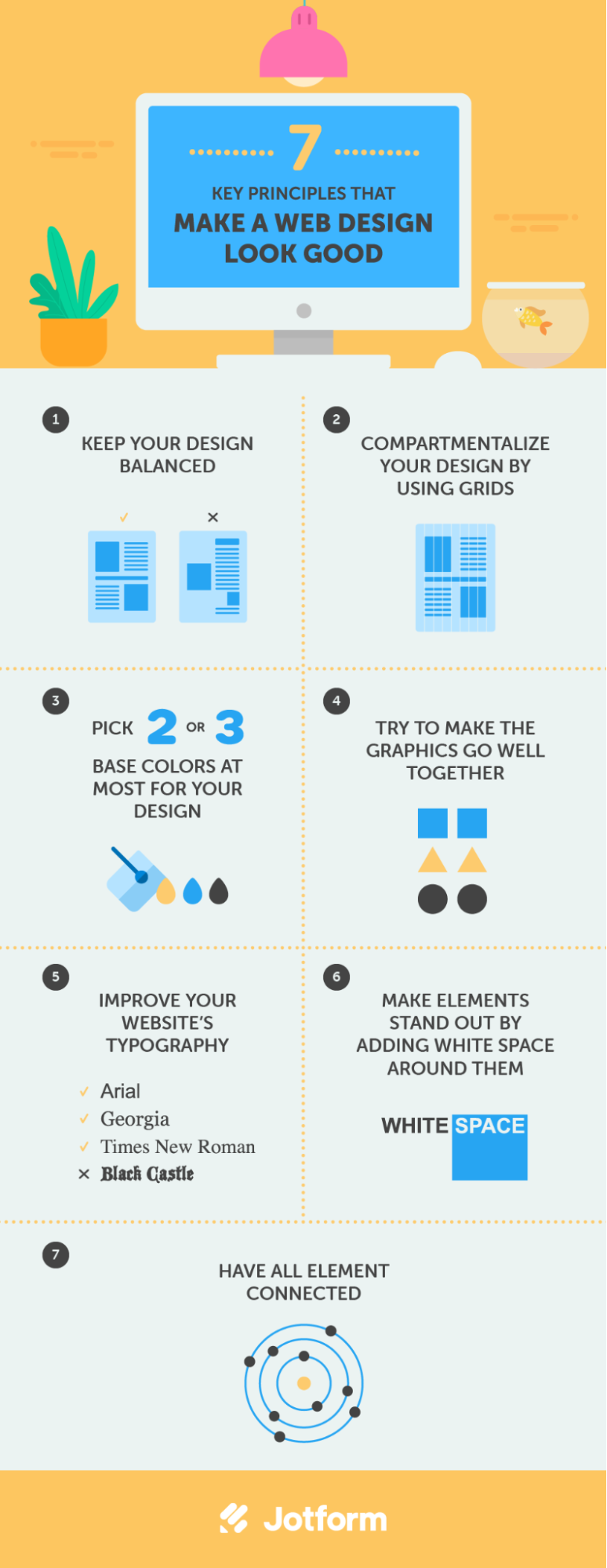
Here are our top ways to add a splash of color and visual appeal to your generic web design templates without having to entirely rebrand:
Color scheme
Whether you are creating entirely new pages or simply refreshing older content, color is incredibly important to the visual appeal of a website. We are all familiar with the classy, simplistic homepage of Google. However, would we remember it for all the right reasons if it was in a shade of garish green? The answer is quite evidently no.

Here are some of our top tips to create the perfect color scheme:
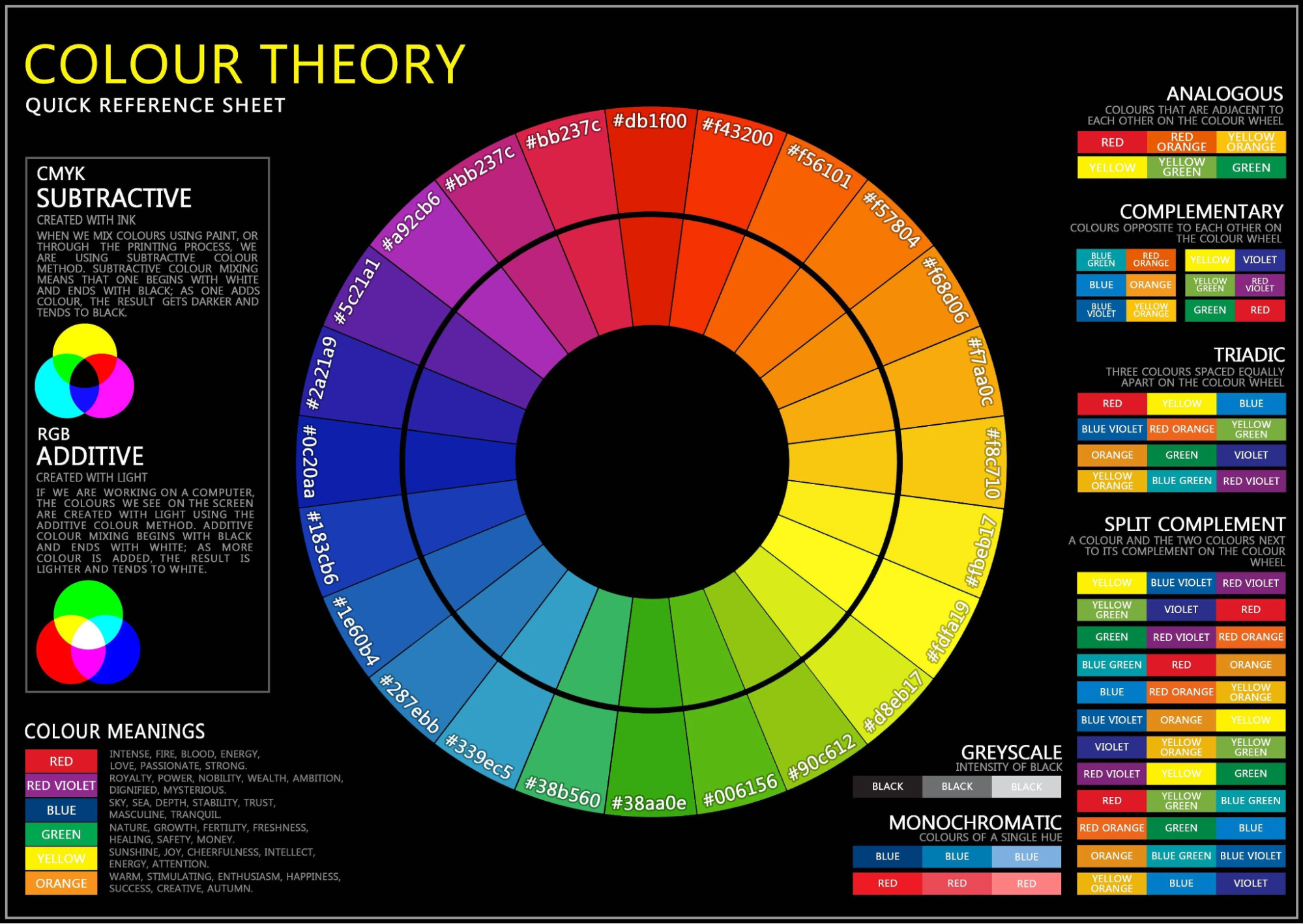
- Color theory: It is important to remember that some colors complement one another while others do not. Therefore, a rudimentary understanding of some color theory basics is important when designing a webpage. The below infographic outlines some of the most crucial theories that you will need to know.
- Keep it simple: It is also important to remember to keep color schemes relatively straightforward. The temptation to oversaturate a page with a vast array of colors is understandable, however, in practice, this method looks overwhelming and chaotic. The best tactic is to select two or three colors as a consistent theme throughout your content.
- Match to your brand: If your brand is associated with specific colors then utilize them in your web design to promote synergy. Take a look at the KFC website, the familiar shade of red from the brand’s logo is prominent throughout the website.
Font
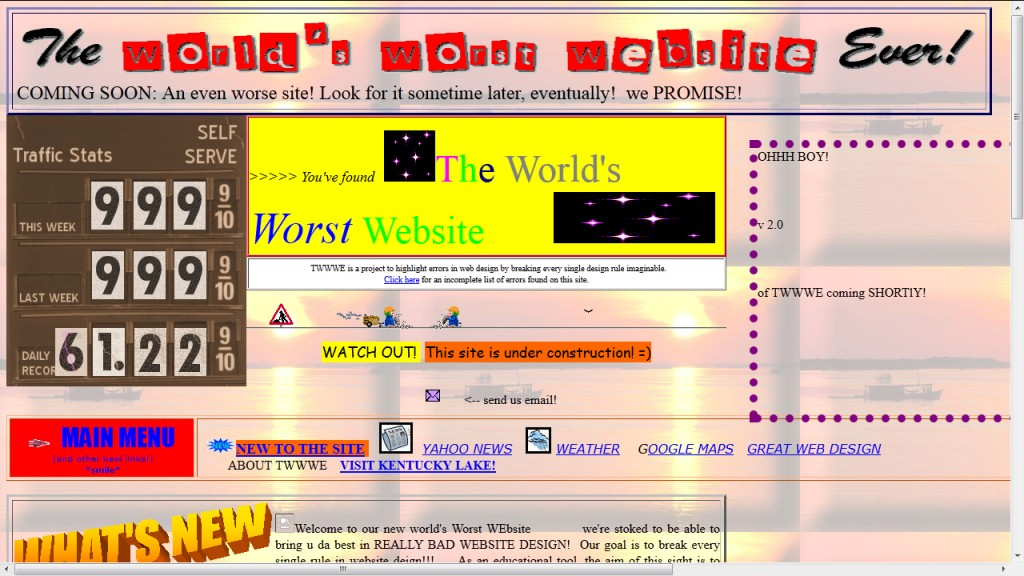
Is your website full of different, complex, and fancy fonts that you are convinced look visually appealing to your target audience? Then we need you to stop right now. These fanciful fonts may look nice but can be detrimental to the user experience.
Selecting the correct font is one of the most important aspects of web design. A poor choice of typography can make your content unreadable and hard to navigate.
It’s also important to select a web-safe font. This means that it comes pre-installed on most operating systems making the text render correctly on different devices and browsers.
Our top ten choices of the best web-safe fonts for readability are:
- Arial
- Times New Roman
- Helvetica
- Courier
- Verdana
- Candara
- Geneva
- Calibri
- Optima
- Cambria
White space
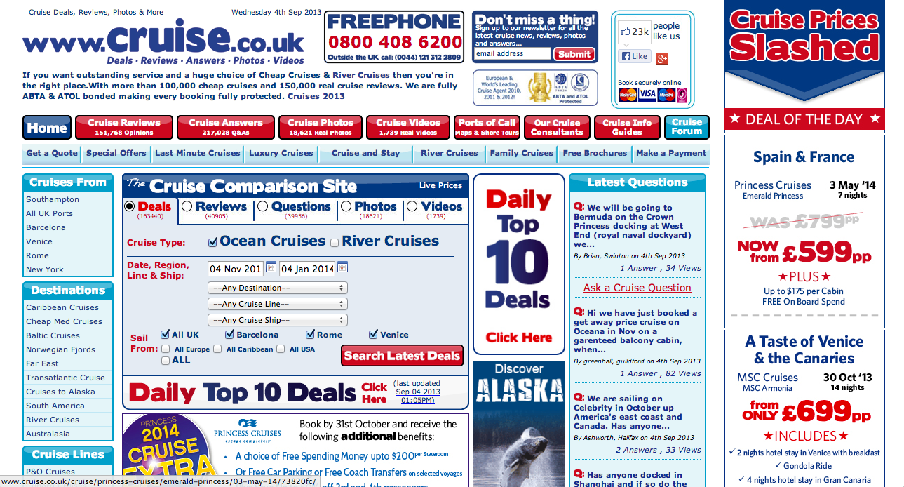
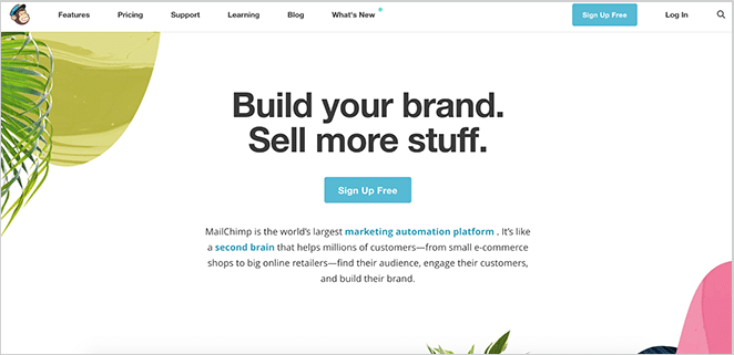
The temptation to cram every inch of a page with content is a common mistake in web design. It can make a page look overstuffed and cramped.
The use of white space may seem counterintuitive when designing a website. How can voids of emptiness look visually appealing? Well, incorporating white space can emphasize the other elements of your page and give them room to breathe. This makes the page more easily readable and eye-catching without being overwhelming.
Need some more persuading? Take a look at the case studies below and decide for yourself what seems more appealing.
6. Implement Search Engine Optimization techniques
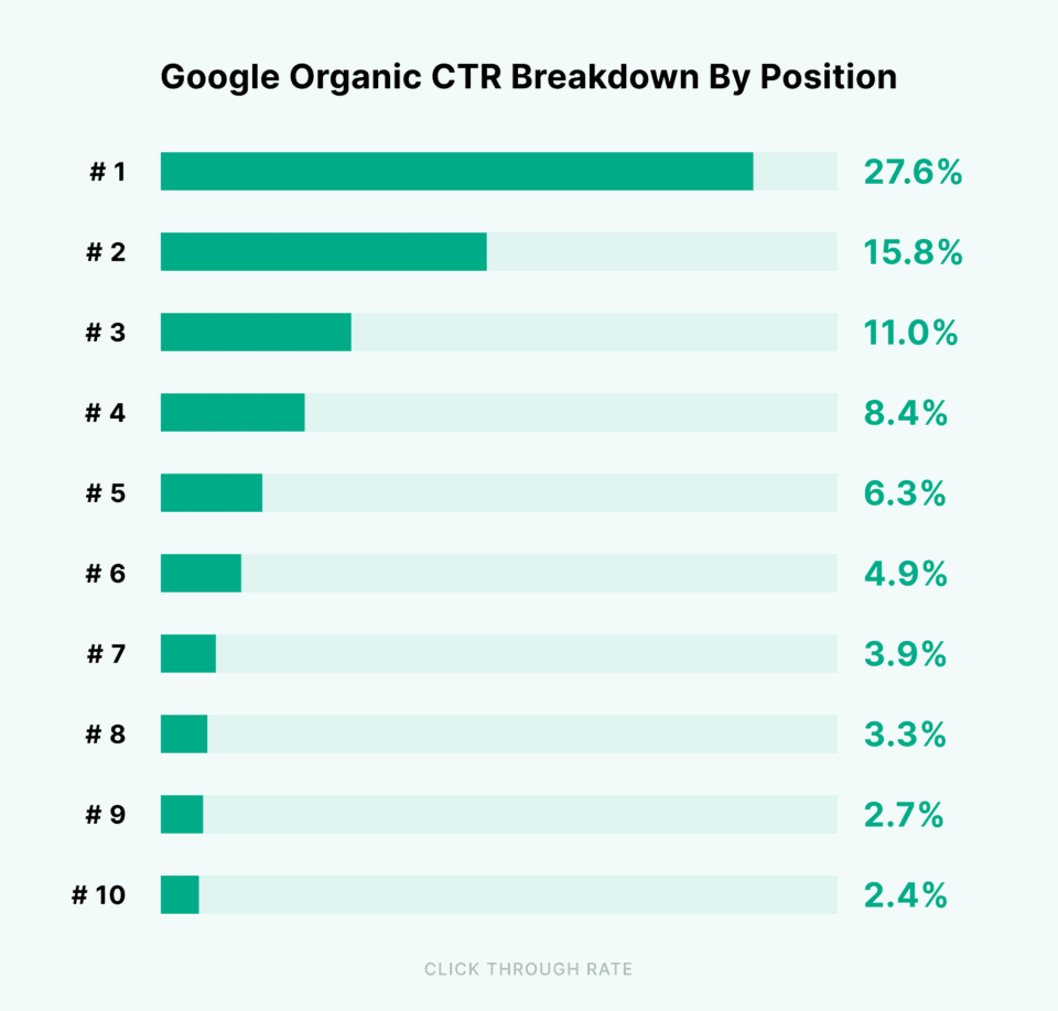
One of the most crucial goals of any online marketing campaign is to raise your search engine ranking. This is because the higher you rank on SERP (Search Engine Result Pages), the more visible your content will be to your target audience.
In fact, the number one result on a SERP will have around 27.6% of all clicks for that search query. This figure starts to decline drastically the further down a website ranks, with only 0.63% of users clicking on a site from the second page of results.
SEO, or Search Engine Optimization, is the ultimate buzzword in digital marketing. It is the practice of using numerous techniques to improve a website’s SERP ranking by satisfying the search engine algorithm.

So, do you want to climb the search engine mountain and claim your spot at the summit? Then here is our choice of the three best white hat SEO techniques guaranteed to improve your website’s SERP ranking:
- Keyword-rich: Your copywriting team should utilize relevant keywords in any new content created for your newly designed webpage. To find the very best keywords for your website content we recommend using a product like Semrush.
- Backlinks: Acquire backlinks from authoritative external websites by providing high-quality, sharable content and utilizing outreach marketing,
- Metadata: Using attention-grabbing meta-titles and descriptions that incorporate keywords for your content will raise your click-through rate.
It is important for us to acknowledge there are some black hat SEO tactics that have been used to inorganically improve search engine rankings. These include:
- Keyword stuffing: This tactic is about cramming as many keywords into a passage of text regardless of readability or relevance.
- Hidden text: This technique spams keywords into content by changing the color of the font to match the background.
- Link farming: Using a series of websites that all link to one another to increase SEO.

We strongly advise against using these strategies as they are unethical and can result in your website being penalized by the algorithm.
7. Reduce page loading times
It would seem that patience is not a virtue when it comes to accessing web pages. Did you know that 40% of users will leave a website after waiting for more than three seconds for a page to load? In fact, it is estimated that a one-second delay in landing page response can reduce conversions by at least 7%. This means that if you are an e-commerce website that earns $50,000 per day you could be facing a loss that exceeds $1 million a year from lagging loading times alone.
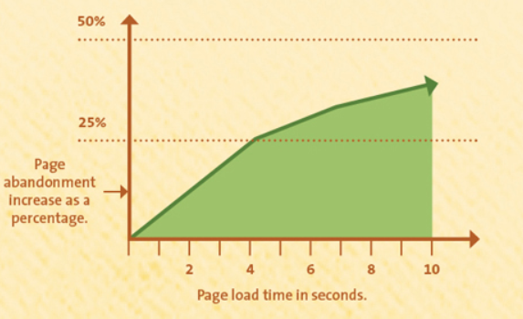
Use Google PageSpeed Insights to gauge how your website performs in terms of loading times. This incredible piece of free software will analyze your page speed for both desktop and mobile devices creating a report filled with valuable metrics.
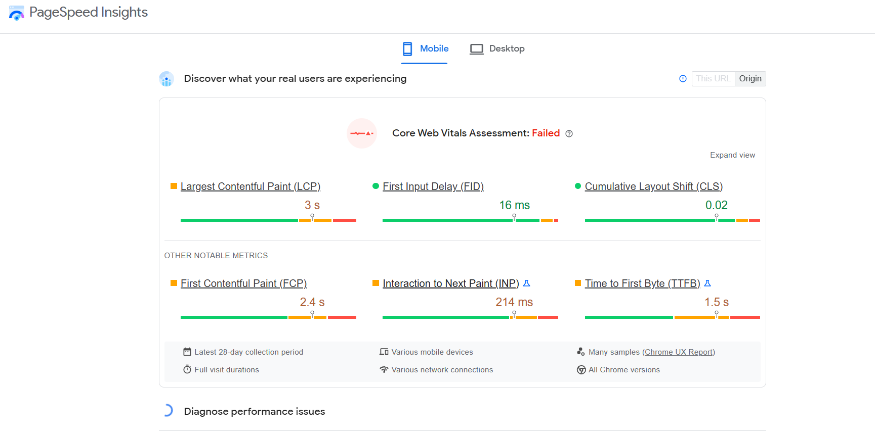
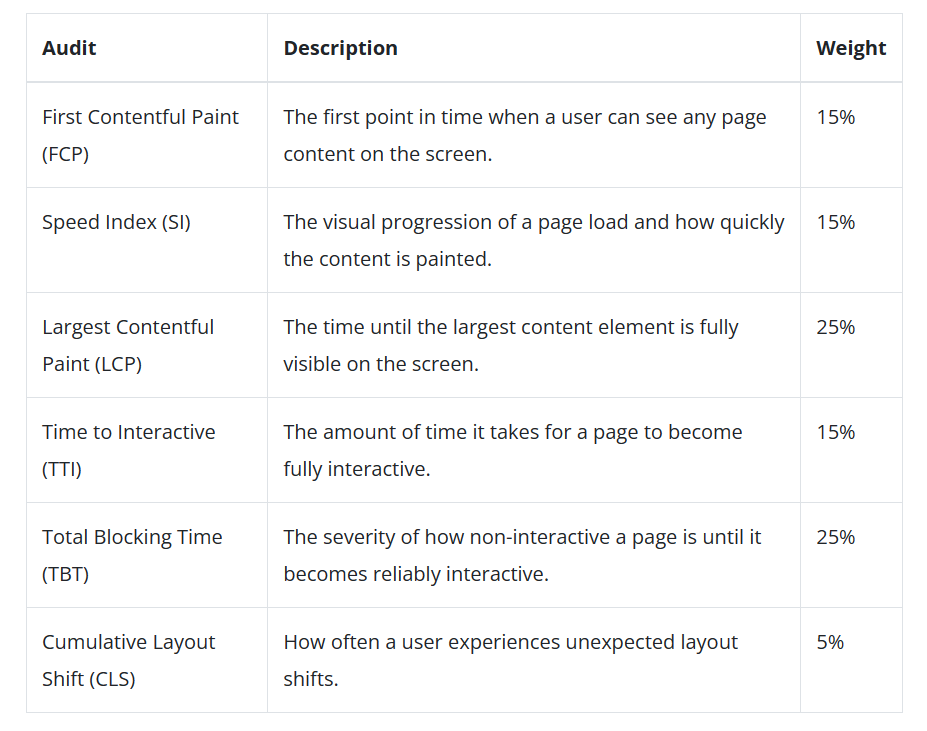
Confused by what Largest Contentful Plate or Time to Interactive means? Check out the table below, provided by LoadNinja, that summarizes what each metric means.
Once the diagnostic has been conducted, it is time to start minimizing those pesky loading times to increase the usability of your website. Thankfully, PageSpeed Insights will provide you with suggestions, called ‘opportunities’, to cut down load times.
Our top three tricks to improve your loading times right now are:
-
- Compress your images: We all like to use images to make our content pop but this, unfortunately, can cause loading times to suffer. To rectify this use a plugin, such as WP Smush, to condense your images without sacrificing the quality.
- Minimize redirects: Eradicate any unnecessary redirects that do not serve a viable purpose.
- Cache your web pages: By caching your website you are making copies of your site files which allows the server to generate a webpage quicker for a potential customer.
8. Include multiple calls to action
Incredibly, a total of 70% of small businesses do not have call to actions located on their homepage. And this seems to be a massive oversight as it is estimated that by implementing a CTA a website’s conversion rate can increase by an extraordinary 120%.
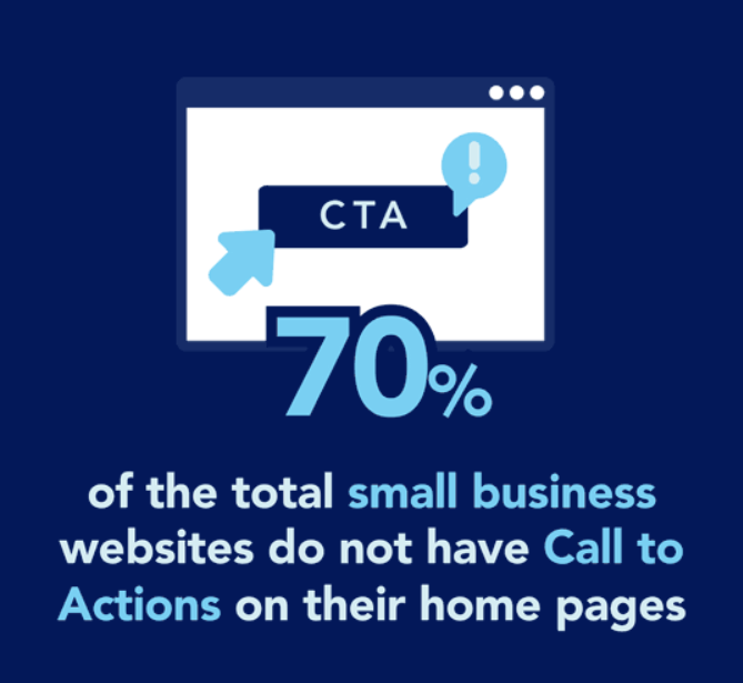
That said, we do not want to simply teach you how to use vanilla, industry-standard CTAs. Instead, we want to show you how to create the best calls to action around to command users to take a desired action. So, follow these tips.
- Use commanding and emotive language: Yes, it is true a call to action will not have a lengthy word count. But that simply means we have to make the most of what we do have. An incredible CTA consists of:
- A strong action word
- Emotive language
- Sense of urgency
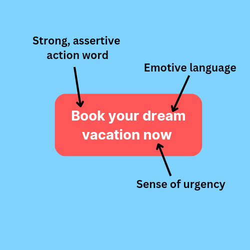
- Make it attractive: While the wording of a call to action is undeniably important, it is also essential for it to be eye-catching. A study by Hubspot found that a red button outperformed a green button by 21%. We believe that for a CTA to stand out, it should use:
- Bold coloring that utilizes color theory that contrasts the web page background
- A large, prominent button that has a strong presence on a page
- Use of a basic rectangular button, a unique shape can be off-putting

Ready to revamp?
There you have it, our top eight tips for performing the ultimate website revamp. Whether you own an e-commerce website chasing sales or are a big brand looking for awareness, these tips should aid you in transforming your outdated online presence into a successful website.
But, this will not be the end of your web development journey. In fact, the average lifespan of a website is only a mere 1.5 to 2.5 years. While you relish your new gleaming site remember that the online world is forever changing. So, take a moment from your hectic schedule to occasionally consider what will your next revamp will look like. We can’t wait to see what incredible improvement you make.


