

What’s the first thing you notice about a business?
According to the US Chamber of Commerce, 55% of people’s first impressions come from visual branding elements, such as a company’s logo. So it’s safe to say that logo design is something you really want to get right; it’s one of the first steps you can take to create a recognizable and trustworthy brand identity.
There are a lot of subliminal ways you can let potential customers know what your business is about just from the colors and fonts you use. For fintech (financial technology) logos, this usually involves lots of smooth shapes and fonts in blue, black, or green colors.
Of course, there are going to be some exceptions. But doing this carefully can help you stand out from the crowd without losing too much of your association with your marketing niche.
So, if you’re a fintech company who’s a bit downhearted with your current design choices and looking for a way to rebrand, we’ve got a curated list of some of our favorite fintech logos to give you some fresh ideas.
The importance of great design
We all have an idea of great design in our minds – something iconic that people instantly think of whenever they hear a brand’s name or associated product.
When it comes to financial services, customers will probably have only a couple of trusted providers who they’ll look out for time and time again. If they have a pre-existing relationship with these companies, they know what to expect. This can make it hard for new contenders to break into the market and prove their worth.
One of the first ways you can show your potential customers what they can expect from your company is through your logo. It needs to reflect your brand in the most authentic way possible, so it’s best that you spend some time and think it through properly.
Here are some important factors that a great logo design can contribute to.
Building brand recognition
First and foremost, you want people to be able to discover your brand and learn about it. A logo serves as a visual representation of your company – everything you wish to encapsulate in a nutshell.
When it comes to building fintech brand awareness, you’re off to a tricky start. Not only is the market incredibly over-saturated, but you’re also having to compete with all of the existing, well-established physical banks who people still tend to trust more due to their longevity.

When more people become aware of your brand and its logo, you can begin to incorporate other branding elements into the mix. This gives you the chance to build positive associations and present yourself as a trustworthy, reliable business that people can invest their money in.
Enhancing memorability
Brand recognition and memorability concerns how successful a brand is at sticking in peoples’ minds. If a group of people look at your logo and then wait a few minutes, how easy would it be for them to recreate it from memory?
A really great design stays with your customers. It becomes the first thing they think of when (in this instance) they hear the word ‘fintech’. Think of iconic banking logos, like the blue and red stripes belonging to Bank of America. This evokes feelings of patriotism, freedom, and security.
Differentiation from your competition
Digital banking is a huge industry, worth an estimated $118.51 billion at the beginning of 2023. And that’s not even considering the cryptocurrency market, which has an eye-watering market capitalization of $1.1 trillion.
So it’s safe to say that there’s a fair bit of competition out there for any hopeful fintech startup wannabes.
It’s vitally important that fintech brands can create a logo that they will stand behind and be noticed with – something that will elevate them past their peers. If you have a certain niche or advantage over your competitors, see about incorporating that into your design, somehow.
For example, if you’ve developed a new type of technology or system, or if you pride yourself on your exceptional customer service, these are all things that can be displayed with your logo.
Forging a brand identity
Creating your fintech logo design is the first step to forging an excellent brand identity that everyone can recognize and rally behind.
This goes beyond the design of your logo, products, and services, and branches into how you interact with your community and the world around you. But you can demonstrate this from the get-go with symbols you decide to use in your logo, such as the use of trees or natural imagery in environmentally conscious brands.
What makes a super logo?
A super logo has to be versatile. It needs to look the part no matter where you have it – whether that be front and center on your website, physically on business cards and credit cards, or plastered over social media in your digital marketing campaigns.
Let’s take a look at a few interesting elements that make up a visually appealing logo.
- A unique typeface: A typeface is the home text-style to which a font belongs to, e.g. Times New Roman. If you were to change this typeface by italicizing it, changing the size, or making it bold, you’d be changing it to a different font within the typeface’s group. Currently, these terms are used more or less interchangeably. So, if you want to create something eye-catching with your logo design, it’s a good idea to take a look at the typeface options available, or go about designing one yourself. It’s what companies such as Disney have done, allowing them to create and trademark that iconic, swirling display.
- Appealing typography: Whereas typeface is the style of lettering you use, typography is how you arrange that on a page. Many modern logos are simplistic in style, making use of the blank space on a page to create contrast. Keep it clear in your mind if you want to do something similar with your own logo, or if you’d prefer to make full use of the space available.
- A consistent color palette: Within your company branding, you’ll have a set of style guidelines which dictate what colors you can use in your advertising. These also apply to your logo, so it’s important you make sure things match. You don’t want any awkward color clashes on your promotional material. In your guidelines, have a few distinctive colors which you aim to use for the majority of your branding. Make sure they all work well with one another, and think about the story they tell and the associations you want to make in your customers’ minds.
- Interesting simplicity: Logos can often fall victim to the trap of over-elaboration. Whilst something visually stimulating is good for your memorability, you don’t want it to be overcomplicated to the point where your consumers get confused. Think of the best logo designs to date; McDonalds, Facebook, and Apple may spring to mind. They all have a degree of simplicity that makes them easy for anyone to recall and write down on paper.
5 fintech logos to draw inspiration from
There’s a lot of psychological design elements that go into creating a logo. Before you go about designing one, make sure you understand the implications of your design choices. It’s always a good idea to hire a professional logo maker, or at least get some valuable insight from a graphic designer before you begin.
After all, your logo is the forefront of your visual identity. You want it to be perfect, just like these fintech brands below!
1. PayPal
We’ll start off with PayPal, which only recently underwent its own fascinating rebrand in 2022.
PayPal is an online payment system and current account, designed to allow individuals and businesses to make financial transactions securely over the internet. It’s currently used by over 430 million people, making it one of the top 10 largest fintech companies in the world.
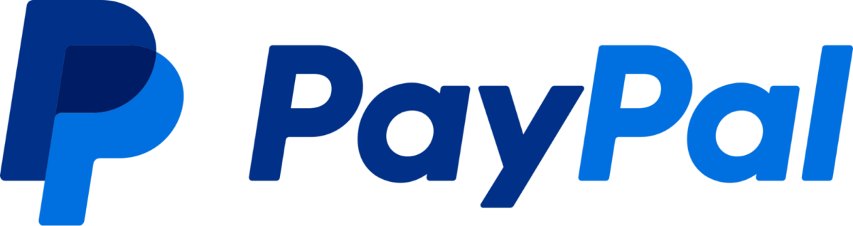
Let’s break down the visual elements we can see here:
- The logo features 2 overlapping ‘P’s next to the company name, written in a specialized sans-serif font known as ‘Paypal-Sans’.
- The lettering is italicized to the right, giving a sense of leaning forward into the future.
- The overlapping ‘P’s symbolize unity and togetherness of the brand and its users.
- The two-tone color scheme is simplistic but engaging, evoking feelings of professionalism and security.
2. American Express
American Express is a symbol of opulence around the world, and boasts a strong history that goes all the way back to the 1850s.
The current logotype brings the brand down to its basics – a simple ‘AM-EX’ in a bold blue and white font. In 2018, designers got rid of the blue gradient, placing the emphasis purely on the lettering and the longstanding association of those words alone.
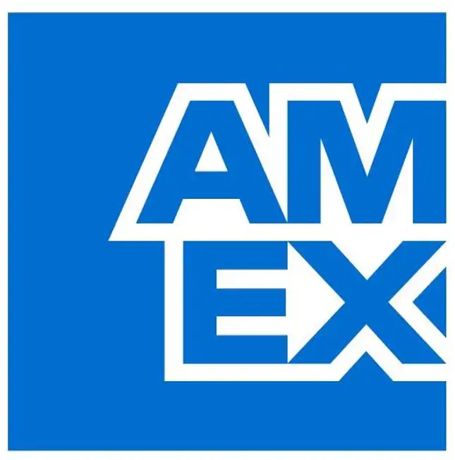
The longer version of the logo features the whole of the words ‘American Express’, spanning across from the left to the right side of the screen and slightly overlapping the border. This creates a sense of an all-encompassing brand, able to cater to any financial need.
The colors, like with PayPal, are calming, professional blues that represent and emphasize feelings of trust.
3. Monzo
Monzo’s intrigue comes from the regular geometric shapes that form the ‘M’ of its logo, as well as the ‘hot coral’ color that they also use on their bank cards.
In their own words:
“We’re the bank with the hot coral card – and it’s what helps keep us distinctive. But it’s more than that. Hot coral represents our warmth, our empathy and our human quality. So we’ve made it the forefront of our brand, followed closely by deep navy and soft white.”
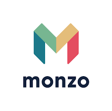
This style choice is also reflected in their typeface, Oldschool Grotesk, which seems more relaxed than the other styles we’ve looked at. All in all, this dynamic design speaks to a more authentically modern audience, aimed at increasing the freedom to transfer money without a physical banking account.
4. Mastercard
Mastercard is one of the largest payment-processing corporations in the world, second only to Visa.
This logo has become so iconic that, in their latest redesign, Mastercard decided to drop all lettering completely. This has just left the overlapping yellow and red circles, creating that warm shade of orange in the middle. It’s certainly a much more modern logo than its former iterations, adopting about as minimalist of a look as you can get.
Compared to other fintech logos, it’s a bit of an anomaly. This is due to the color choice – much warmer and bolder than their blue and green counterparts.
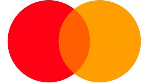
Like with PayPal’s design, the overlapping circles create a sense of unity and togetherness. All the lines are rounded and smooth, drawing your eyes into the central focal point, which only highlights that feeling of connectivity. It places whoever sees it at the center of the action.
Mastercard as we know it today started out life in the 1960s as the Interbank Card Association, with a simple ‘i’ logo. This remained a feature in the company’s redesigns until 1979, and by that time the current red and yellow circles had been in use for many years.
The current logo was designed in 2016 and aimed to embrace the modern, simplistic feel that had started trending amongst similar companies (just take a look at Google’s transformation to see what we mean).
5. Klarna
Take a look at Klarna’s logo and tell us what the first thing you saw was.
We’ll take a wild guess and say it was probably the very in-your-face baby pink background, right?
While this finance logo design looks more suited to be the face of a fashion company, there are some very interesting choices going on here which make it another great example of an engaging logo. Let’s take a look.
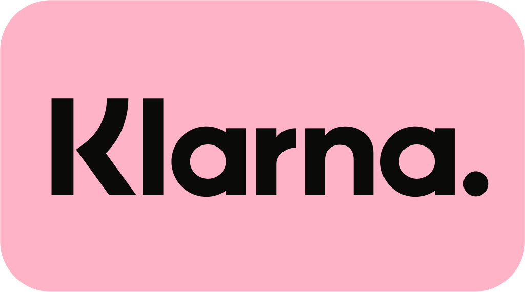
- The bright pink color attracts the eye and sticks in peoples’ minds
- Instead of a symbol, Klarna uses a wordmark – a type of logo that only uses the name of a brand
- The distinctive period mark at the end of the logo makes Klarna’s name seem more definitive, like a direct, confident statement – there’s no hesitancy to it
- The smooth, swooping ‘K’ and rounded curves of the lowercase letters add to the ‘smoooth’ marketing pitch Klarna uses in their advertising
- Klarna is a buy now, pay later (BNPL) service aimed at making shopping easier – this ideal is matched perfectly by the pink color which evokes associations of early 2000s chick-flick shopping sprees
Ready to start your rebrand?
Rebranding can be a bit of a nightmare, but it can also be a great opportunity to expand and get a fresh perspective on things.
Hiring a professional is the best way to make sure you get the highest quality logo design possible, but there are also templates you can use to get a basic idea if you’re unsure of what you want.
A logo should be something you’re proud of – something that makes up the core of your web design. If you don’t feel inspired by your logo, maybe it’s time for a change. In an industry moving as rapidly as fintech, it’s good to keep things fresh.


