
When you look at the interior design choices around your home, is it a sanctuary of white space and tidy shelves? While you’re there, take a look at your wardrobe, too. Do classic tops, chic dresses, and tonal colors sit on your hangers?
If the answer to these questions is a resounding yes, then you might be a minimalist. For the most part, people use this phrase to describe their personal style. But did you know it’s a trend sweeping the branding world as well?
Even if you’re a self-proclaimed maximalist, we’re going to take you through the popular trend to determine if minimalism is the right choice for your business. So, let’s explore what it is, how you can implement it, and which brands have already jumped on board.
What is minimalism?
Minimalism can have different meanings depending on who you ask and how they incorporate the concept into their lives.
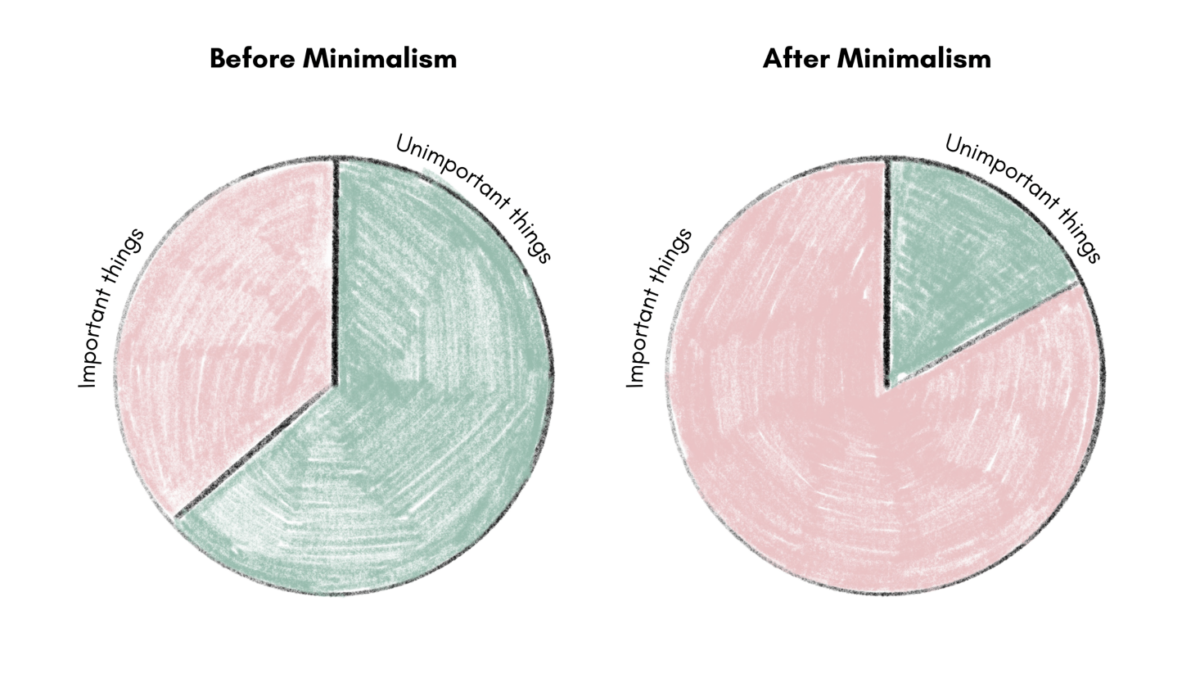
However, when you boil it down, it’s the practice of reducing non-essential elements to emphasize simplicity, functionality, and clarity.
With conscious decision-making and a lack of distraction, those who practice minimalism can find value in what’s important.
Why is minimalism a trend?
Minimalism isn’t a new concept by any means. It became popular throughout history as a response to global financial situations and access to new materials. However, it is stated that the movement really took off between the 1960s and 1970s.
So let’s find out why, all these years later, we’re still talking about minimalism.
- People have become more aware of their environmental impact as climate change anxieties grow, meaning they are buying less non-essentials.
- The rising costs of living have forced people to be mindful of their money, which has encouraged them to adopt a minimalist lifestyle.
- As our dependence on technology increases, so does our screen time. This can be a very overwhelming space to be in, so minimalism becomes a sense of calm.
But, of course, one of the most compelling reasons why we follow a trend is because we see other people do it. Celebrities and influencers have been posting about their minimal homes, products, and fashion, which makes their followers want to do the same.
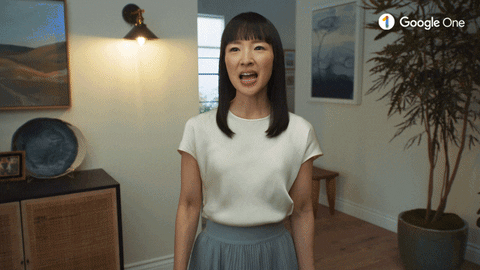
Recently, you’ve probably heard minimalism used in association with Marie Kondo, the New York Times bestselling author who rose to worldwide fame. She talks passionately about the benefits of a minimal lifestyle in her books, using quotes like these:
“Clutter obscures what’s most important. Discarding that which doesn’t support your ideal lifestyle creates space for treasured possessions to truly shine — and leaves room for future joy-sparking additions.”
What are the benefits of a minimal brand design?
Times have certainly changed. Consumers no longer view brands as simple links on the search engine. Instead, they have high expectations of what your business needs to deliver before they’re willing to make a purchase.
For example, they want you to share their values and spend time building a connection with them. But most importantly, they expect you to deliver an experience personalized to their wants and needs. Companies that get this right have 40% more revenue potential than those who don’t.
Think back to the bullet points above. Chances are your target audience is in at least one of those situations. Therefore, adopting a minimalist design can help you give them what they’re looking for.
Don’t worry if you’re not yet convinced, because here are some of the other benefits worth thinking about:
- Clear messaging: Getting values and messages across to audiences is vital because they are a significant part of the buying decision. So, when a business is stripped down to its core, these can take center stage.
- Brand recognition: A minimalist design is typically much simpler, which makes it easier for customers to recall the business that uses it. 46% of consumers prefer to buy from brands they are familiar with, so this will boost revenue and loyalty.
- Improving the user experience: A minimal design is much easier to understand and navigate than complicated interfaces or busy designs. It also facilitates faster website loading times and less crashing, which reduces churn and frustration.
- Standing out: As brands fight to get the customers’ attention through content marketing, the market becomes very visibly cluttered. Offering people a neutral space will be a welcome change for people feeling overwhelmed by it.

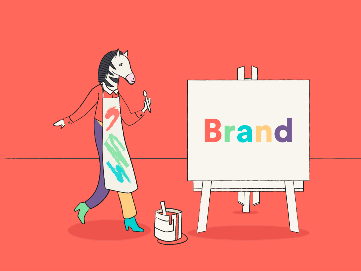
How to give your brand a minimalist makeover
We’re sure you’re now convinced that minimalism is worth thinking about. If that is the case, then you’ll also be wondering how to begin this new branding venture.
If you think you’re about to sacrifice creativity for plain, boring graphics and a grayscale color palette, then we have news for you. Let’s find out what a minimalist design is really about, shall we?
1. Logo design
75% of people will recognize a brand by its logo. This means it is a crucial stepping stone towards building a successful and iconic business.
For this reason, some designers will overcomplicate the asset because they want to build a fuller, more nuanced picture of brand identity. This does have some benefits, such as richer storytelling and better differentiation, but it can also overwhelm the customer with its business.
A minimalist logo design gets rid of these unnecessary extras and focuses on one visual that represents the brand best. We can’t tell you what that is, but what we can do is provide some guidelines for how it should look once you’ve come up with it:
- Use clean lines
- Design in 2D
- Focus on a simple design
- Stick to a single color
- Optimize negative space
The best way to test your design once it’s done is to ask yourself these questions: Is it easy for someone else to replicate and can it be transferred onto any material? If the answer to both of those questions is a “yes”, then you’re on the right track.
For some extra reassurance, we’d suggest the iconic luxury fashion brands who already hit the nail on the head. They are a great example of minimalism at work because, due to their higher price tags, they must communicate a sense of elegance and timelessness to their audience.
Companies like Chanel prefer to use monogram logos for this reason because they are more effective at portraying this aesthetic.
2. Brand colors
You might miss out on the minimalist trend by thinking you’re stuck with just black and white.
While this has the potential to be striking, it can make it harder to stand out or make your business feel monotonous.
But as we touched upon earlier, you don’t have to put these limitations on your business. Following this design trend just means you have to carefully consider which colors you introduce and apply them strategically.
- Convey emotions: Research has shown that color can affect people’s emotions. For example, customers typically think of purple as glamorous or noble and orange as warm and kind.
- Portray values: The associations people make can be used to get across a brand’s values and messaging. For example, many of us would see predominantly green branding and assume the business cared about the environment.
- Appeal to a target demographic: Traditionally, pink is thought of as feminine and blue is seen as masculine. If a company is trying to attract a particular audience, it may be best to use these colors.
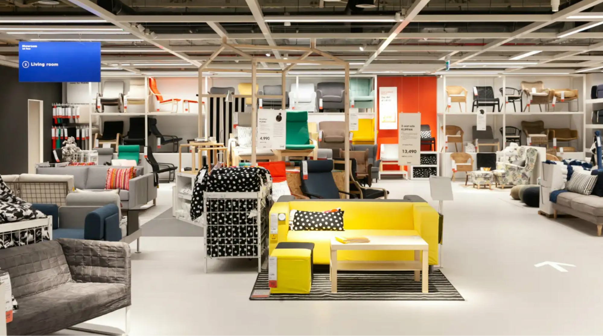
For an example of how big brands put these ideas into practice, let’s look at everyone’s favorite Swedish furniture store, IKEA.
The Scandinavian style of clean lines and natural wood are a minimalist’s dream. But this is contrasted by the pops of color all around the showrooms. Often, these are props like clothes hanging in a wardrobe that aren’t even for sale.
One reason why designers do this is to create a sense of excitement, putting customers in an emotional state where they want to buy more. Remember how you felt as a child in a toy store? You get to resort right back to that feeling in IKEA, except this time, you have your own adult money in your pocket.
3. Typography
Many decisions are made about a piece of text before it gets published, probably more than you realize.
You may look at a magazine, book, or website and appreciate the size of the type and the colors that make it legible. But have you given much thought to the use of letter case, font styles, or kerning before?
These characteristics, and others we’ll explore soon, combine to make an art form known as typography. This is the technique of arranging text for effective communication with audiences that maintains a brand’s identity. But to use this idea as a minimalist, there needs to be a focus on an aesthetically pleasing, simple, and functional composition.
Below are some conventions of minimalist typography you need to consider before you get started:
- Easy-to-read typefaces/fonts, such as Sans-serif
- Plenty of line spacing
- A lack of visual distractions on the page
- Ample whitespace
- One color is typically used across all typography elements
- A clear contrast between the text and the background
Aesop is the perfect example of this design element. The Australian brand is a skincare specialist that creates a “sensory pleasure” through high-quality products and ingredients.
Why is this promise an important part of the company’s identity? Most people with a beauty regime agree the process is a time for relaxation and clarity. Dr. Sanam Hafeez even compared it to “Any other form of self-care”.
For this reason, it was important for Aesop to show potential customers it could deliver an experience that emphasized stress relief and luxury. They found that minimalist graphic design was the best way to do this.
The stylistic choice to use quotes is fascinating. It shows how thoughtful Aesop is with its branding, which is a staple of minimalist thinking. The words provide consumers with educational value and engaging storytelling without overwhelming the design.
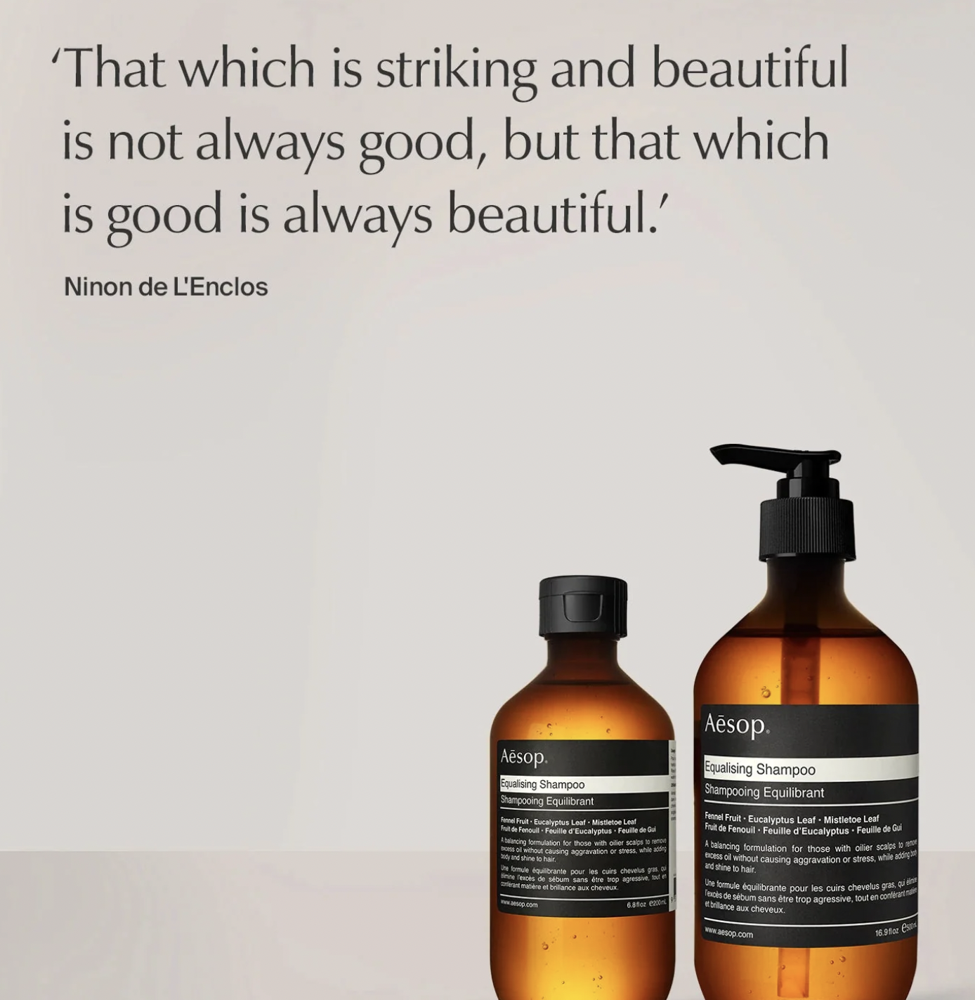
The way the luxury brand can achieve this is through careful typography. Plenty of space is given between the product image and the text, which gives the reader breathing room as they digest the information, creating a sense of calm. This is also achieved by the way the typeface of the quotation matches the product design, establishing visual clarity.
4. Graphic design
Graphic design is a crucial part of any branding strategy. It visually communicates messages and information to consumers, which when used effectively, can be much more dynamic than lots of text.
But these visual assets are usually bright, decorative, and imposing to attract the consumer’s eyes. Surely this goes against everything minimalists stand for?
We understand why you might think this, but it isn’t the case at all. Even the most famous minimalist brands incorporate graphic design into products, applications, and marketing materials. In fact, of all businesses, only 19% weren’t on the bandwagon in 2022.
So, if you do decide to join in with the trend, don’t neglect graphics because of common misconceptions. That could be a big mistake. Instead, simply apply different design principles to get the same outcome.
Below are some of the ways you can add visual appeal and still maintain minimalist ideas.
- Be selective with color but use it to pack a punch when necessary
- Avoid design trends you think will come and go quickly
- Use photography when it’s striking, not to fill a gap in a design
- Interactive elements can be engaging, but make sure they’re smooth
- Use negative space to direct focus instead of doing it with busy designs
Getting the right balance can be tricky. So, let’s look at a brand who knows what they’re doing. Warby Parker is an American eyewear company that offers everything from sunglasses to contacts, and eyeglasses. Founded by students, it prides itself on being an affordable, and simple option for those looking to jazz up prescriptions.
To go with its transparent, fashion-forward image, Warby Parker adopted a minimalist approach to their branding. Shall we see how this translates into graphic design choices?
Focusing on the website, you’ll see it is mostly white and gray with shades of blue. Warby Parker makes its graphic elements an eye-catching detail on their minimalist page by designing them in this pop of color. However, because they don’t take up much space and remain consistent with the color scheme, it captures attention in the right way.
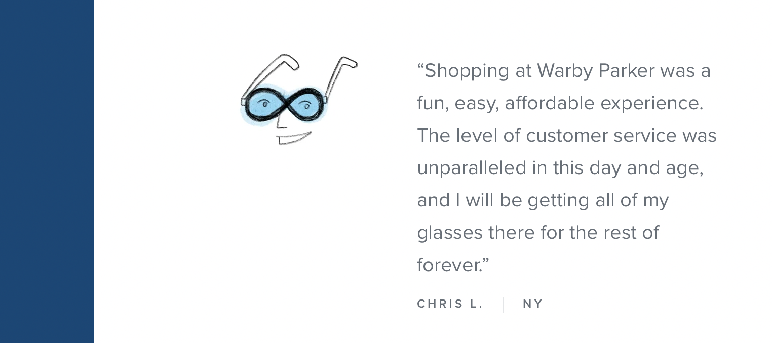
Also, by incorporating original and hand-drawn elements, the brand effectively conveys its fresh approach to the eyewear industry. This facilitates customer connections without the need for excessive information or dense explanations.
5. Social media
Social media is overflowing with strong opinions, funny videos, and selfies. And this isn’t even half of what goes on. Of the 77% of businesses with their own channels, many will replicate this chaos because they think it helps them be more relatable and personable.
But the truth is, channeling minimalism can do this much more effectively. When you don’t bombard your audience, it becomes easier for them to interact with your content. Having these meaningful conversations with followers is the best way to humanize your brand.
Here are ways you can apply minimalism to your social media presence:
- Choose the right platforms: Your business doesn’t have to be everywhere at once. You’ll lose consistency and value if you try to juggle too many platforms. Instead, research which are preferred by your target audience and spend time building a presence on those.
- Produce high-quality content: Often businesses will feel the pressure to post frequently. But consumers much prefer quality over quantity. Share content that is engaging, informative, or curated to match perfectly with your brand identity.
- Advertise with care: Promotional content can be jarring for your audience, especially if it interrupts the experience they’re having on your social media page. To avoid this, keep ads consistent with your branding, convey a simple message, and give every element a clear purpose.
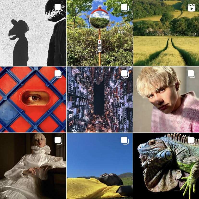
We had to make the minimalist tech giant Apple an example somewhere in this article, and for us, its advertising on social media is really what stands out.
While some companies fight for a place in the spotlight, Apple is noticeably quiet. Despite having millions of followers on X and Facebook, consumers won’t find any posts to look at. Instagram is where the magic happens, and yet it might not be what you expect.
Despite the brand’s white and gray aesthetic, its feed is filled with colorful images taken on iPhone products. Interestingly, you won’t find any posts that Apple has created itself as everything is user-generated content (UGC) from customers or partnerships.
This fits into the minimalist aesthetic in two ways. Firstly, despite not posting in black and white, which may be more conventional for Apple’s brand identity, the lack of ads makes the space look clean and uncluttered. Secondly, the company only showcases how its products enhance the user experience, which is a core part of its mission and values.
Time to simplify your branding strategy?
Many people mistake minimalism for a lack of something. But it is what remains that matters. Having a solid understanding of these guiding principles will help you make meaningful design choices, whether you choose to rebrand or not.
At the end of the day, the decision is yours to make. Hopefully, we’ve shown you that, in the chaos of a competitive market, minimalism could be how your business cuts through the noise and leaves a lasting impression on an increasingly desensitized audience.