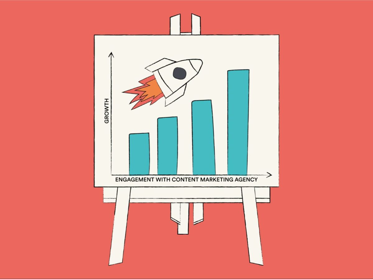

As much as we try to deny it, no one has the time or attention span to slog through data-heavy reports with percentages going in one ear and findings going out the other. Humans are inherently visual and can process images 60,000 times faster than text.
To harness this gift, it’s time to leave reports for the filing cupboard and put infographics in center stage. Information should be engaging, accessible, and tell a story. This makes them easier to share and, therefore, a powerful content marketing strategy.
But where do you begin? What information do you use, and where do you use it? Don’t panic; this article will be an infographic design guide to everything you need to know. Afterward, your mind will be brimming with exciting new ideas just waiting to be seen.
What is an infographic?
Before we begin, let’s cover the basics of an infographic. It is simply the term used when any data, whether it be qualitative or quantitative, is represented in a visually appealing way.
You are likely familiar with line graphs, visual content such as this is an example of data being displayed visually instead of strictly through text. Infographics take many forms and tend to be more creative and graphic design focused than the humble line graph in this example.
They are designed to be engaging and provide audiences with information in seconds. They are so successful at this that users share and like infographics three times more than any other type of content.

What makes a good infographic is one that is visually engaging, presents information clearly, and conveys a compelling message. This is just the tip of the iceberg, though. To learn more about the magic of infographics, come with us as we cover the different types.
The 10 different types of infographic
It may baffle you, but some say there are loads of infographics out there of various types, but before you get too overwhelmed, we will look at the top 10 you will frequently come across – even without realizing it.
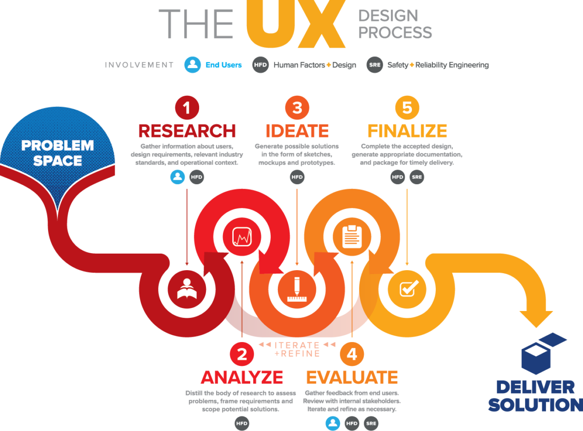
1. Process infographic
Let’s start off with the process infographic; this data visualization walks you through a process of something step-by-step, making it much easier to follow. Each step is broken down into bitesize chunks that make even the most complicated subjects more accessible to people from all backgrounds and knowledge levels.
Process infographics are best for tutorials and training new employees. In addition to this, for explaining to clients how you intend to conduct business. It doesn’t necessarily matter what industry you are in; if the subject is quite a niche or confusing for the average person, a process infographic is your best bet.
As an example of a process infographic, here is one explaining the steps of user experience (UX) design.
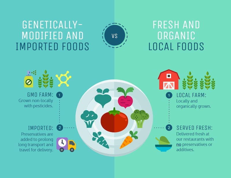
2. Comparison infographic
Comparing things usually consists of many bullet points, lists, and tables, which can get a bit messy. However, with a handy dandy infographic, everything is tied to get other with a neat little bow.
Whether you are comparing two or more things to one another, a specialized infographic allows for a seamless presentation that even beginners can follow. Really understanding where things differ is important when educating an audience or when convincing them to change their mind.
Below is an example of a comparison infographic demonstrating the difference between genetically-modified and imported goods to fresh and organic local foods.
3. List infographic
We can all agree that long lists can be a slog to get through, especially when it feels like it goes one ear and straight out the other. Well, infographics are here to make lists fun and memorable with bright colors and engaging images; lists have never been so exciting.
Use infographics such as this when summarizing a big info dump to accentuate the important parts. They are great for quick scanners who don’t have the time to delve deeper into the subject.
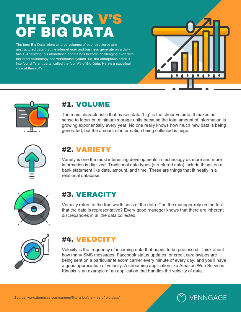
Here is an example of an infographic listing the four V’s of big data.
4. Resume infographic
Creating a resume is a rite of passage for those looking for a job; it sounds easy enough, just list your experience, skills, and education – but in reality, this won’t get you very far, especially with ever-increasing competition.
So, what more has to be done to create a resume that catches your attention and gets you that interview? Using a special infographic will make you stand out with creative graphic design elements, and your resume will be a joy to read.
However, with resume infographics, the design choices must be appropriate for the role. For example, you have more liberty to add some quirkiness for a creative illustrator role, but for a job in the fintech industry, it’s best to keep it sleek and simple.
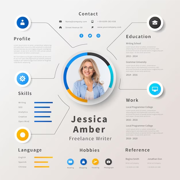
Below is an example of a resume infographic for a freelance writer.
5. Map infographic
You can probably guess what this type of infographic entails; it covers statistics, demographics, and geographical data, whether worldwide or in certain areas. They are extremely useful for creating connections and seeing the big picture. Map infographics are also very versatile and vary in detail.
Map infographics can be used in almost any context, as long as it is appropriate, for example, a fashion company showing how particular clothing is more popular in warmer climates. Or a transport company illustrating their most popular routes.
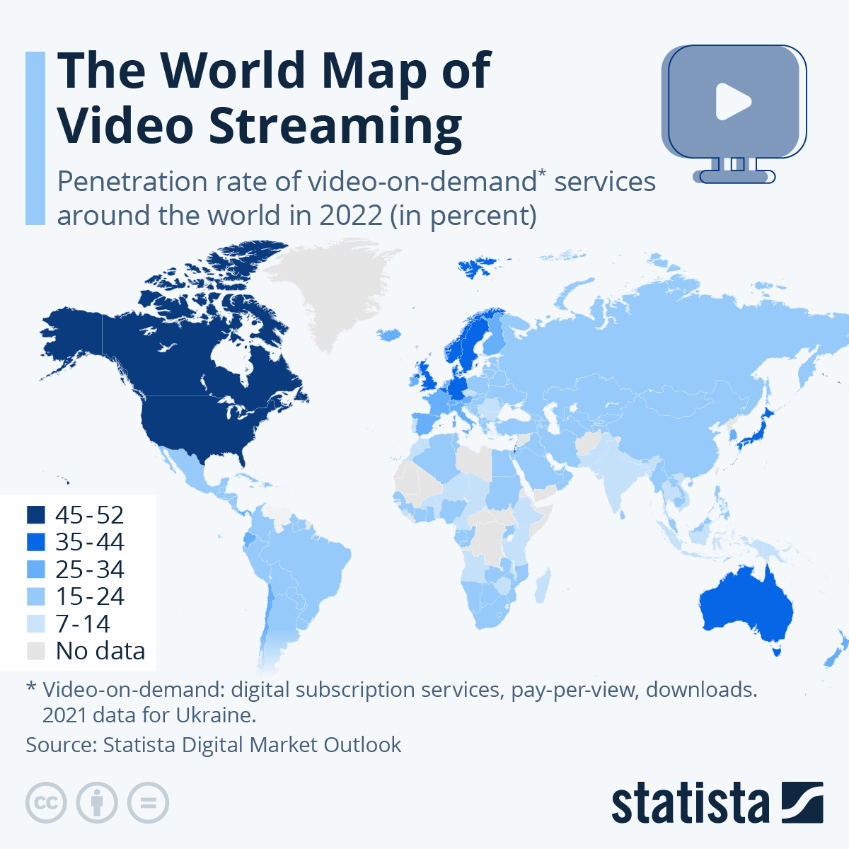
Here is an example of a map infographic; it represents the popularity of video streaming.
6. Informational infographic
We know what you’re likely already thinking; ‘Aren’t all infographics informational?’ The answer is yes; in some ways, they all are, but this variation differs because it is reserved for the most complex information. Then, it turns into digestible information that only takes seconds to understand.
They are typically used by technical subjects that must engage readers from all knowledge and experience levels. Not many people enjoy dense paragraphs filled with jargon and statistics that frankly mean nothing to us, so informational infographics are an absolute must.
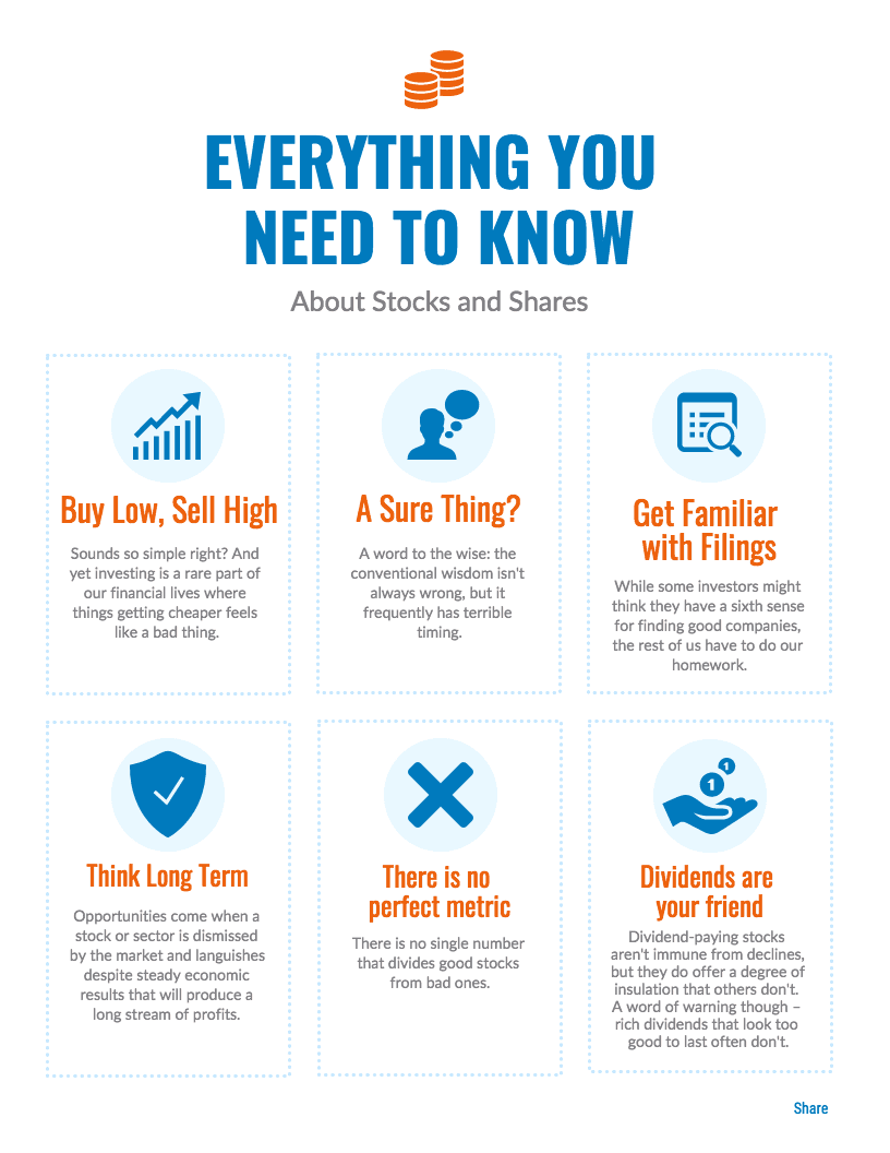
Below is an example of an informational infographic; it breaks down the in-depth complexities of stocks and shares.
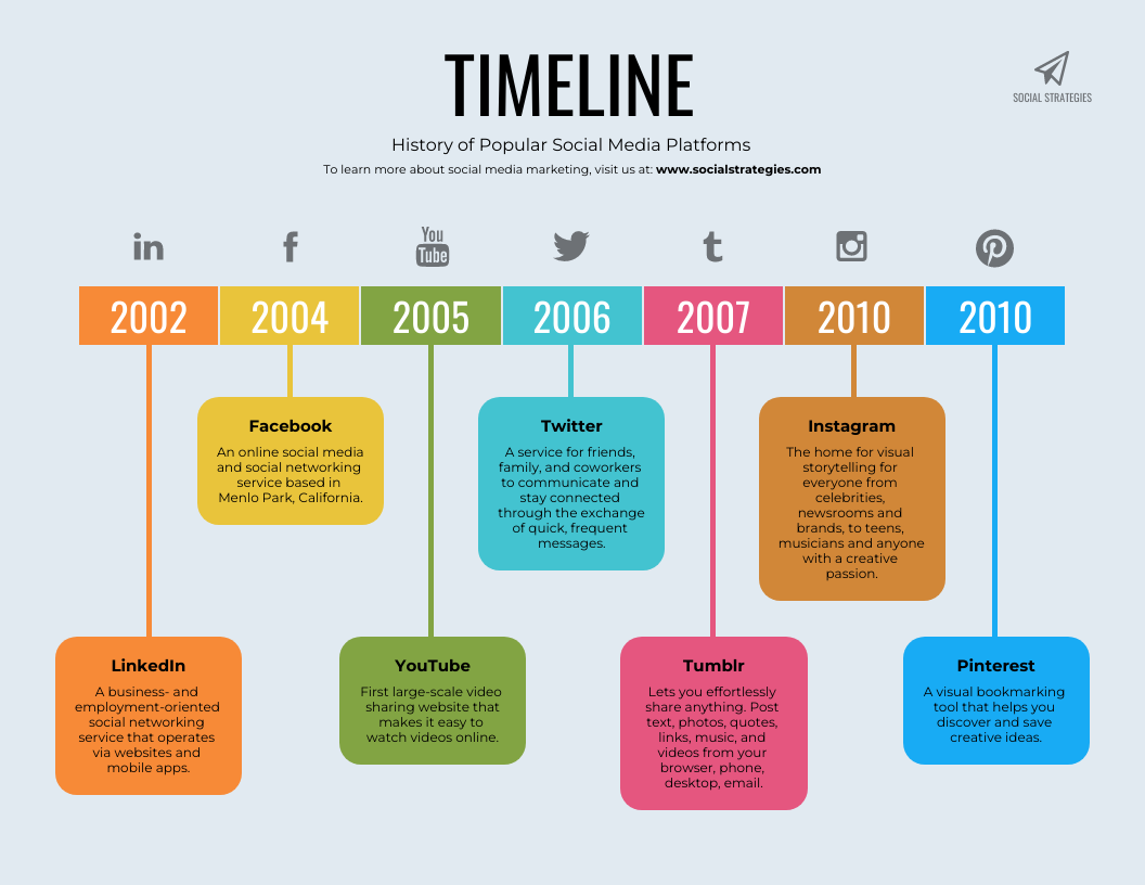
7. Timeline infographic
When dates and times are involved, things can get quite blurry. That’s why timeline infographics were created, making the journey easy to follow while pinpointing important events during the progression.
Timeline infographics can be used for anything, as long as it has evolved, whether long or short. Important historic journeys will typically be presented through a timeline demonstrating birth, battles, deaths, etc. As well as this, it could be the development of a product over weeks or months or the journey of a company from when it was founded to where it is now.
Here is a timeline infographic illustrating the history of popular social media platforms.
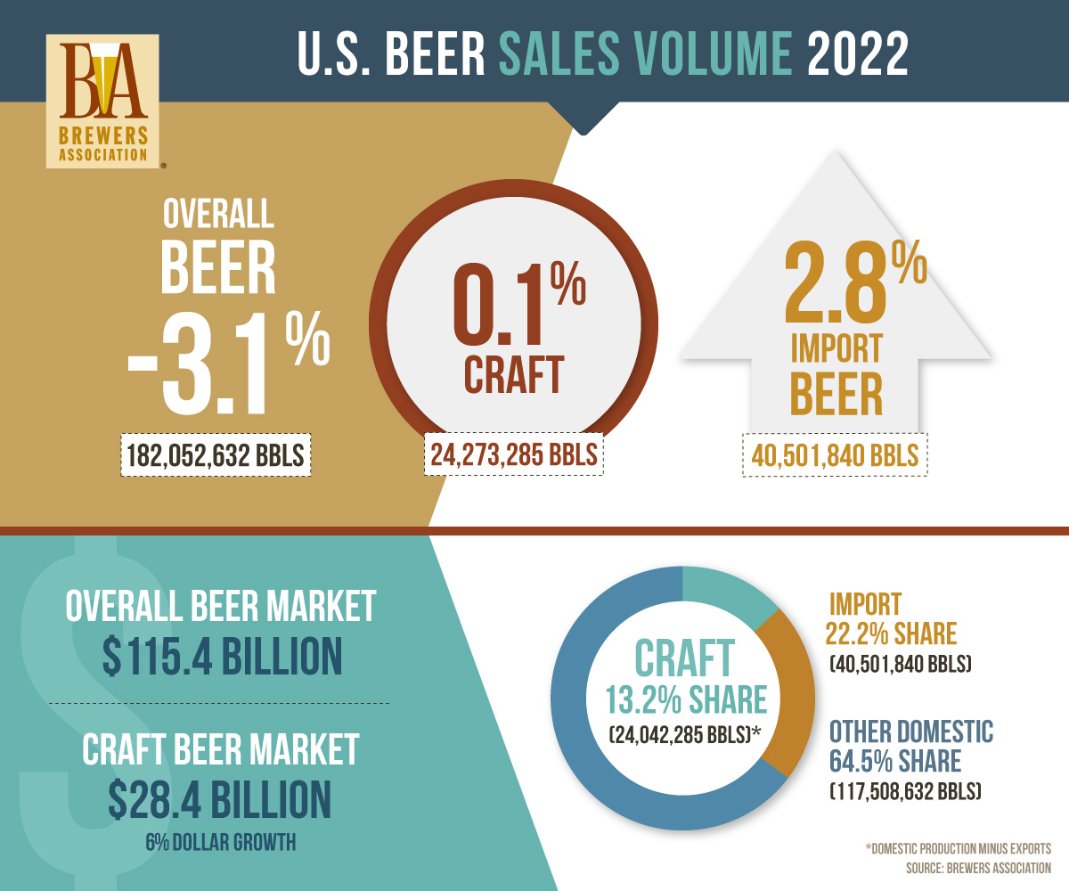
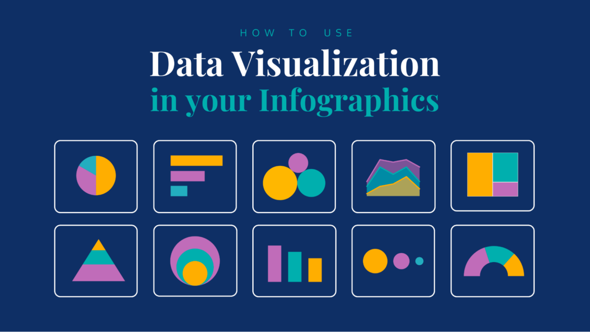
8. Statistical infographic
Pie charts, bar graphs, and other ways to present data are the star of the show in statistical infographics. With number-heavy data, simply listing it gets repetitive, boring, and ineffective, but putting it into an infographic gives it a new lease of life.
The perfect opportunity to use statistical infographics is for representing survey results, with important findings being highlighted with bold colors and design elements. This way, understanding the statistics and their meaning is much easier and comes together to paint a bigger picture.
Below is a statistical infographic about beer sales in the U.S.
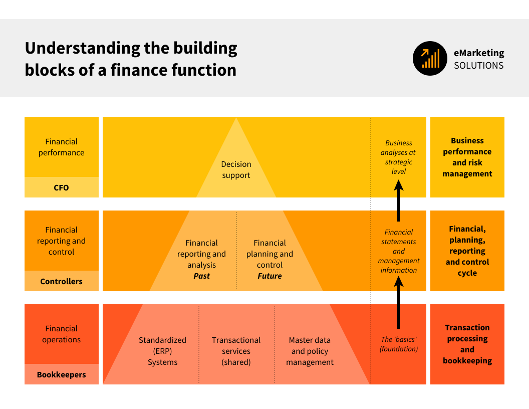
9. Hierarchical infographic
You have likely heard of Maslow’s Hierarchy of Needs, a psychological theory that arranges human needs into a pyramid, with the most basic at the bottom and higher-level ones needing to be fulfilled before progressing to the next layer of needs that are not as critical.
This same structure can be used in numerous other instances to represent the order of importance. They can be various shapes but are typically vertical pyramids to mimic the one that started it all back in 1943.
Here is an example of a hierarchical infographic that shows the building blocks of a finance function.
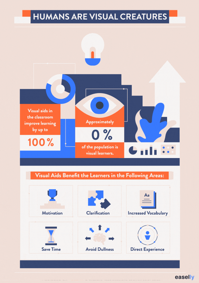
10. Interactive infographic
This is where infographics take it up a notch and get even more engaging. This interactivity can consist of visual elements such as triggered animations or quizzes and external links. To summarize, they look a lot like a typical infographic included in this list, but with an added ‘oomph.’
Creating an interactive user experience makes information more impactful as their brains will be less inclined to scan over it. With the added element of a quiz to test their knowledge on the subject, retention will increase tenfold.
Here is an example of an interactive infographic expressing how humans are visual creatures.
What information should you put in an infographic?
So, now that you’re aware of how many forms an infographic can take, how do you know what information to use and where to use it? Luckily, we are here to answer this question and break down how to make the data you care about present itself to make an impact.
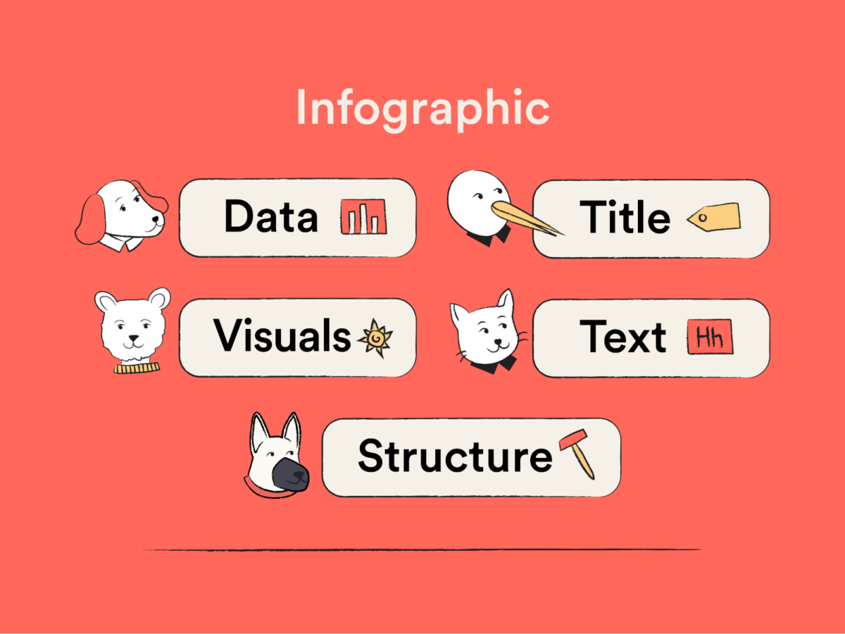
Data
Naturally, we need to know what data to put in an infographic. Don’t rush this, as this is the very foundation of the infographic. If the information is outdated, unreliable, or frankly not very interesting, no matter how pretty it looks, it’ll be deemed ‘meh.’
As we have covered the different types of infographics already, it will make much more sense what ones are better suited to which data.
Here is a rundown of data effectively presented in infographics:
- Statistics: Represented in statistical infographics, quantitative data such as percentages, counts, and ratios are best portrayed through charts and graphs.
- Survey results: This is much like statistics but leaves room for creativity outside of charts and graphs. Infographics can highlight trends, preferences, and opinions from the findings.
- Research findings: If you have conducted thorough research on a subject, using an infographic to wrap it up with a pretty bow makes it accessible to a wider target audience.
- Geographical data: Data related to specific locations is ideal for map infographics. It could provide regional or cultural insights.
- Comparisons: Use comparison infographics to present data in a comparative format to accentuate differences, similarities, or pros and cons between options or scenarios.
- Historical data: You can use a timeline infographic for historical data to show changes over time and important milestones. This could cover anything as long as there has been development over time.
- Workflow data: As seen in procedure infographics, workflow data explains processes using simple steps, illustrating each stage and its importance.
Title
Every infographic needs a title or header. It gives context to what is represented and is a great opportunity to grab attention. It should be clear, concise, and with an element of intrigue. The title is where first impressions of your infographic are established, so you only have seconds to get it right!
To create the best title for your infographic, follow these tips:
- Be clear: Avoid filler words and get straight to the point; what is the infographic about? The main message should be conveyed in just a few words without being too vague.
- Keep it short: Titles must be short; any longer and they lead to boredom and confusion, which doesn’t bode well for the rest of the infographic. Also, from a design point of view, it can look visually overwhelming.
- Make it visually appealing: A clear, eye-catching, and easily readable font is the best choice for infographic titles. It should also match the rest of the infographic’s style and color palette.
Visuals
Perfect, your title is punchy, and your data top-notch, but how do you make it visually appealing? This is where the magic of infographics happens; visuals enhance storytelling, making for a more compelling and emotionally impactful infographic design.
How your infographic looks is totally up to you, but certain rules will make it most effective:
- Clear: As fun as graphic design is, don’t get too carried away with different fonts, colors, and images. This only creates an overwhelming viewing experience, drowning out the information.
- Relevant: Only use images and icons relevant to your topic. They should only be there to enhance a point, not just to fill a blank space.
- Eye-catching: Use a color scheme that grabs attention and stays consistent throughout the infographic. Fonts should also be eye-catching; switching the font up to accentuate some points is good, but don’t go too crazy, as it will look messy and incohesive.
- Accessible: Infographic visuals should be accessible to look crisp and clear on all device screen sizes and qualities. Shrunk down, blown up, or in black and white shouldn’t matter to an infographic.
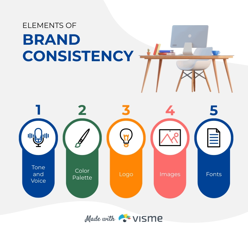
- Brand-consistent: Use visual representation to fit in with your brand recognition. For example, if your brand has a red color theme and logo, play this into your infographics so that viewers know almost immediately that you are behind the top-notch content.
Text
Finding an infographic that presented information using nothing but graphics would be a real challenge. Text is vital to communicating the main message and engaging audiences. But, if you add too much, it pretty much negates the whole point of an infographic.
So, how do you know what to say and how much of it? Here is what makes for effective infographic text:
- Concise: The text should be brief and to the point without missing any key points using short sentences or phrases.
- Informative: Keep the text informative and relevant to what is covered in the infographic. Don’t use text to repeat what the image has shown; instead, provide expand on it with valuable insight.
- Credible: You need to back up your infographics with legit sources, whether from your original research or others. It is paramount that any information is accurate as it can be very damaging and misleading if not. Site sources to remain reliable and transparent, as well as copyright compliant.
- Legible: Because infographics must be adaptable to various screen sizes and sight abilities, they must be easy to read. This can be achieved through color, font, and spacing.
Structure
Finally, now that we have all the elements of a brilliant infographic, we have to ensure it flows together. We want to take the audience by the hand and lead them through the infographic like a museum.
Infographics tell a story, and stories have a beginning, a middle, and an end. Here is a basic layout that all effective infographics should follow.
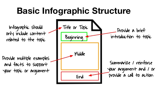
Here are the best tips and tricks for structuring your infographic:
- Natural flow: The content should be top-to-bottom or left-to-right, aligning with the audience’s natural reading patterns.
- Group information: Arrange related information into sections to make the infographic cohesive. This also prevents the reader from jumping around and getting confused.
- Create focal points: You likely have some super interesting or exciting key points you want people to know; these should be the focus as it makes infographics memorable. You can draw attention to them by leading them there visually with arrows or flowcharts and making them pop with color and fonts.
Best tools for creating infographics
It’s no longer a mystery of what information to put in your infographic, but how exactly do you create one? Sure, you can use your graphic design prowess in Adobe, or if you’re new to the land of infographics, a beginner-friendly software that makes information well and truly pop.
Here are some of the best infographic tools, especially for beginners.
1. Canva
We start this list with one of the most user-friendly infographic makers you could ever hope for. Canva has a free plan provides numerous infographic templates that remove a lot of difficulty when deciding what shapes, colors, and structures to use.
All you need to do is drag and drop the elements you want into the project and customize away to your heart’s content from there! If you fall in love with Canva, a paid subscription provides even more templates, images, and design tips for when you get stuck. Canva isn’t limited to infographics; it can take care of almost all graphic design tasks.
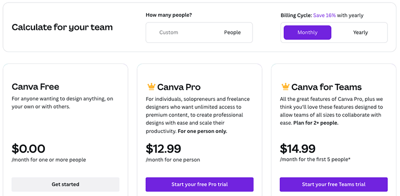
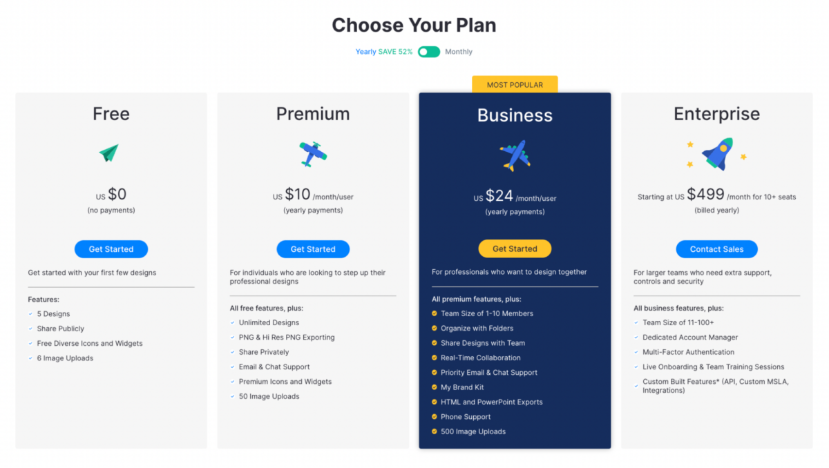
Here is Canva’s pricing plan; you can see it can be customized to fit teams for the best value.
2. Venngage
Venngage is another great tool for beginners. Its user interface is very easy to use and showcases many different templates just waiting to be customized to fit your vision. The online platform can do anything from charts, icons, or reports; you can try it out for free!
As well as being a great infographic tool, Venngage has lots of inspiration and resources to get your creative juices flowing. What’s better, if you are having trouble, you can ask for help from their 24/5 priority support team.
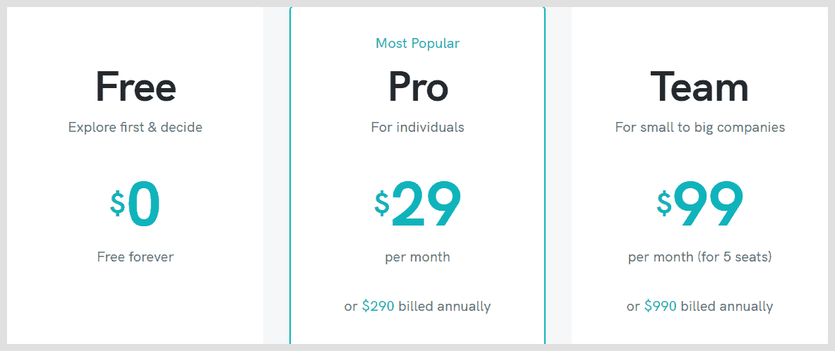
Below you can see Venngage’s pricing plan, ranging in price points and features.
3. Piktochart
To make an eye-catching infographic in Piktochart, you can simply copy or link your data from a boring old spreadsheet and paste it into the graph maker. To go that one step further, you can also create interactive maps to make data really come to life.
Whatever type of infographic you have in mind, whether statistical, process, or hierarchical, Piktochart can make it with numerous high-quality templates at the ready.
Like the other tools on this list, you can get started for free before committing to a subscription.
Putting the ‘info’ in infographic
All in all, we know and love infographics for their appealing and engaging way of presenting data. It makes even the most mundane things really interesting, and that is an incredible feat.
But you can’t just make any old graph with squiggly lines around it and call it an infographic; it has to be worthy of its name. This is done by following guidelines of what information goes into it and how it is best presented.
These tips and tricks are there for a reason; they work! If you stick to them while making the infographic your unique creation, the information it carries will reach the masses like never before.