
Have you decided to finally bring your healthtech startup into the market? Congratulations! There’s nothing more exciting than the first steps of a business venture.
But launching a new company can be as overwhelming as it is thrilling. Approximately 10% of startups in the US fail within their first year. To make matters worse, those in the technology industry have the lowest success rate.
Don’t worry, because hope isn’t lost yet. You can set yourself up for success at the very beginning of the process when you make smart branding decisions. Let’s discuss the most important components of a brand and what you need to think about to make them great.
Why is healthtech branding so important?
Technology companies in the healthcare industry work to improve patient care and experience across assessment, diagnosis, and treatment. To achieve these goals, software, hardware, and tools are developed. Below are some innovations we’ve seen.
- Improving mental health care
- Producing cutting-edge clinical trials
- Streamlining drug development with biotechnology
- Creating wearable medical devices
- Digitizing patient data
- Making customized plans for health insurance
- Optimizing therapeutics to better treat chronic pain
- Delivering data-driven health plans
- Enabling the automation of health systems
- Predicting patient outcomes with machine learning algorithms
These advancements show just how important the industry is. Like the ones above, every part of the healthcare system is essential to our lives. As such, we want to know we’re in good hands. That’s why it’s dependent on an ecosystem of reliability, trust, and expertise.
Great branding makes it possible to showcase these qualities. It proves a business has a strong foundation to deliver high-quality products. Also, consistently designed assets create familiarity, which is fundamental in forming emotional connections with audiences.
1. Create a human-focused visual identity
Many people consider visual identity the main ingredient of any business. So let’s begin our branding journey there. Spoiler alert: an aesthetic logo is just the beginning.
Visual identity involves developing elements of your brand that echo what you want customers to think about you. If you want them to feel you care, speak to their hearts.
Here are our best practices so you can get started.
Emotive color palette
Color has more influence on us than you might think. There’s a reason why many fast-food chains use red and yellow. And why luxury brands tend to stick with black. The pattern can be seen with healthcare companies, too, who often use a combination of blue and white.
This all comes down to psychology. Research has shown that the palette you use affects the perceptions and behaviors of those who see it.
For example, up to 90% of first impressions are made based on color. Many of the companies above would’ve made their choice because white makes us think of cleanliness and blue is associated with loyalty.
Putting this into practice will help make your brand connect with customers on a deeper level without them even realizing it.
You don’t have to stick to conventions, but remember your color choices send a message. For instance, red portrays confidence but also danger. Not the best idea for a business in the health and wellness market, is it?
According to Color Graphics, here are good color alternatives, along with their meanings.
- Orange: Warmth and success
- Green: Health and growth
- Pink: Relaxation and kindness
- Yellow: Happiness and hope
- Brown: Security and dependability
Authentic imagery
Brand imagery is everywhere we look; on emails, advertisements, websites, and social media platforms. Businesses know they capture our attention quicker. But if you want to keep your audience around for longer, choose your visuals carefully.
For example, something related to your consumer’s experiences and emotions is much more effective than something posed and staged. When was the last time you saw a stock image and felt something? Probably never.
Here are some ways you can elevate your brand imagery.
- Choose high-resolution images. It doesn’t look professional when an image is blurry or hard to read. Even on a budget, you can find quality photography. Try looking at free websites like Unsplash or Pexels.
- Use the people around you. Genuine moments with patients or employees (with consent, of course) in an environment they’re familiar with are much more natural. Plus, you won’t have to hire models, making this a cost-effective method.
- Conduct audience research. When you understand the demographic attributes and tastes of your ideal customers, you can design with them in mind. The best way to gather this information is through focus groups, A/B testing, and surveys.
- Try to craft a narrative. Storytelling is an easy way to appear authentic. Set a scene, use props, and embrace moments on camera that aren’t perfect. You could even create a sequence of visuals to make a cohesive narrative.
Let’s look at Huma as an example. The UK-based healthtech company provides personalized care through at-home and cloud-based hospital services. Their product puts humans first, demonstrated through their choice of imagery.

Instead of opting for generic stock photos or borrowed images, they create their own. These say a lot about Huma’s brand. For example, it emphasizes the personal approach to healthcare services they promise. In-house graphics also show a company values visuals that specifically represent their identity, making them appear more authentic.
User-friendly typography
In Robert Bringhurst’s book, The Elements of Typographic Style, he describes typography as a system based on “the structure and scale of the human body.”
Like our body parts, text should come together in a flow of different appearances, sizes, and proportions. If every one of us looked identical, things would start to get confusing. By arranging content in this way, it reads more naturally and appeals more to audiences.
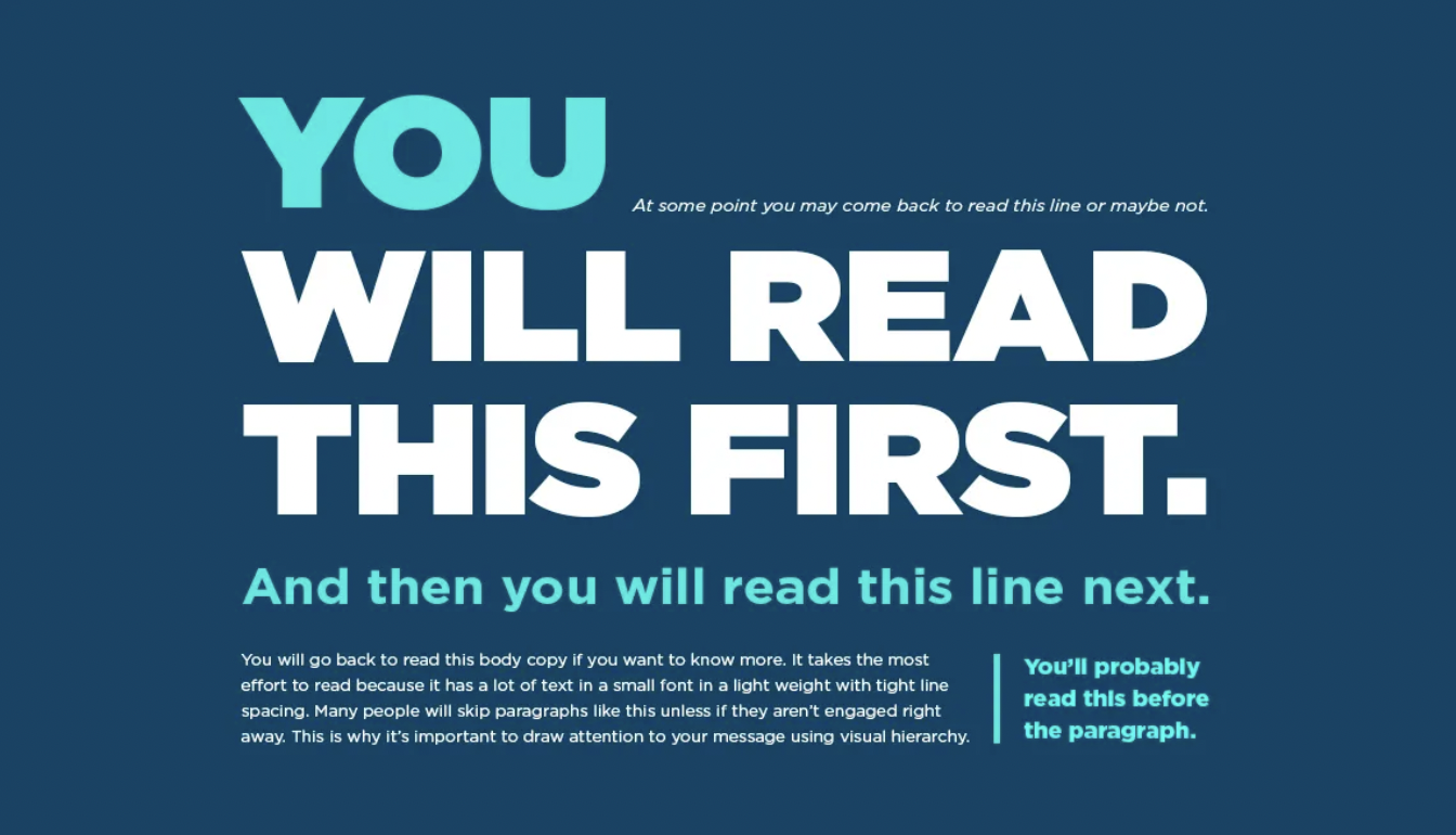
Let’s translate this philosophical idea into some typography top tips.
- Mix and match. Have an interesting (but readable) typeface for headings and a more practical option for body text. This contrast will catch the reader’s eye and create a sense of depth. Try to avoid any more than two or three fonts.
- Make the most of white space. White, in many cases, is easy on the eyes and a break from being overwhelmed. When you apply this to typography, white space can be a tool for emphasis and clarity.
- Avoid multiple font colors. Colors make your words pop, but too much can be jarring for the reader.. But a lot of different colors will become jarring for the reader. It’s better to let your images be the embellishment and avoid unnecessary headaches.
- Always use paragraphs. A clunky, never-ending content structure guarantees no one will read all of it. Breaking text into manageable and readable chunks will encourage the user to stay engaged and retain the information.
Memorable logo
Sure, the success of businesses like Nike, Apple, and Coca-Cola was down to many factors. But there’s no denying their logos were a significant contribution.
These three brands know how to nail a logo. Each design ties into brand identity rather than the product itself. For example, Nike’s “swoosh” looks like a checkmark and links to their “just do it” messaging. This is much more creative than a picture of a trainer.
The trick is to remember that a logo is more than just a company’s name. It acts as a visual identifier, a promoter of what your brand does, and a signal of professionalism.
Let’s look at some of the other ways you can make a lasting impression.
- Ask the people who know best. Your employees and existing customers have perceptions of your brand already. In interviews, focus groups, or surveys, ask them to describe things like the personality, voice, and concept of it. Consider applying whatever stands out the most to the design.
- Keep it simple. Think back to the champions of branding. They knew a minimalist logo would be easy to remember, replicate, and scale. We suggest making a mind map that encapsulates every part of your company to narrow down some possible visuals.
- Do competitor research. Look at both the market leaders and your direct competition in the healthtech industry. Find out what your audience likes and use this to form the basis of your design. This doesn’t mean copying someone else’s logo, but instead inspired by visual elements like imagery and concepts.
- Use your unique selling point (USP). Tapping into what your brand does best will help you gain originality. The furniture brand IKEA, for example, uses the colors of the Swedish flag to represent the culture and values they’ve taken from their roots.

2. Develop an accessible website
Whether your target audience is a medical professional or their patient, an accessible design is essential.
The design of your website needs to be functional for everyone to eliminate barriers to healthcare and give everyone equal access. If it isn’t, users will become frustrated and perceive your brand negatively overall.
Let’s look at the considerations often overlooked in the branding process.
Inclusive color
For many customers, a website is their first introduction to a brand. For that reason, many businesses use tactics like images, videos, and call-to-actions to keep them around for longer. However, a survey showed that, regarding visual elements on a website, nearly 40% of people appreciate the use of color the most.
We’ve already discussed the emotional impact a color scheme can have. But there are additional considerations to make.
For example, certain combinations could make your assets hard to understand or see. Approximately 300 million people have color blindness worldwide, and poor design choices could exclude them from your brand entirely.

Below is a list of the most common combinations that are hard to see with color blindness.
- Green and gray
- Blue and purple
- Red and green
- Green and brown
While these are the ones to watch out for the most, there are more to think about. If you’re worried, companies like New York-based Stark can help. The plugin scans your website with a contrast checker in real time and tells you if it’s inaccessible. You’ll even have an artificial intelligence assistant to make suggestions when something needs fixing.
Appropriate language
When it comes to language, it’s not just what you say, but how you say it. Patients have been known to put off visits to healthcare facilities because of the provider’s bad bedside manner. They feel humiliated, shamed, or judged, often due to a poor choice of words.
You can influence consumers to choose your business if it communicates with them effectively. Not only this, but the right language builds a positive reputation, humanizes your brand by reinforcing your personality, and differentiates you from competition.
Below are some tips to help you make your website a safe space for everyone.
- Avoid words that could alienate or offend individuals.
- Don’t use stereotypes as an example in storytelling.
- Be empathetic and non-judgemental
- Center your content around the user and not the product.
- Aim for gender neutrality.
- Learn the appropriate terminology for all disabilities.
- Understand your audience’s level of medical knowledge
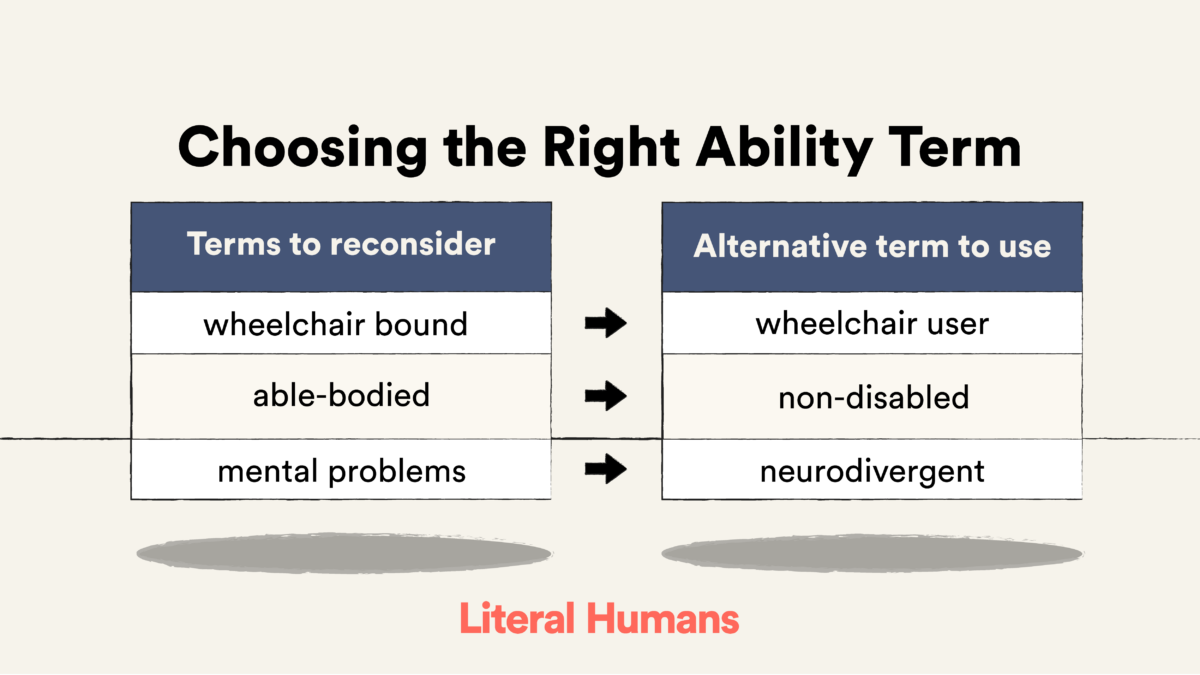
The best way forward is to ask your audience. Of course, not everyone will have the same preference for terminology, but it will give you a clearer idea of what’s acceptable in the communities themselves. Remember, what you read can be well-intended but inaccurate.
Clear accessibility features
The COVID-19 pandemic kept us inside and online. Many of us experienced therapy over Zoom for the first time, making appointments via apps, or getting triaged over the phone. Even when masks were thrown away years later, digital health management remained our reality.
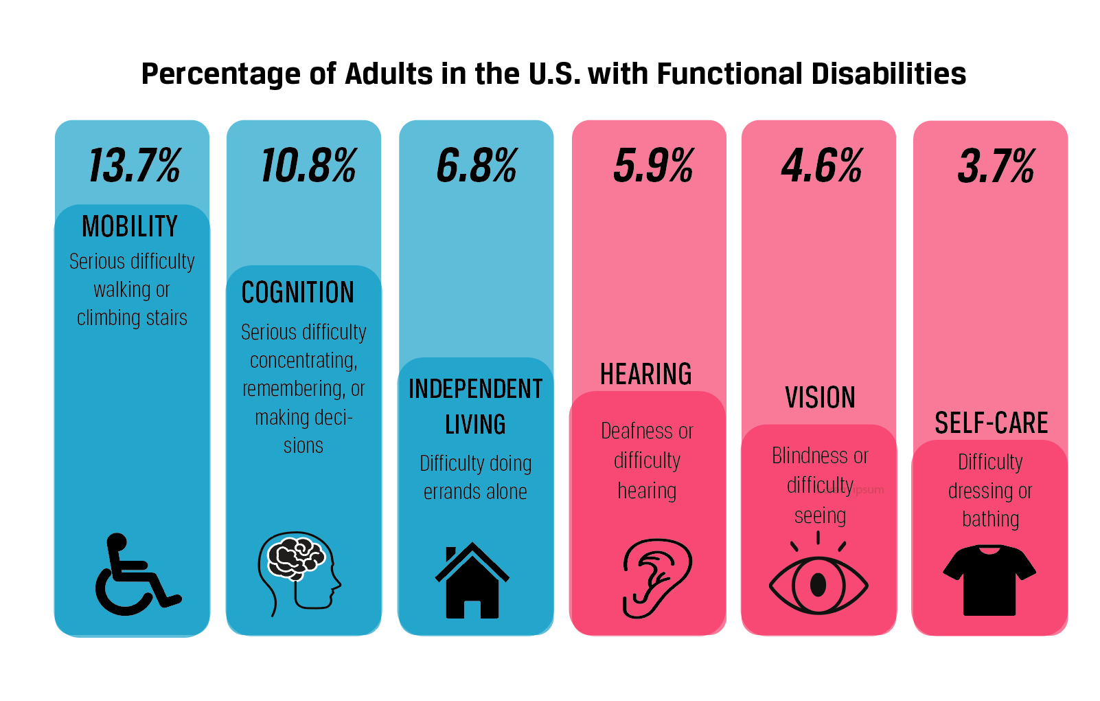
This period proved that healthcare providers can use technology to improve the efficiency, quality, and organization of the industry. However, it also highlights the barriers it creates, such as fear of the unknown and exclusion of older adults due to complexity. Around 27% of Americans have disabilities, and a poorly designed website often neglects their needs.
Healthtech companies can all make small contributions so the transition from physical to digital is smoother. One way this can be done is through the use of accessibility features. These elements help users understand what is happening on the page and make it easier for them to access it.
Here are some features that should be a standard practice when branding.
- Alternative text. This is the written copy used to describe an image or its purpose on your page. Users with visual impairments won’t otherwise have access to your content and can ruin their experience on your website.
- Closed captions and subtitles. Videos are crucial for an effective and engaging website. But people in loud environments, with learning difficulties, or with hearing impairments should also be able to enjoy them.
- Keyboard-only navigation. This setup is something you can’t forget about. It allows anyone with a screen reader, motor impairments, or a broken arm to use your website.
- Size considerations. Don’t make important buttons, links, or headings too small. If users can’t find what they need, they can’t access your healthcare solutions. To improve your page, make it very simple to increase the size of the content.
3. Lean on your purpose and values
The purpose and values of a company are the fundamental beliefs that drive it forward. They will shape decisions, operations, and future plans.
But they are as important externally as they are internally. Customers want to know what a business stands for before they engage. This is especially true for healthcare startups, which are responsible for things like a person’s wellbeing and their private health data.
Incorporating these guiding principles into every part of a brand will make it last. Make sure you remain consistent and action-driven so the admiration doesn’t turn into distrust. Let’s look at how you can make this happen below.
Compelling brand messaging
As a business owner, you probably know exactly what its purpose is and what values you associate with it. But are your audience as clued up as you are? If they aren’t, it’s because you haven’t mastered brand messaging.
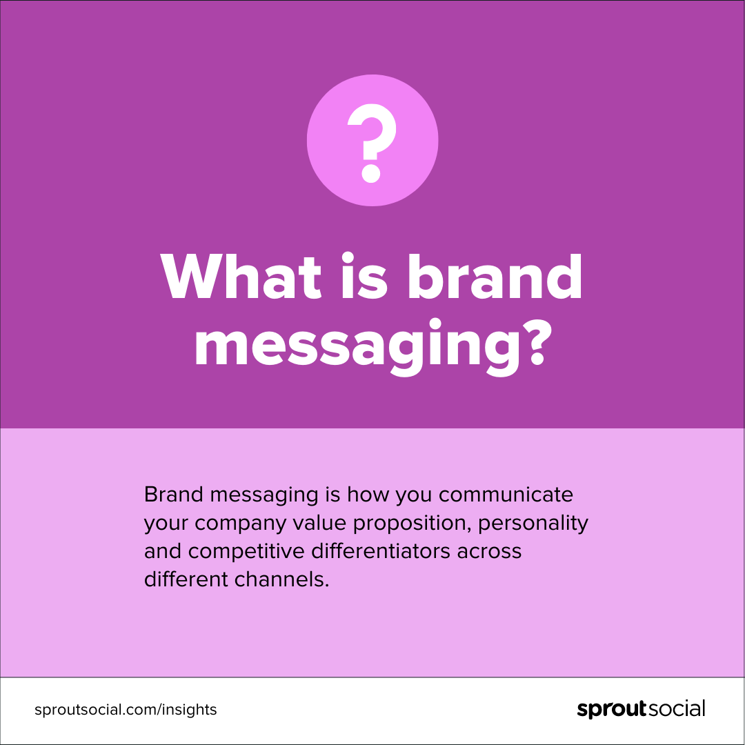
We aren’t talking about a snappy description on the side of your packaging, although that can be a part of it. This tactic is a way of communicating your ethical ideals through various branding assets.
Here are some of the most important components and how to make them yours.
- A unique value proposition. Is there a specific area of study, like behavioral health or life sciences, you’re focusing on? Or have you developed an innovation no one else has brought to the market yet? Whatever it is, use it to your advantage and tell your audience about it.
- A mission statement. This explains a brand’s reason for existing in the first place, what products are provided, and what will happen in the future. Keep this short and sweet, there are other places you can go into heavy detail.
- A brand voice. You can inject some personality in here to unify your tone, messaging, and style. Define your tech company with core characteristics and consider what sort of person they’d be if they were one.
- A tagline/slogan. This short phrase is used in marketing to help the consumer understand a business. Think about the most iconic examples, like L’Oreal’s “Because You’re Worth It.” It’s simple, easy to remember, and ties into the brand’s purpose of creating beauty and with it, confidence.

High-quality educational content
The best content stems from creativity. From branded GIFs to trendy TikToks, the possibilities really are endless. As a tech startup, there’s no reason you can’t be having fun too. Just remember, to create harmony with your purpose and values, educational content should come first.
Providing consumers knowledge beyond how your product works shows a commitment to better health, inclusion, and accurate results. These are some common values shared by brands in the healthtech industry. Educational content lets you stay true to your promises.
And what about purpose? The aim for most of these companies is to leverage technology in hopes of overcoming problems faced by healthcare organizations. Education aligns perfectly with this goal. After all, if we didn’t have knowledge, we wouldn’t have the amazing advancements we mentioned earlier.
So, here are some examples of educational content to get you started.
- White papers
- Newsletters
- Webinars
- Relevant guest posts
- Case studies
- News-related blogs
- Scientific infographics
Powerful customer stories
Would you trust a business that simply said, “We’re the best choice for what you need”? Probably not without some proof. That’s why many tech companies enlist the help of their loyal audience. In other words, they prove their worth with customer stories.
By giving customers a platform to share their experiences, a brand can do things like:
- Validate that they act on their values to have a real-world impact.
- Demonstrate how they will meet a future customer’s expectations.
- Show that they are working on the commitments they’ve made.
Let’s look at GRAIL, based in San Francisco, California. The biotech company uses a team of clinicians, oncology scientists, and engineers to enhance early cancer detection. As soon as you click on their website, there are multiple customer stories to watch.
Like this one. The video below tells the story of Robert, who was told by a healthcare professional he was the “luckiest man he’d ever met.” Thanks to GRAIL’s Galleri test, his symptomless cancer had been found and caught in time for treatment.

The beautiful story focuses on Robert, and how surprised he was to discover he was at risk of cancer. He also mentions how hard the diagnosis was for his daughter and that he now gets to see her graduate.
It genuinely showcases the product’s impact and doesn’t feel like an advertisement at all. We’d give it more than two thumbs up if we could.
Success awaits
Any entrepreneur could tell you that a company is nothing without branding. But if it was so easy, everyone would be successful. As we found out earlier, this isn’t the case.
Everything from the shapes in your logo, the color of your website, and the message you put out into the world plays a part in your success. When you take the time to get it right, your startup can beat the odds and thrive.
If you do utilize the tips and tricks above, make sure you test their performance over time and strive for improvement. That’s how you become a branding champion.