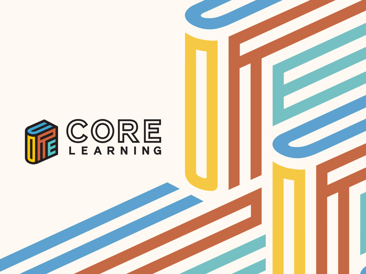
CORE Learning is a US equity-focused educator development organization that provides comprehensive professional learning services to educators so that all students receive high-quality instruction.
In many ways, CORE is a dream client for LH. My background in the US education and nonprofit sectors and our experience working with edtech clients as an agency gave us a solid understanding of their work and target audience from the get-go.
So when CORE told us they were looking for a total brand makeover, I knew we were the perfect agency to help them. Not just because of my background but because I knew our incredible team of designers would be up to the challenge.
CORE is a major player in the US education sphere and has been operating for over a quarter of a century. Rebranding can be an emotional process in such a well-established organization, so we knew we had to take a sensitive, empathetic, and human approach to the project.
Our job was to help the client feel safe while pushing them to make bold choices and involving as many internal and external stakeholders as possible to create a sense of buy-in.
The task ahead was gargantuan: creating a new visual identity and migrating over 600 pages to a fresh-out-the-oven website — while CORE underwent not one but two mergers.
Here’s how we did it.
“I continue to be floored by the thoughtfulness, creativity, expertise, professionalism, and diligence of you all. The most important decision I have made since taking this role just over a year ago was to partner with this team. You are simply incredible. Thank you.” — Clay Willis, CORE Director of Communications
Challenge #1: Reimagining the CORE brand
Before we could get started on the website, we first had to overhaul CORE’s logo and visual identity — and it was quite the journey.
Over the course of several months, the LH design team immersed themselves in all things CORE — its work, current identity, and the message it wanted to convey with the new logo.
Questionnaires, meetings, and feedback rounds with multiple CORE stakeholders helped solidify buy-in so that CORE team members felt included in the process.
Creating a visual brand identity
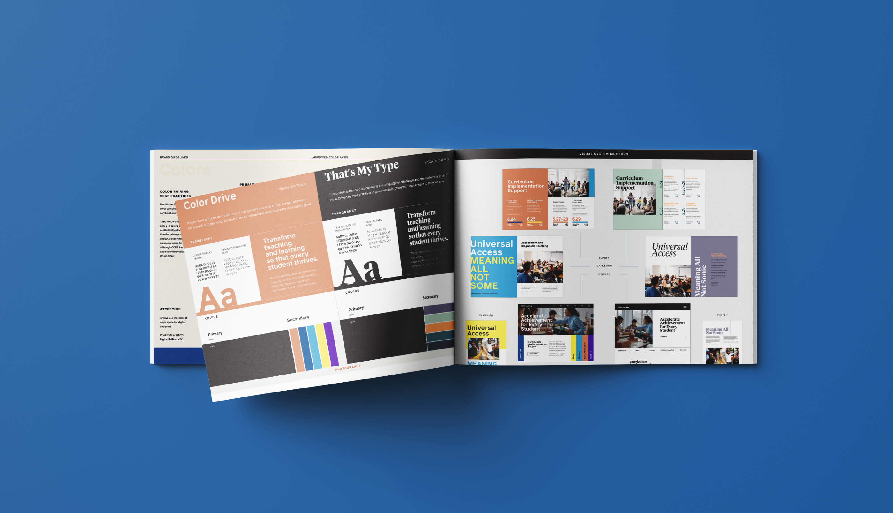
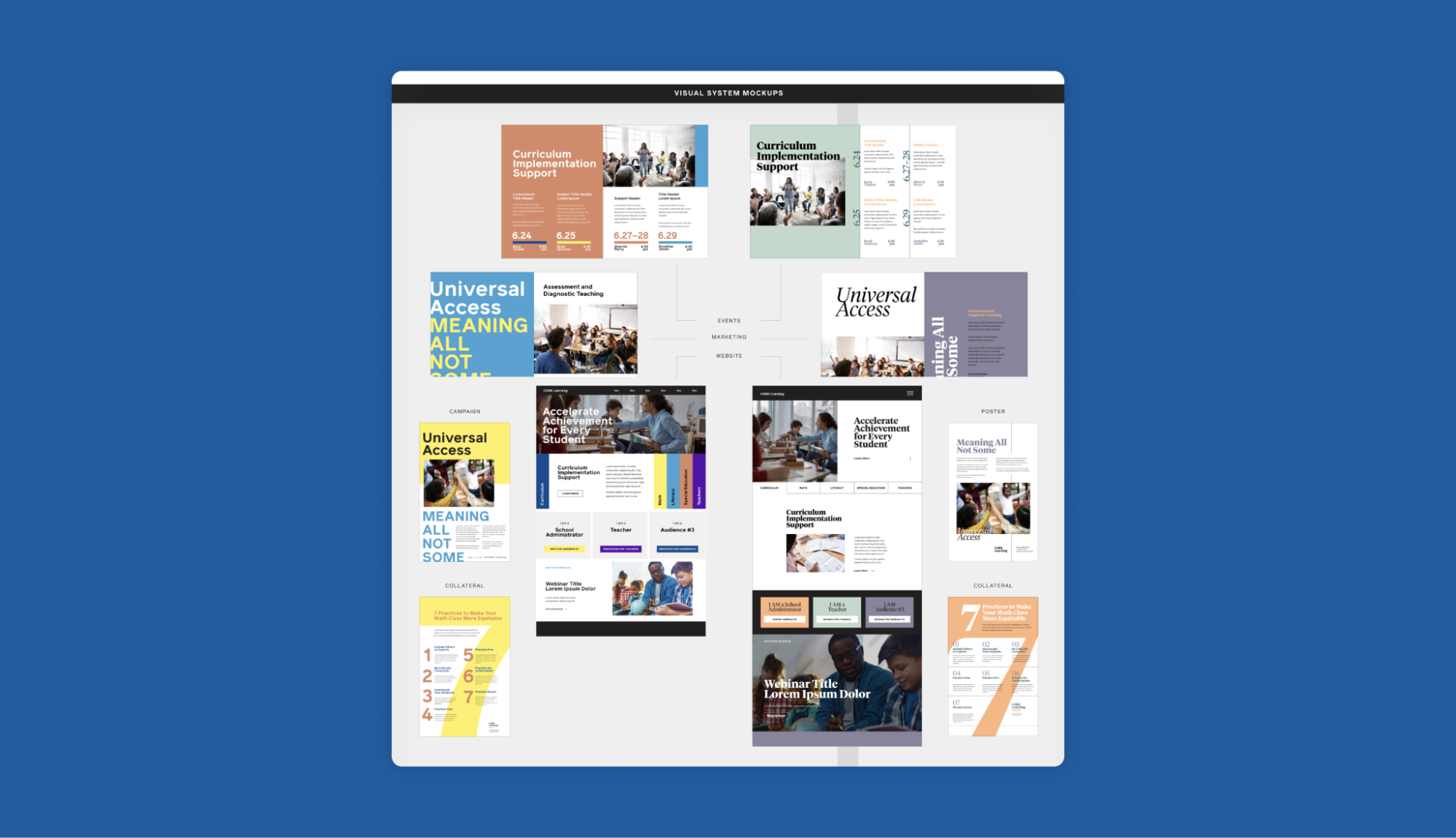
The first step was to choose a visual system that CORE would use on its website and all branded assets. We shared a discovery questionnaire with CORE to understand their brand, mission, needs, and preferences. Based on their responses, we created and presented two visual systems that we felt would be a good fit for their brand: ‘Color Drive’ and ‘That’s My Type.’
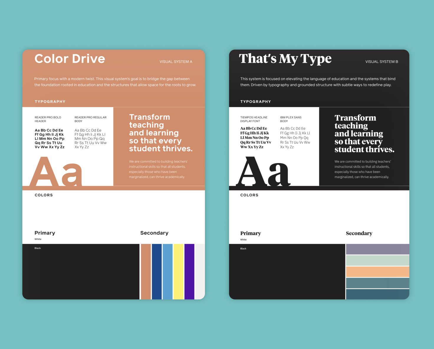
Following several rounds of consultations and feedback, the CORE team chose the ‘Color Drive’ visual system and brand colors, which they they felt were unique, compelling, and best represented their organization.
Then it was time for the logo. Although some CORE team members were keen to keep the apple theme, our brilliant graphic designer Kanacia pushed them to get out of their comfort zone.
The team believed they could move beyond the apple cliché to create a more original logo that truly represented CORE’s values and sub-brands. Their approach was grounded in solid research; for instance, during the second round of logo design, they emphasized the importance of creating a connection between the icon and wordmark to ensure a cohesive and meaningful logo.
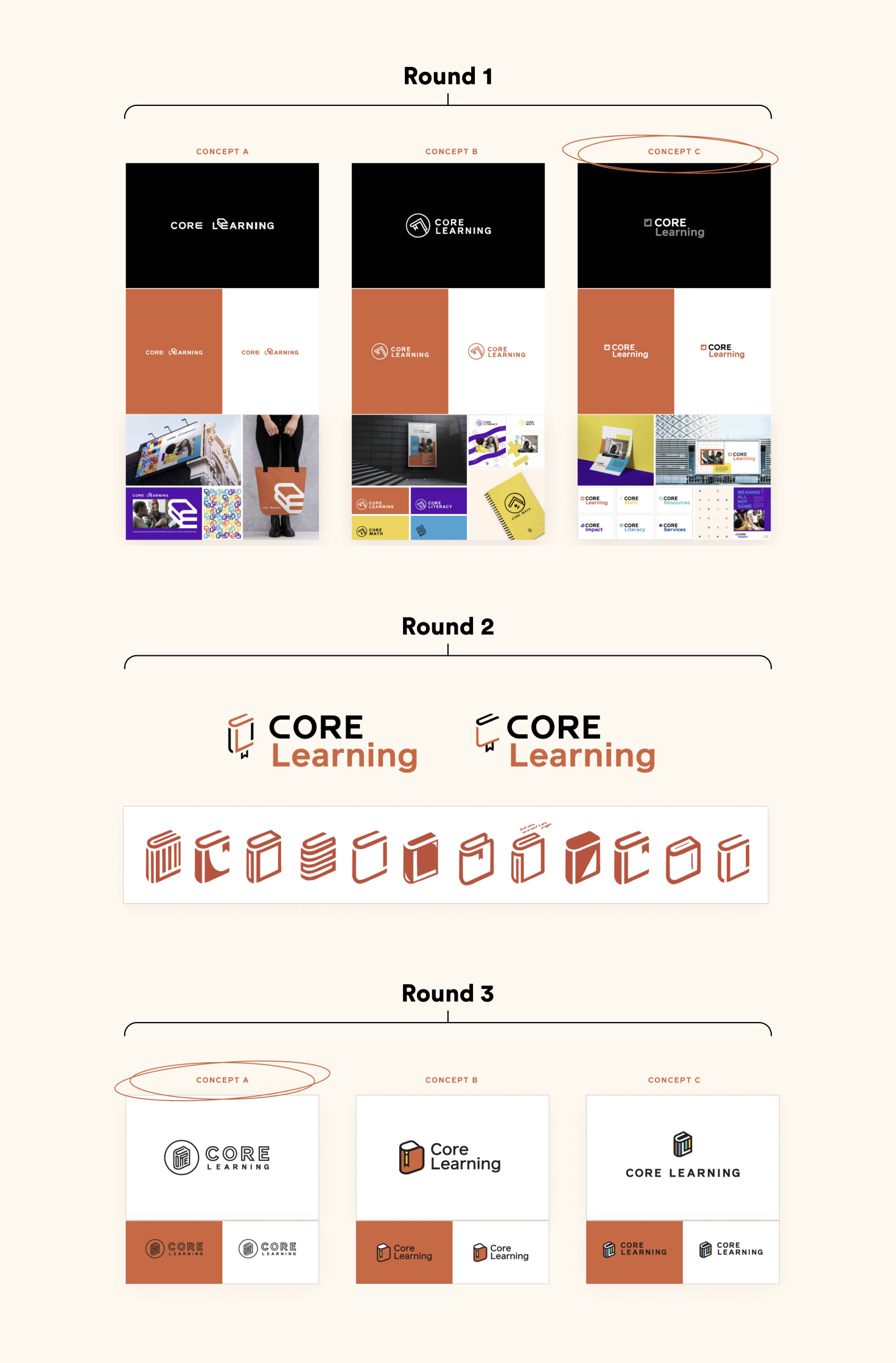
After hours spent sketching out designs and multiple feedback rounds, the book-shaped logo won, giving CORE a unique and eye-catching logo and brand identity that capture its values and work and stand out in the US education sector.

But the brilliance of the logo doesn’t end there. It also doubles as the logo for CORE’s sub-brands — CORE Literacy and CORE Math — with the book “opening” to reveal its contents.

Choosing a new name
“A rose by any other name would smell as sweet,”…or would it? Romeo may not have cared that Juliet was a Capulet, but in marketing, names matter — a lot.
CORE understood this too, and wanted the new name to be de-acronymed, short, memorable, and politically neutral — without departing from the CORE brand. In short, it had to reflect the natural evolution of CORE’s work.
The LH team carried out extensive positioning and competitor research and enlisted the help of a branding expert to hold a naming workshop.
Around the same time, CORE was in the process of merging with Pivot Learning, — adding another piece to the naming puzzle.
Together, we narrowed the longlist down to a shortlist, and our branding expert recommended three options. In the end, CORE Learning was the winner.
CORE Learning worked well as a way to maintain Pivot’s brand equity. It also meant there was no need to change the website URL (corelearn.com) or metadata tags.
Plus, the CORE team felt that “Learning” was more active and dynamic than “Learn” and evoked an ongoing journey or lifelong process for both educators and students.
Challenge #2: rebuilding CORE’s online home
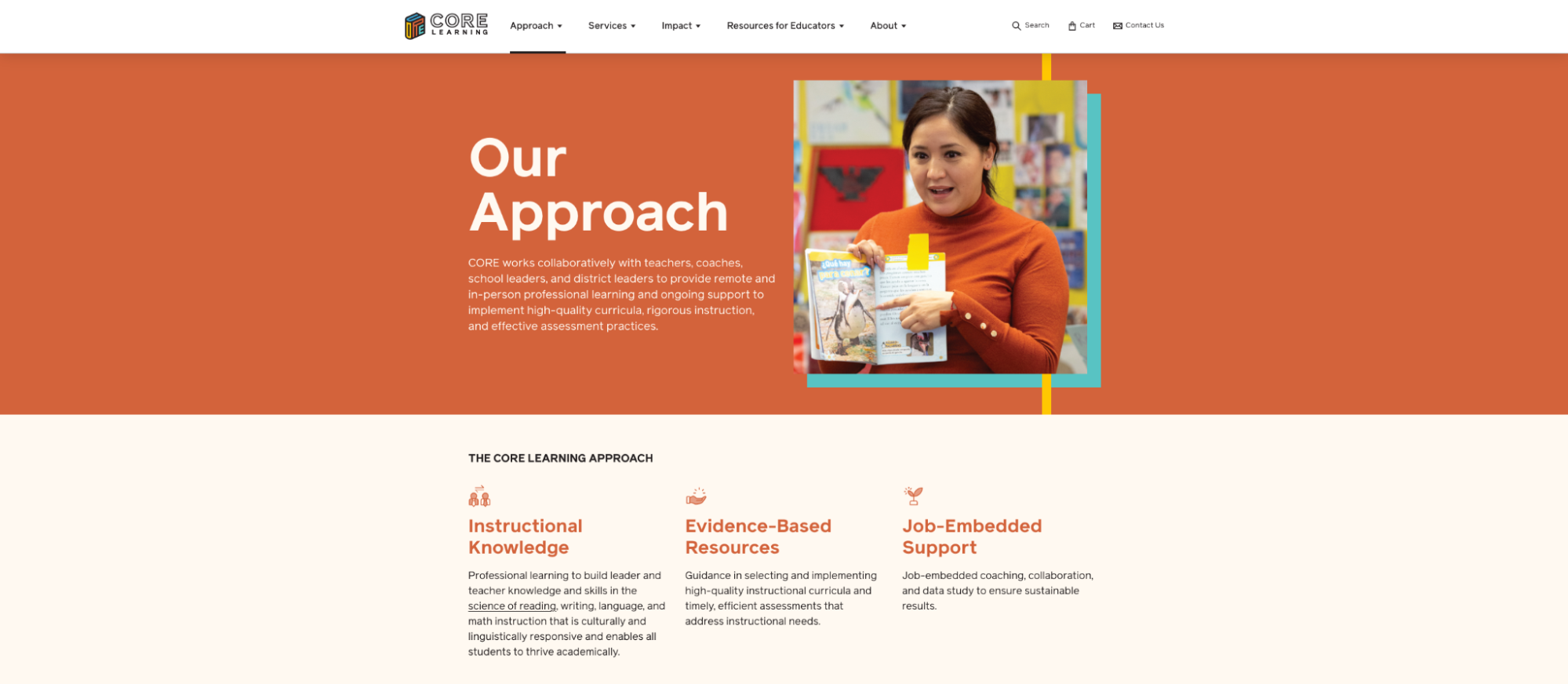
Armed with a box-fresh name, logo, and visual identity, it was time to start the somewhat daunting task of redesigning CORE’s website.
CORE described the old website as being like a house they kept adding onto over time without planning or forethought.
Part of the reason for this is that the CORE website is aimed at multiple ideal customer profiles (ICPs) and serves multiple functions — including downloadable resources, an e-commerce store, and online courses.
Over the years, CORE’s website had become confusing and inaccessible. There was no clear hierarchy to the pages, the language was dense and academic, and the multiple service lines were difficult to navigate.
Add to this the poor visual branding that didn’t resonate with the target audience, and it was clear that CORE’s website needed an overhaul.
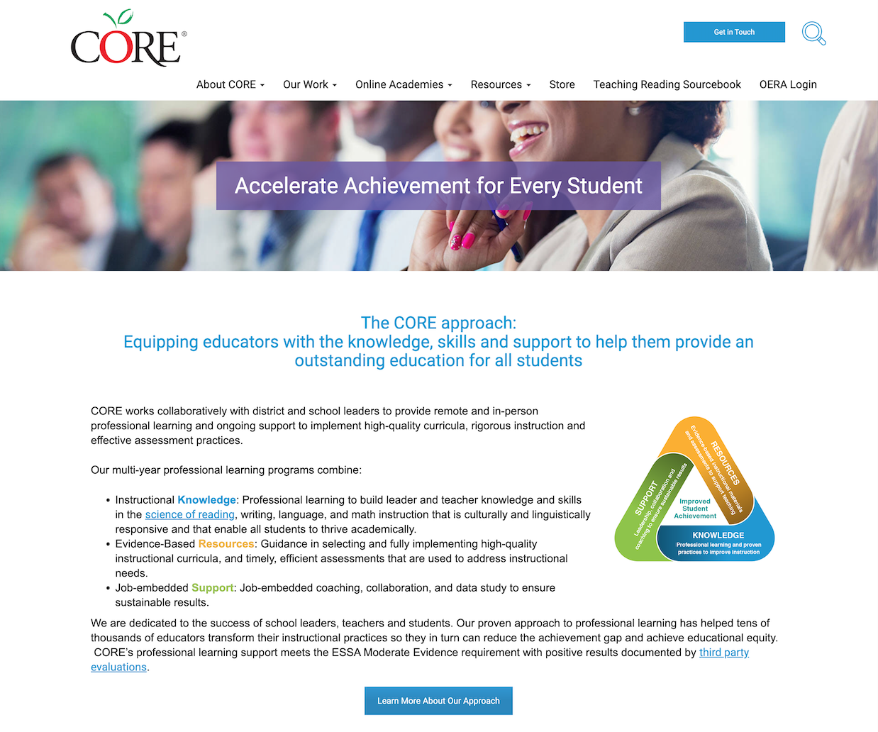
This was no straightforward website build for a startup. It required creating a structure that would house hundreds of existing web pages in a way that would make sense and be easy to navigate.
Fortunately, our Creative Director and web design team were on hand to guide the process. He conducted extensive interviews with internal stakeholders and multiple meetings with Clay, CORE’s Director of Communications, to build the wireframes.
Once the design was finalized, Derrick trained the CORE in-house team on using the backend of the site and created custom web modules for them to use — empowering them to keep updating the site without our support.
Meanwhile, our copywriters worked their magic on the copy and handed it over to the CORE team, who handled the migration with the help of our web developer.
Together, they managed to import over 600 pages from the old site without breaking anything or losing organic traffic in the process. Which was pretty impressive!
Challenge #3: the importance of being flexible
As I mentioned earlier, CORE underwent two mergers during the rebranding process, which meant LH had to be flexible enough to adapt to its evolving needs.
For example, after the second merger with UnboundEd was confirmed, CORE’s President, Robert Sheffield, told us the website needed to be finished within two months instead of the four-month timeframe we had been working with.
The news took us by surprise, but we kicked into top gear and successfully delivered to the new deadline.
The lesson I want to highlight here is the importance of being agile as an agency. Our ability to pivot helped CORE have enough of the website ready to soft launch it alongside the merger announcement.
The results: A best-in-class website that educators love
In the end, all the hard work paid off. The final result was a best-in-class (if you’ll excuse the pun) logo and visual identity and a fresh-looking website that visitors love.
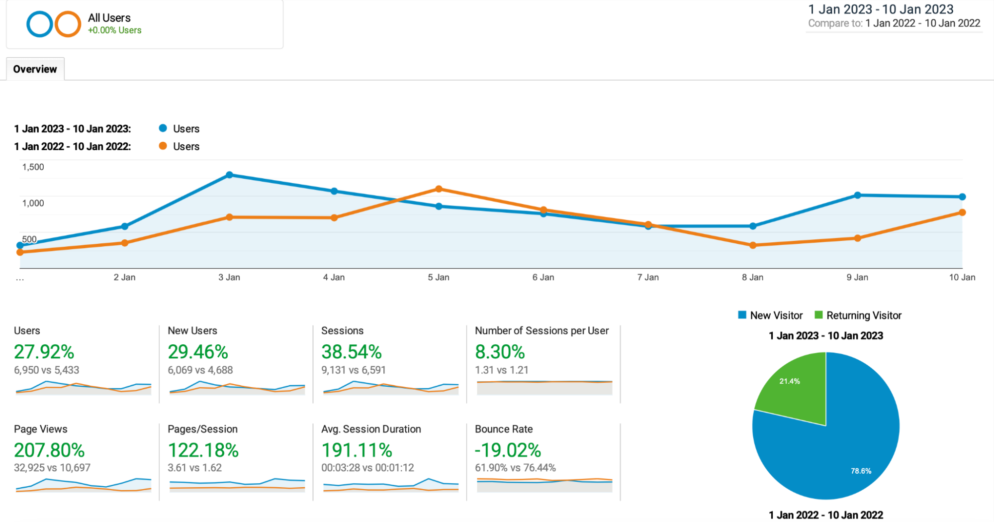
The website launched in Q4 of 2022, and by mid-January 2023, we could already see the results.
Page views were up by 207% compared to January 2022, page views per session increased by 122%, and the average session duration had soared to 191% compared to the previous year.
Plus, bounce rates were down by 19%.
Expanding our partnership with CORE Learning and UnboundEd
The new visual identity and website were just the beginning. As 2023 kicked off, CORE Learning continued to rely on Literal Humans for all aspects of content marketing.
Our collaboration quickly expanded as we created a whitepaper and other downloadable resources for educators, complemented by a comprehensive content strategy to drive traffic to their refreshed website.
CORE was so pleased with our work that they entrusted us with building the website for their sister company, CalCurriculum, and providing ongoing SEO content development and technical SEO support for UnboundEd.
We’re taking a data-driven approach to optimizing UnboundEd’s blog content to enhance its visibility, draw in high-quality traffic, and generate leads. To ensure the best results, we have partnered with a technical SEO expert to implement strategies that keep content aligned with evolving SEO practices.
Our comprehensive audits, insights, and best practices go beyond surface-level fixes; they’re tailored to position UnboundEd as a leader in the education sector. This ongoing work aims to create content that’s both highly discoverable and impactful, reaching the right audiences and driving meaningful engagement.
Large brands like CORE Learning and UnboundEd require a flexible, dedicated partner that can adapt to their evolving needs and deliver 360° solutions to all things digital marketing— from design and copywriting to SEO, user journey testing, stakeholder interviews, competitor research, and more.
And that’s the LH added value — no matter how big the challenge, we always find a way to make it work.
Does your edtech brand need a makeover?
Working with CORE Learning has challenged us to grow in all the right ways, solidifying our position as a reliable marketing partner for edtech brands.
The CORE rebrand was vast and complex, yet we navigated the project with agility, staying within scope and delivering to tight deadlines to create an engaging brand and website that genuinely reflects CORE’s mission and values.
As with all of our best collaborations, the foundation of our success was a solid working relationship with CORE. This partnership allowed for close communication and collaboration, fostering mutual trust.
CORE’s team welcomed our input and implemented our recommendations, which is the kind of partnership we love to see. In turn, we demonstrated to CORE that we’re a dependable, long-term partner adaptable to their evolving needs.
If you’re a leader in the edtech sector looking to elevate your brand, website, or overall marketing approach, schedule a free strategy call to learn how we can help your brand achieve its goals.


